Making Figures in Python
by Jerry Chen
A good data visualization can turn data into a compelling story, which interpret the numbers into understandable figures.
Matplotlib is a plotting library that can help researchers to visualize their data in many different ways including line plots, histograms, bar charts, pie charts, scatter plots, stream plots, simple 3-D plots, etc. Moreover, it supports TeX expressions for mathematical expressions and work with the python scripts, jupyter notebook and web application servers. The interface is similar to MATLAB, so there is a minimum transition. The Matplotlib is well-documented and provides the tutorials and samples on the official website.
Why matplotlib?
- It is free, open source. A default plotting library comes with Python.
- While coding take more time, but you can make sure you can generate the same plots with the same settings every time.
- If you process your data in python, why don’t you just choose to stay in the same environment?
Installing
As described in our tutorial on installing Python packages, we can install Matplotlib with install by entering the following lines into your console (Details):
conda install matplotlib
To test if you install correctly, you can try to import the library to see if you get any error messages. If not, then you are ready to go!
import matplotlib.pyplot as plt
Workflow
- Prepare your data: usually save in the a list or Numpy array.
- Create the plot/sub-plot.
- Customize your plot: adjust the linewidth, color, marker, axes, etc.
- Show/Save plot
Simple Example
This example is taken form the article Ten simple rules for better figures while they illustrate the rule of Rule 5: Do Not Trust the Defaults. The example is simple enough and provides examples of common tweaks for making professional figures for your research publications.
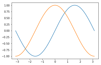
Default plot
Step 0. Import libraries
import numpy as np
import matplotlib.pyplot as plt
Step 1. Prepare your data
# Create a mesh with 256 points from -Pi to Pi
x = np.linspace(-np.pi, np.pi, 256)

# Find the y values accordingly
y1 = np.sin(x)
y2 = np.cos(x)
Step 2. Create the plot
plt.plot(x,y1)
plt.plot(x,y2)
Step 3. Customize your plot – since it is default, you don’t have to do anything now.
Step 4. Show/Save plot
plt.show()
Professional Plot
Step 0. Import libraries
import numpy as np
import matplotlib.pyplot as plt
Step 1. Prepare your data
# Create a mesh with 256 points from -Pi to Pi
x = np.linspace(-np.pi, np.pi, 256)

# Find the y values accordingly - you can also stack the y1, y2 in python
y1, y2 = np.sin(x), np.cos(x)
Step 3. Customize your plot
# Setting the figure size and resolution
fig = plt.figure(figsize=(10, 6), dpi=300)

# Setting the color, linewidth, and linestyle
plt.plot(x, y1, color="red",  linewidth=2.5, linestyle="-")
plt.plot(x, y2, color="blue", linewidth=2.5, linestyle="-")

# Setting the boundaries of the figure
plt.xlim(x.min()*1.1, x.max()*1.1)
plt.ylim(y2.min()*1.1, y2.max()*1.1)

# Changing spine style
ax = plt.gca()
ax.spines['right'].set_color('none')
ax.spines['top'].set_color('none')
ax.xaxis.set_ticks_position('bottom')
ax.spines['bottom'].set_position(('data', 0))
ax.yaxis.set_ticks_position('left')
ax.spines['left'].set_position(('data', 0))

# Use Latex to set tick labels
plt.xticks([-np.pi, -np.pi/2, 0, np.pi/2, np.pi],
           [r'$-\pi$', r'$-\pi/2$', r'$0$', r'$+\pi/2$', r'$+\pi$'])
plt.yticks([-1, 0, +1], [r'$-1$', r'$0$', r'$+1$'])
plt.xticks(fontsize=14, rotation=0)
plt.yticks(fontsize=14, rotation=0)

# Adding legends
plt.plot(x, y1, color="red",  linewidth=2.5, linestyle="-", label="sin")
plt.plot(x, y2, color="blue", linewidth=2.5, linestyle="-", label="cos")
plt.legend(loc='upper left', prop={'size': 16}, frameon=False)

# Annotate the points
t = 2*np.pi/3
plt.plot([t, t], [0, np.cos(t)], color='blue',
         linewidth=1.5, linestyle="--")  # line
plt.scatter([t], [np.cos(t)], 50, color='blue')  # point

# Annotate the equations
plt.annotate(r'$\sin(\frac{2\pi}{3})=\frac{\sqrt{3}}{2}$',
             xy=(t, np.sin(t)), xycoords='data',
             xytext=(+10, +30), textcoords='offset points', fontsize=16,
             arrowprops=dict(arrowstyle="->", connectionstyle="arc3,rad=.2"))

# Annotate the points
plt.plot([t, t], [0, np.sin(t)], color='red',
         linewidth=1.5, linestyle="--")  # line
plt.scatter([t], [np.sin(t)], 50, color='red')  # point

# Annotate the equations
plt.annotate(r'$\cos(\frac{2\pi}{3})=-\frac{1}{2}$',
             xy=(t, np.cos(t)), xycoords='data',
             xytext=(-90, -50), textcoords='offset points', fontsize=16,
             arrowprops=dict(arrowstyle="->", connectionstyle="arc3,rad=.2"))

plt.show() # show figure
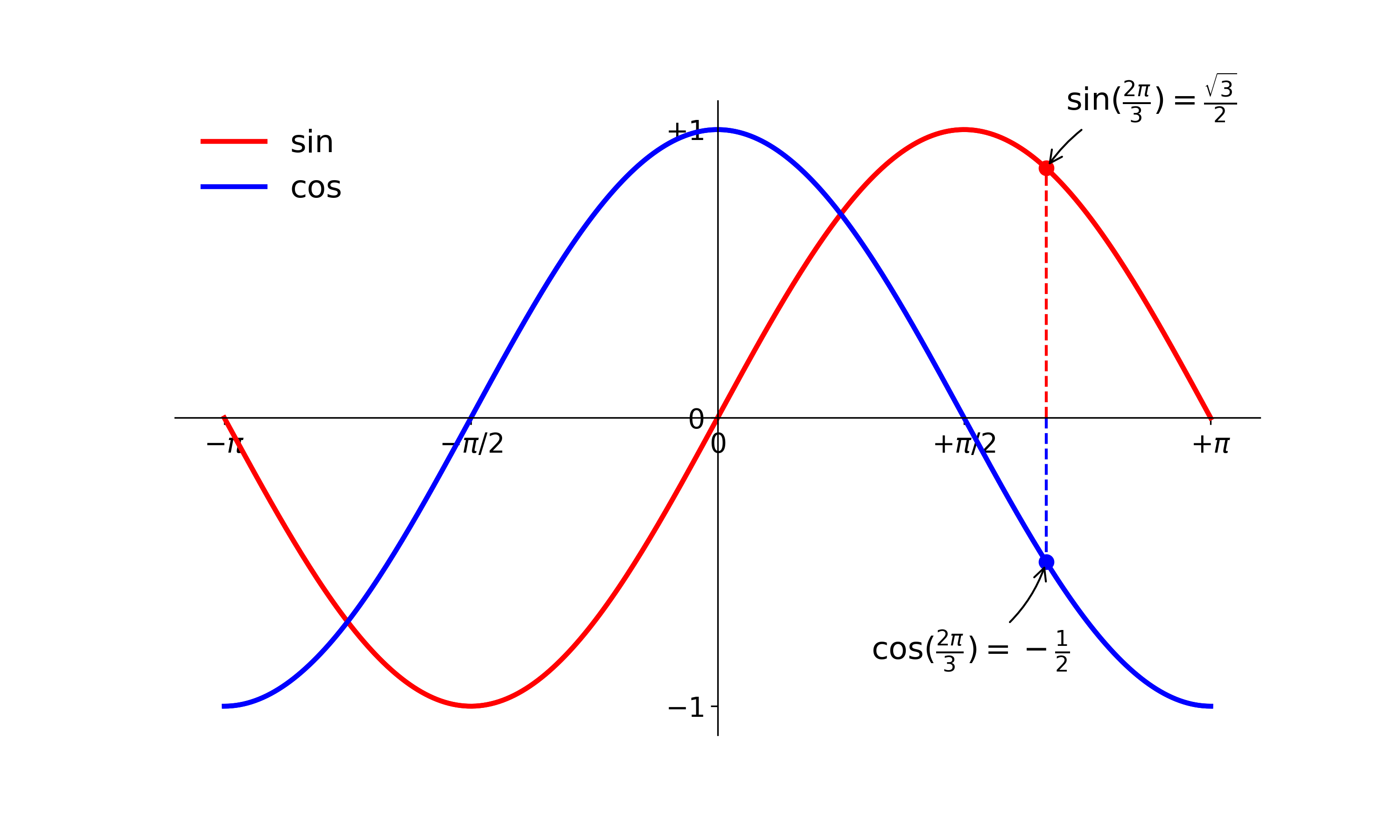
Step 4. Save plot
fig.savefig("sincos.png", dpi = 300) # save figure
Take away
Now you can easily tell that generating the plot using matplotlib is not hard while using the default setting. It makes you quickly get a the sense of the change of the dependent variables, i.e. fast prototyping. However, if you want to utilize matplotlib to generate professional figures for your publications, you might need to put some efforts to tweak each single element of the figure. Once you are done, you can process the similar type of data by using the same code, and it will ensure your figures always have the same style.
Frequently-used plots for researchers
Here we want to use simple dataset to demonstrate some frequent-used plots. We make sure the dataset is simple enough for you to understand and modify.
1. Showing 2D data
2. Showing Statistical results
3. Showing 3D data
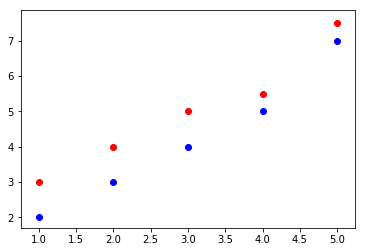
Scatter plot
# Step 0
import numpy as np
import matplotlib.pyplot as plt

# Step 1
# Note: data can be a list of numpy array
x = [1, 2, 3, 4, 5]
y1 = [2, 3, 4, 5, 7]
y2 = [3, 4, 5, 5.5, 7.5]

# Step 2 & 3
plt.scatter(x, y1, color='blue')
plt.scatter(x, y2, color='red')

# Step 4
plt.show()
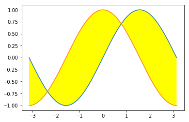
Filled line plot
# Step 0
import numpy as np
import matplotlib.pyplot as plt

# Step 1
x = np.linspace(-np.pi, np.pi, 256)
y1, y2 = np.sin(x), np.cos(x)

# Step 2
plt.plot(x, y1)
plt.plot(x, y2)

# Step 3
plt.fill_between(x, y1, y2, facecolor='yellow')

# Step 4
plt.show()
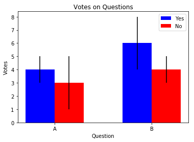
Bar chart with error bar
# Step 0
import numpy as np
import matplotlib.pyplot as plt

# Step 1
n_groups = 2

mean_y = [4, 6]
std_y = [1, 2]

mean_n = [3, 4]
std_n = [2, 1]

# Step 2
# Return evenly spaced values within a given interval eg. np.arange(3) >>> array([0, 1, 2])
index = np.arange(n_groups)
bar_width = 0.3

plt.bar(index, mean_y, bar_width,
        color='b',
        yerr=std_y,  # err bar
        label='Yes')

plt.bar(index + bar_width, mean_n, bar_width,
        color='r',
        yerr=std_n,  # err bar
        label='No')

# Step 3
plt.xlabel('Question')  # add x-label
plt.ylabel('Votes')  # add y-label
plt.title('Votes on Questions')  # add title
# index + bar_width / 2 define ticks location
plt.xticks(index + bar_width / 2, ('A', 'B'))
plt.legend()  # add legend

# Step 4
plt.show()
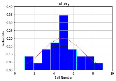
Histogram
# Step 0
import numpy as np
import matplotlib.pyplot as plt

def normpdf(x, mu, sigma):
    '''Finding norm PDF'''
    u = (x-mu)/abs(sigma)
    return (1/(np.sqrt(2*np.pi)*abs(sigma)))*np.exp(-u*u/2)

# Step 1
x = [1, 1, 2, 3, 3, 3, 4, 4, 4, 4, 5, 5, 5,
     5, 5, 5, 5, 5, 6, 6, 6, 7, 7, 8, 8, 9]
mean = np.mean(x)
std = np.std(x)

# Step 2
n, bins, patches = plt.hist(x, 9, normed=1, facecolor='blue', edgecolor='cyan')

y = normpdf(bins, mean, std)
plt.plot(bins, y, 'r--', linewidth=1) # add a 'best fit' line

# Step 3
plt.xlabel('Ball Number')  # add x-label
plt.ylabel('Probability')  # add y-label
plt.title('Lottery')  # add title
plt.axis([0, 10, 0, 0.4])  # difine the axes display range
plt.grid(True)  # show the grid

# Step 4
plt.show()
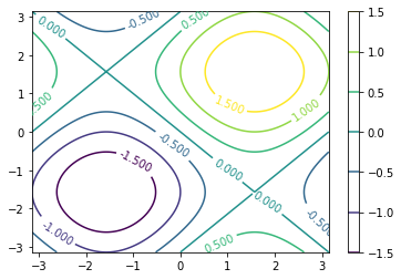
Contour plot with color bar
# Step 0
import numpy as np
import matplotlib.pyplot as plt

def f(x, y):
    '''use "function" to get f(x,y) and return the value'''
    return np.sin(x) + np.sin(y)

# Step 1
n = 256
x = np.linspace(-np.pi, np.pi, n)
y = np.linspace(-np.pi, np.pi, n)
X, Y = np.meshgrid(x, y) # generate the grid
Z = f(X, Y)

# Step 2
Contour = plt.contour(X, Y, f(X, Y))

# Step 3
plt.clabel(Contour, fontsize=10)
plt.colorbar(Contour)

# Step 4
plt.show()
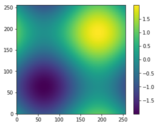
Color grid (Imgshow) with color bar
# Step 0
import numpy as np
import matplotlib.pyplot as plt

def f(x, y):
    '''use "function" to get f(x,y) and return the value'''
    return np.sin(x) + np.sin(y)

# Step 1
n = 256
x = np.linspace(-np.pi, np.pi, n)
y = np.linspace(-np.pi, np.pi, n)
X, Y = np.meshgrid(x, y) # generate the grid
Z = f(X, Y)

# Step 2
plt.imshow(Z, origin='lower')  # origin at the bottom-left

# Step 3
plt.colorbar()

# Step 4
plt.show()
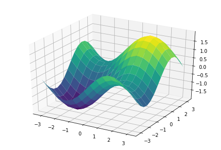
Simple 3D plot
# Step 0
import numpy as np
import matplotlib.pyplot as plt
from mpl_toolkits.mplot3d import Axes3D  # import 3D axes
from matplotlib import cm  # import colormap

def f(x, y):
    '''use "function" to get f(x,y) and return the value'''
    return np.sin(x) + np.sin(y)


# Step 1
n = 16
x = np.linspace(-np.pi, np.pi, n)
y = np.linspace(-np.pi, np.pi, n)
X, Y = np.meshgrid(x, y) # generate the grid
Z = f(X, Y)

# Step 2 & 3
fig = plt.figure()
ax = Axes3D(fig)
ax.plot_surface(X, Y, Z, rstride=1, cstride=1, cmap=cm.viridis)

# Step 4
plt.show()
Other Data Visualization Packages in Python
- Seaborn: is built on top of matplotlib library for statistical plotting.
- Bokeh: is a Python interactive visualization library for web browsers.
- Geoplotlib: is a Python toolbox for visualizing geographical data.