- ▢
- –
- ✕
// go fullscreen for a totally immersive experience!
// keep in mind that this is merely a mock operating system, so not every little function works like how it should in an actual operating system.
// some are just there to help immerse you in the aesthetic!
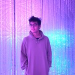
OS Icon
This icon, along with its dsk-OS label, is a link that takes you to a much more primitive display of Danyl's works that he had done in B IMD 233, the UWB course that got him into web design.
Feel free to explore this other realm if you'd like to see Danyl's journey with web design, but it is not part of the portfolio! You won't need any login information to go through the login page; just click on the login button!
Help Page
This is where you are right now!
Here you can read all about the general functions and actions found on the current page.
Profile Page
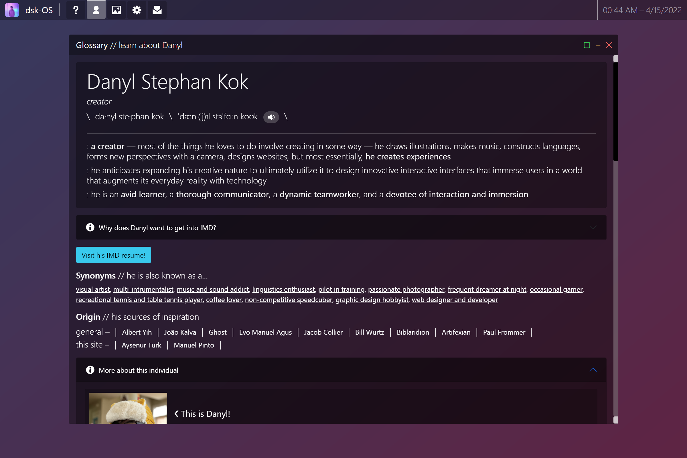
This is where you first land and where you concisely come to know what Danyl is all about!
The first section arranges a short personal statement in the parodied form of a dictionary entry. The "hear pronunciation" button works! Danyl used his iPhone to record his voice for this.
Right under this card are two IMD-specific functions — a collapsable info card explaining why Danyl thinks IMD is a good fit for him, and a button that takes you to a resume taylored just for IMD.
Another section in this "dictionary entry" goes through Danyl's other hobbies, parodied as "synonyms," and Danyl's sources of inspiration, labeled "origin," still for the dictionary parody.
Lastly, you can optionally view highlights from Danyl's strongest skills as a creator. You can choose to jump straight into the single pieces of work displayed here, or you can browse everything by visiting the portfolio windows on the taskbar above.
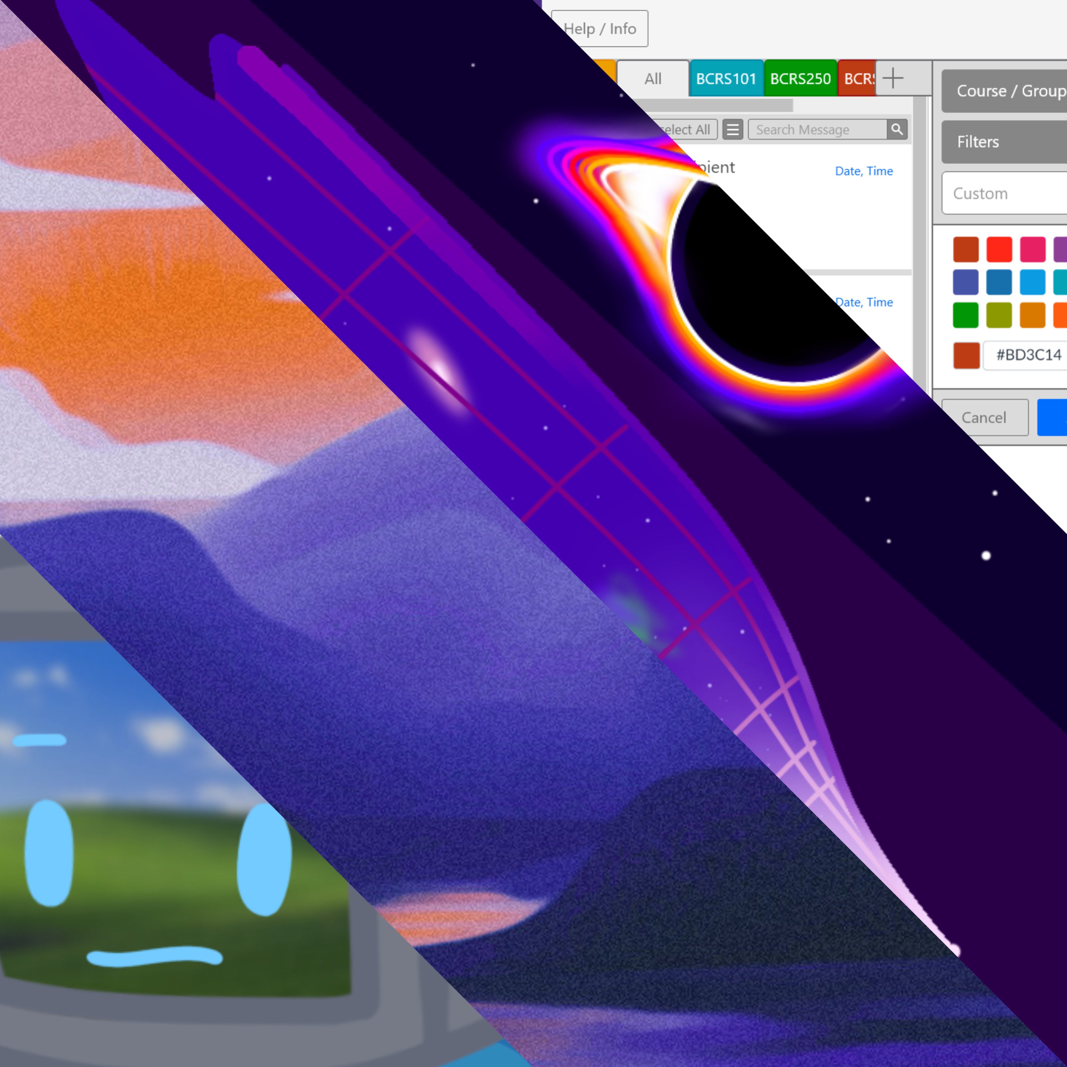
Portfolio
This is the meatiest part of the website.
Upon being clicked, his tiny "app" presents six windows, each holding a different category of Danyl's presentable works in addition to this beautifully crafted website, and each of which you can click on and further explore. They are sorted in order of relevance/importance/significance, with the leftmost "window" asking you for the most attention. That is not to say the right half is irrelevant, though; they are there for you to explore and to show you the collection of things I have indulged in!
System Info Page
This page goes into the journey of exactly why and how Danyl crafted this website.
It's labeled "System Info" for parody purposes.
Message Page
This is really really fancy feature of the dsk-OS ... that's only for show. It doesn't actually send Danyl your message because he has yet to learn back-end web development. Feel free to give it a try though!
If you do need to contact Danyl about anything, please feel free to send him an email at his email address: danylstephan@gmail.com
- ▢
- –
- ✕
Danyl Stephan Kok
creator
- \
- da·nyl ste·phan kok
- \
- 'dæn.(j)ɪl stɜ'fɑːn koʊk
- \
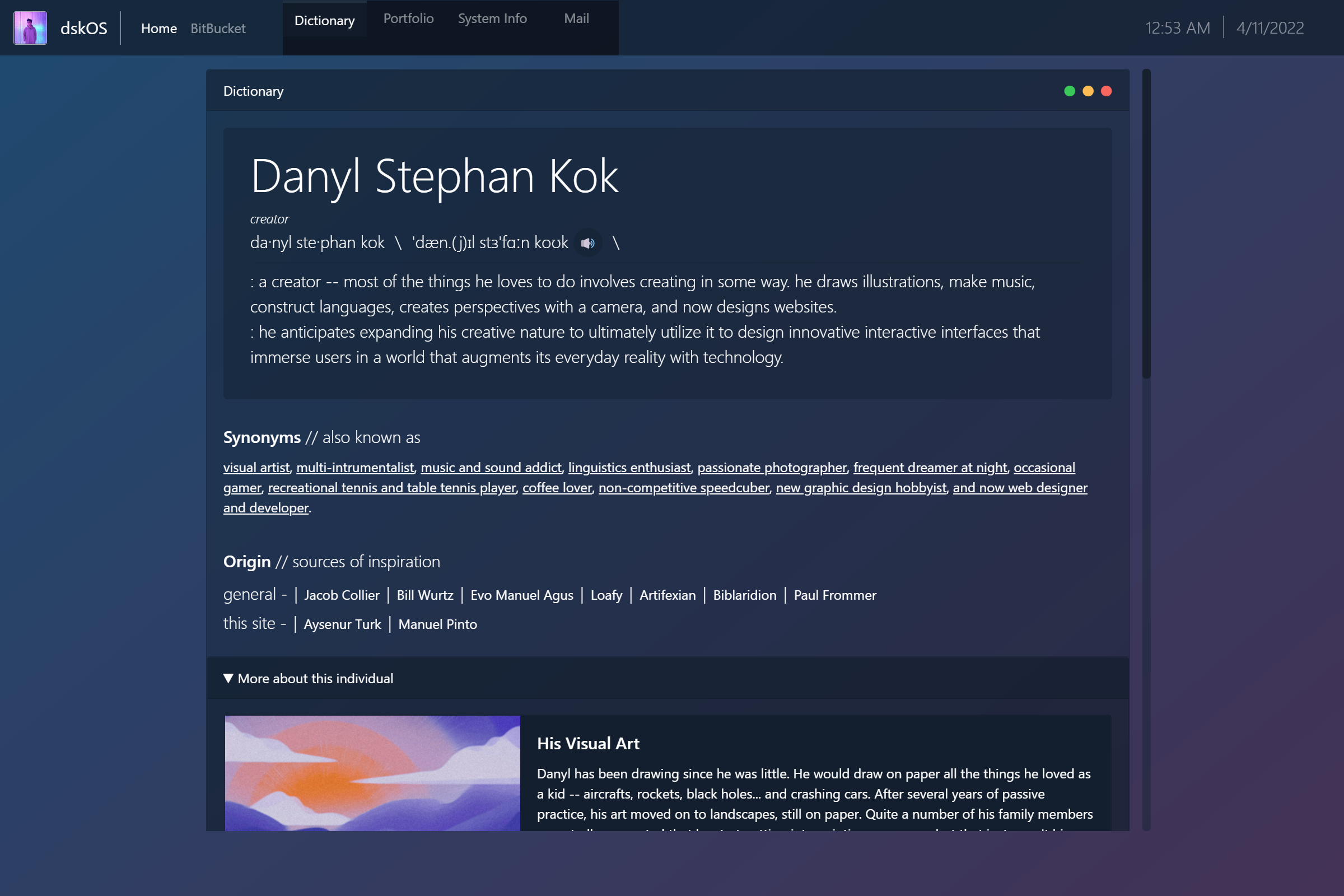
: a creator — most of the things he loves to do involve creating in some way — he draws illustrations, makes music, constructs languages, forms new perspectives with a camera, designs websites, but most essentially, he creates experiences
: he anticipates expanding his creative nature to ultimately utilize it to design innovative interactive interfaces that immerse users in a world that augments its everyday reality with technology
: he is an avid learner, a thorough communicator, a dynamic teamworker, and a devotee of interaction and immersion
Synonyms // he is also known as a...
visual artist, multi-intrumentalist, music and sound addict, linguistics enthusiast, pilot in training, passionate photographer, frequent dreamer at night, occasional gamer, recreational tennis and table tennis player, coffee lover, non-competitive speedcuber, graphic design hobbyist, web designer and developer
Origin // his sources of inspiration
- general –
- |
- Albert Yih
- |
- João Kalva
- |
- Ghost
- |
- Evo Manuel Agus
- |
- Jacob Collier
- |
- Bill Wurtz
- |
- Biblaridion
- |
- Artifexian
- |
- Paul Frommer
- |
- this site –
- |
- Aysenur Turk
- |
- Manuel Pinto
- |

❮ This is Danyl!
// below is one way to visit Danyl's portfolio, but it is recommended to navigate to the same pages using the taskbar on the top of the screen; it helps you make sense of where you are, just were, and will be!
His Visual Creations // UI Design, Graphic Design, Visual Art, Animation, 3D Modeling
Danyl has had a long, long journey with many things visual. Firstly, he has been drawing since he was little; he would draw, on paper, all the things he loved as a kid: aircraft, rockets, black holes and natural disasters, and crashing cars. After several years of passive practive, his art moved on to landscapes, still on paper. He fell in love with the simplicity and monochromaticity of pencil on paper. In 2019, he exposed himself to digital art for the first time. He started his digital journey with cartoon characters, but now he's starting to bring his old landscape friend into the digital world to explore the novel variety of approaches to expression that the digital medium allows. He continues to switch between traditional and digital drawing for the rest of 2019 before fully unleashing the potential he didn't see in himself. As soon as he started college in Autumn 2020, he got into animating, applied his current visual skills and knowledge into designing graphics, and most recently into designing interfaces, all the while excelling through the quarters with mild but bearable hardship and determination.
Jazz Arrangement of Walking with Jesus
Helicopter Sound Recreation
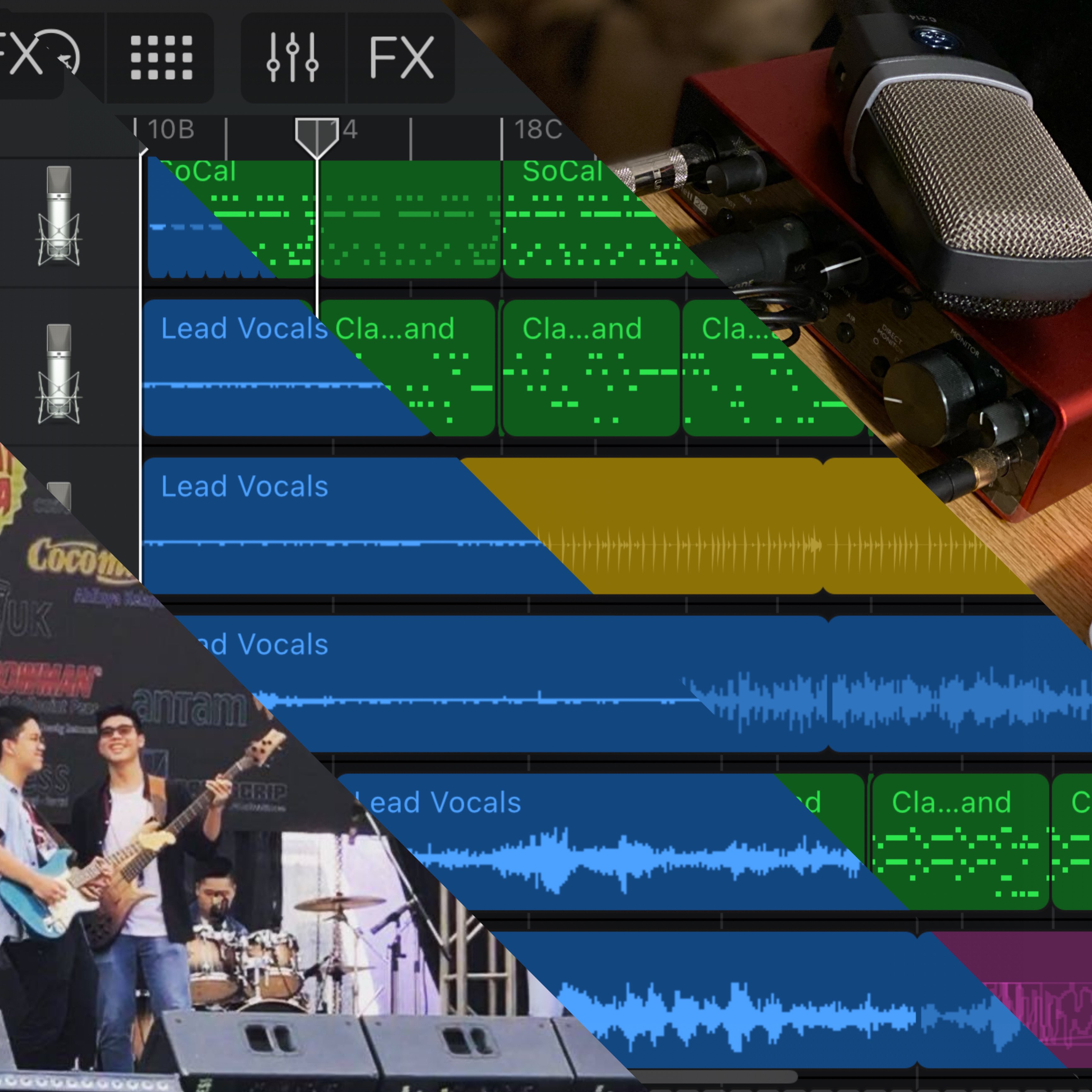
His Audial Works // Music, Sound
Danyl's first exposure to music was through the electronic keyboard. He didn't know how it works or how one uses its every button, but he's fascinated by the miscellany of sounds that it's able to make. He continued his fascination with music through piano lessons, which he initially didn't enjoy very much although it passively shoved the fundamentals into his oblivious musician mind. He continued for years without touching another instrument, which might have incepted the curiosity he still nurtures to this day towards new and unusual instruments. Danyl exposed himself to music software for the first time in 2015. Until this point, he had only been playing with either acoustic or normal band instruments aside from the keyboard, not yet digitally engineered sounds. This then influenced his style of making music on digital platforms as well.
He had fun exploring and creating music as soon as he got this first software, but until mid-2019, he was much more a music creator than a music consumer. He finds the variety of songs to which he is exposed to be "uninteresting," whatever that may mean to him. As he later grew his talent to other instruments, he began to discover the music he'd always wanted to love as well. He is now a self-taught bassist who also appreciates the shuffling rhythms of a percussionist and the spicy chords of a pianist. He isn't only intrigued by organized sound, though. He also just loves sound in general -- the fundamental frequency and how a harmonic series of waves make up a certain timbre, the individual components that make up a unified sound that we hear. To the left is his attempt at recreating a helicopter noise using only his body and clothes, and the recording environment as his sources of sound.
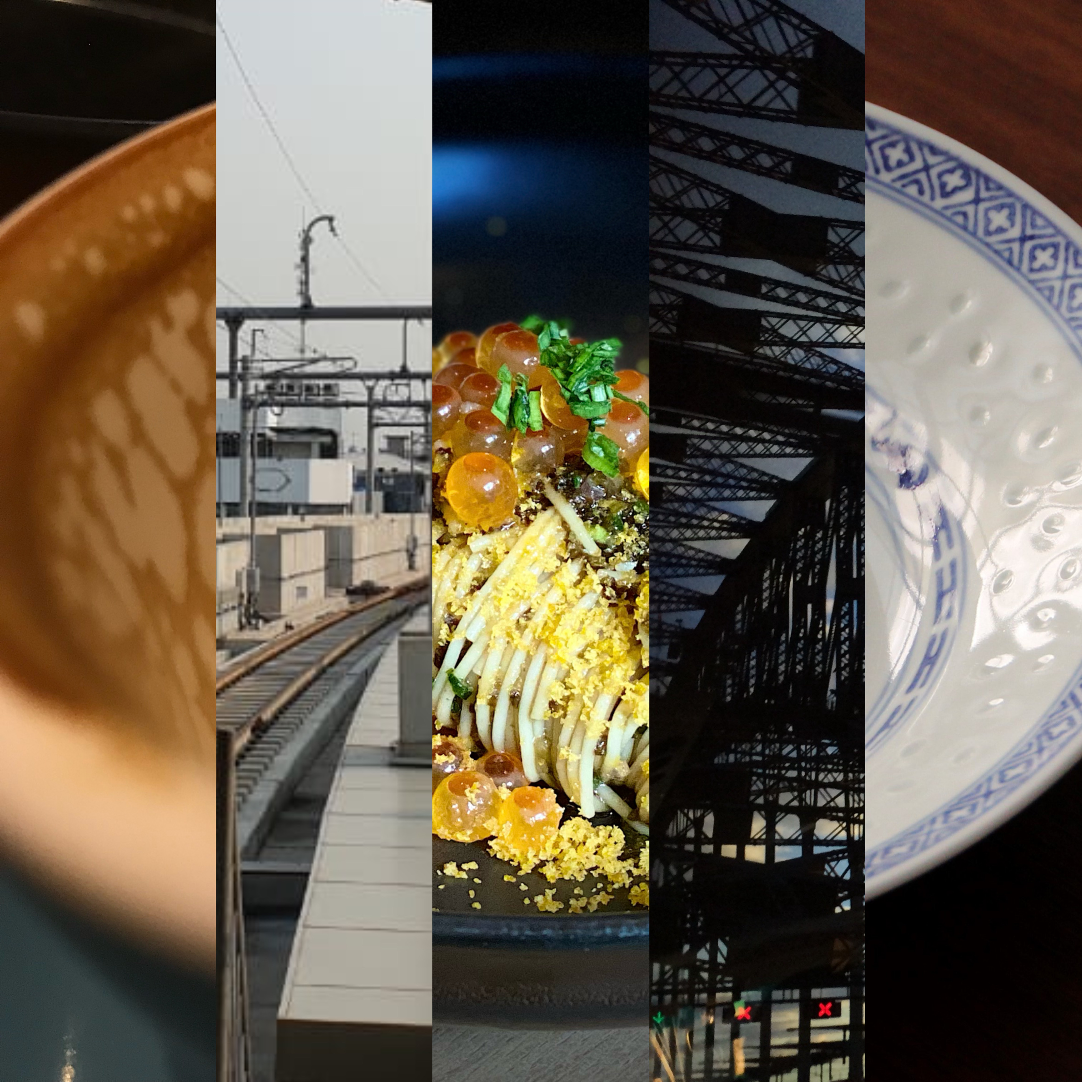
His Photography
Danyl finds beauty in the simplest things he encounters every day, and capturing that perspective so that others too could see from and through it is a devotion of his. He owns a DSLR at home, but he often finds himself wanting to capture something worth his appreciation more often than the times he would have the camera in his hands. He does an ongoing series he calls Phontography, photography centered around the idea of only having his iPhone with him to capture moments worthy of his attention. Close-ups, landscapes, and artificial structures take up most of his storage space, but he's always open to many other aesthetics. Danyl also loves to play around with photo editing apps; it has influenced some of his processes for digital art as well.
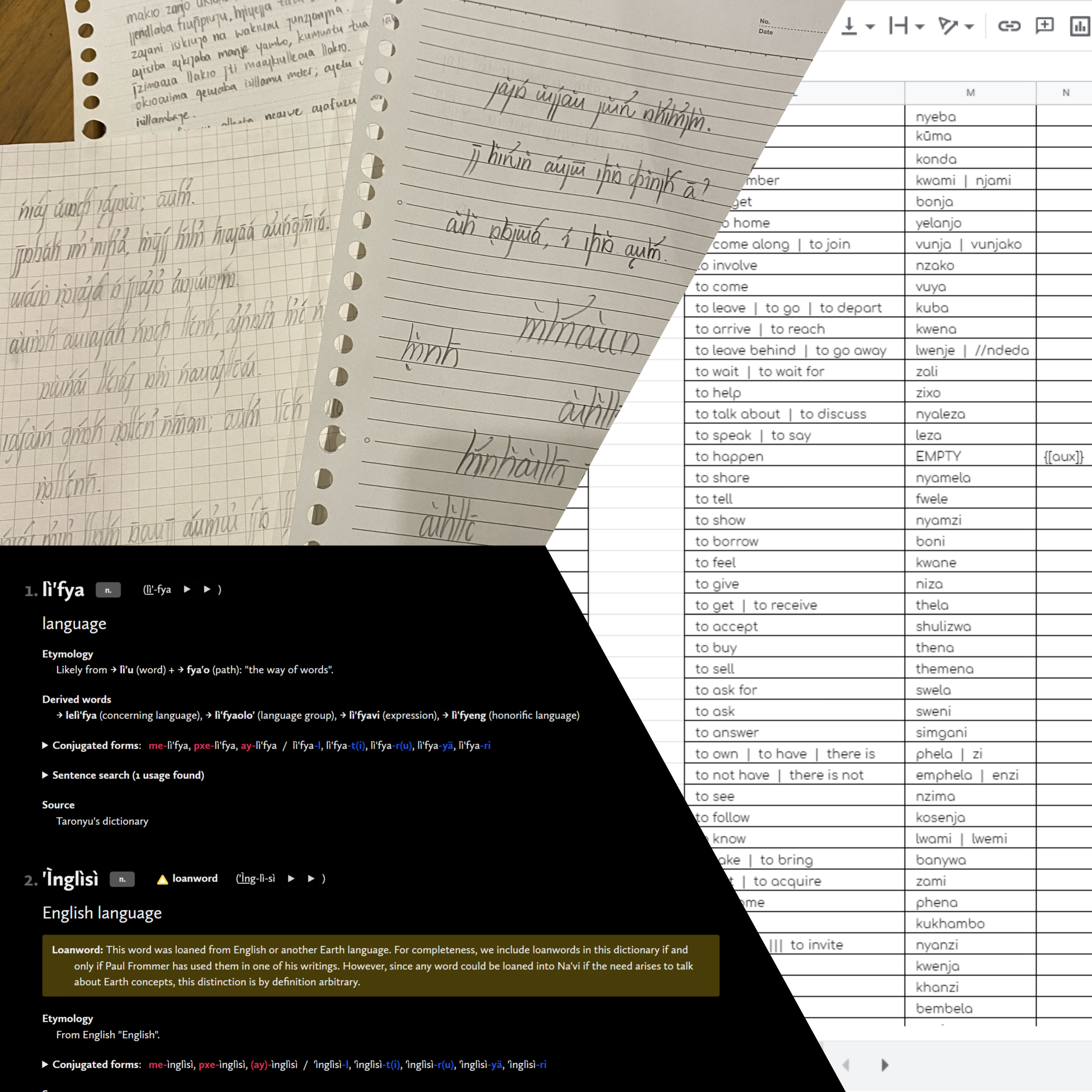
His Constructed Language
There's something about the way languages work that never stops to mesmerize Danyl. Languages have a distinctive way of structuring information, with each piece depending on another to create unique meaning together, like a system. It all started in sixth grade when more and more innocent words are getting banned by teachers of all levels of authority because of Danyl and his friends. They find themselves in need of an encoded English to continue communicating with each "normally" under this new order. As he moved on to seventh grade where the rules no longer applied, and the code slowly faded away from usefulness, Danyl felt like he lost a significant piece of himself. This is where Danyl gained full determination to create more than just a code; he was determined to make an entirely original language, with its own etymology, and its own working grammar. This language that he calls Palenggua, remains to be his one and only constructed language that he maintains, though oftentimes inconsistently. Unsurprisingly, minimizing issues when creating an entirely new language is onerous and demanding. New iterations of the same language find themselves continually emerging, each solving a major issue that seems to have irremediably broken the vital mechanics of the language's syntax. It has been and will always be a tough journey, but it's also a fun one for him.
- ▢
- –
- ✕
About
I've always wanted to design an original interface. I've always thought that I loved it, but I haven't actually tried it until I got to this project, which thus served as a great opportunity for exploration. I dream of crazier stuff like Iron Man's workstation, but I chose to start relatively tame with this portfolio-website-OS, the end result of which I am proud already despite the long list of ideas for additions to it that still remain. The idea for designing an original "operating system" for a portfolio website only came up to me as I was following through with my initial plan. This was originally meant to be a final capstone project for B IMD 233, and secretly, this is its second iteration, adapted to focus on IMD even more. The first iteration can be found here.
The Process
The Initial Plan
As soon as the capstone assignment was opened, I grabbed my comfort pencil and my appropriately gridded piece of paper to dig my brain out. The assignment only asked for a general portfolio, so the core of the idea, the gist of which still survives into this second iteration, is simply a playful parody of a dictionary entry that instead of displaying information about a word, displays information about myself.
// The sacred and ancient, first sketch of the original idea (Feb 2021):
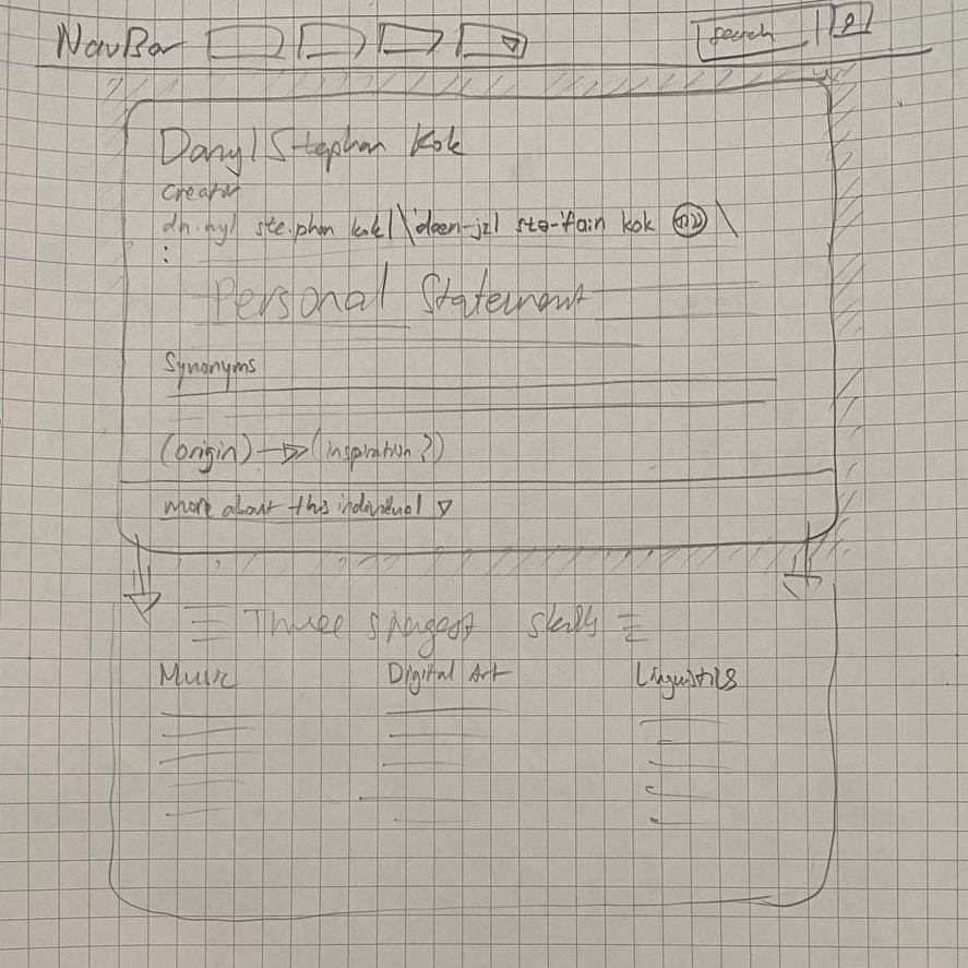
This sketch was done when I was freshly introduced to Bootstrap, the CSS framework on which I am still dependent to this day, but back when I have not discovered much of its potential.
- I only knew the Navbar (on the sketch) as far as what Bootstrap provides as an example, and the idea of having the whole website as a mock operating system hadn't woken up in me yet.
-
I was, though, happy with the whole idea of a profile "card" parodying a dictionary:
- the part of speech being the one word I identify as in this scope
- having the personal statement in place of the word's (or my name's) definition
- synonyms being other things I can also identify as, also only in the scope of what I do; of course I identify as a lot more things on other sides of my life, such as being a loving brother and son.
- aside from having word origin being my sources of inspiration, the last thing on the sketch is the expandable "footer" in a typical dictionary entry that contains more about the word, or more likely related words. In my case, I decided to fill this section with a summarization of three of my then-currently strongest skills, which were music, digital art, and linguistics.
That is as far as the initial idea goes.
The Approach
As mentioned above, I depend a lot on Bootstrap for the execution of this project, mostly for the convenience of the organization of my components on the page. I still find myself overriding many of its actual styling with my own preferences.
The IDE that I use to code both iterations of this website is Visual Studio Code.
// Visual Studio Code:
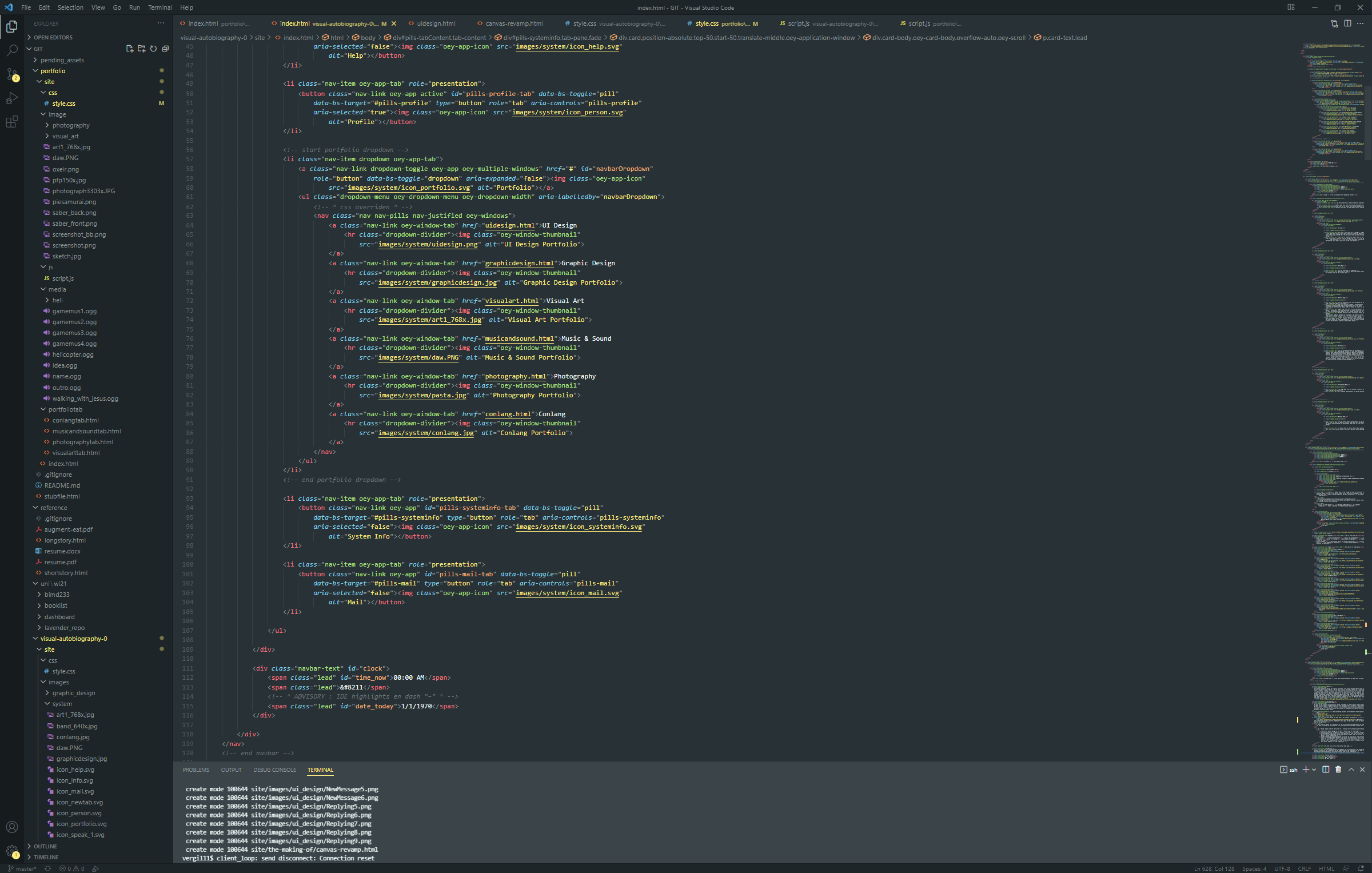
One important thing to point out is that I still hard-code content onto the HTML file itself, which I was told is not the best approach. One thing I tried to do to was to hard-code content onto the JavaScript instead and consider that injecting content, but that still wasn't what I want the ultimate structure and execution to be.
Upon translating this sketched idea into code and into reality in the form of a website, the realization that this whole thing could resemble an operating system finally came to me. This is where the idea really starts to bloom into an end result. As soon as I'm satisfied with what I have taken from the sketch, I steered hard into this new direction. I started stylizing the whole page with all the little attributes that remind me of the major computer operating systems I use (the color-changing background was a nice dynamic addition; inspiration from Manuel Pinto). But it was also where I fell into a ruthless blunder in my execution: overriding the Bootstrap classes themselves instead of creating my own to override them (and this mistake is what drove me to restart with an entire second iteration).
From here it was all just trying little things on VS Code, going over to my browser and seeing what works and what doesn't, and just trying to get reality to be as close to my vision as possible.
The End Result
The first iteration was what ended up being my final submission for the capstone assignment for B IMD 233.
// The first iteration:
I loved the overall form it had taken, and I can see it being used for future portfolios. But the mountain of issues that had piled up from simply working with something unfamiliar had broken it too much for me to mend.
Its second iteration, the website you are on right now, was made with IMD specifically in mind. On top of being adapted for IMD, restarting the project completely with more experience with and understanding of how to use Bootstrap and enough time to think about how I would do the things I wished to do differently, working on this second iteration gave me the opportunity to refine my web design and development skills and make something even better.
- Ever since I started using Windows 11, I immediately fell in love with the design of its appearance (though not so much with its stability), so the apps on the taskbar took a form similar to Window 11's. I used Vectr to either vector-draw or modify defaults of the icons you see on this page.
- I also adapted a rounder but thinner, more cohesive, elegant overall theme. A change that you will most likely notice are the mock buttons on the window banners. Instead of parodying the MacOS style, I went with a more generic but still original look for them.
- Again most importantly though, I went out of my way to ask for opinions from a lot more people for this one, as I find that it helps me understand which design choices I should go for when I'm primarily designing for other people themselves.
// The second iteration:
The Reflection
What I Learned
Working on this project has tested what I really understand about user navigation and cognition. It has pushed me to think about how easily someone could make sense of the space in this interface, how the hierarchy of components on a single page leads their eyes to where I want them. Most importantly though, I was able to have fun with it. It has also reinforced in me the idea that I can only get so far with my own mind. I asked A LOT of people for their many opinions on different things about and around the interface. If I think about it, they represent basically the same people I am designing for, and I am designing according to a compilation of their preferences and convenience, which I'm not always able to find out myself without asking.
Regarding the actual crafting of this project, it all comes back to trusting the process and learning from applying. Of course it's good to have a starting plan, but I learned that things have to somehow adapt in order to escape your mind into reality. And during that adaptation, you learn what works and what doesn't, and you discover new sources of inspiration. I used to focus on pure personal creativity without considering anyone who I'm designing for. Now, I know that I can steer my design in the right direction by getting input from the very people who are going to interact with what I have created with them, for them.
My Next Steps
- Firstly, I'd like to add a tutorial on your first visit to be able to more easily go through
the important navigation points because you can only go so far with intuitive design, but
I'm not quite sure yet how to detect a user's 1st or 129th visit, especially with the home
page "index.html" being only one of many pages of the whole website structure.
- With the tutorial in place, I can also ask users to go fullscreen as the first thing, so I also won't have to worry about the user viewing the web page with the wrong dimensions.
- Next, I would like to revamp the navigation system to implement fewer buttons and using more intuition, especially clicking on "see how this was made" buttons to see how my projects were made. Even small buttons take up a lot of space, which makes the whole page a lot less pleasing to the eyes. With the tutorial process being there I can point it out too to in case it's not intuitive enough to click on the images or cards.
Next is with bigger problems. With every iteration, I discover at least one more thing I could have implemented better. I could list them right here and I will, but I would also like to say that I am set on learning more about the design process to minimize this problem in the first place.
- I seem to still be too much of an idealist that it becomes an obstacle with some design choices. Specifically with this, I am still conflicted on which to prioritize: the consistency of the navigation around the interface, or the ease of navigation itself even if it means breaking some consistencies. By this, I am specifically referring to the way I have organized the portfolio section of the website. If one of the "windows" or a category only contains one significant project within it, should the making of the project be presented directly without the initial "card" for the project that contains a button leading to its making of, or should I keep the card and have one seemingly purposeless step between navigating from the one page to this other one?
- Another thing I have yet and would like to implement is to inject HTML content using JS to avoid hard-coding it immediately onto the HTML file, and actually having the content on a text file that I can edit instead. It would significantly improve style and flexibility.
- Two other things I would like to learn to do better is something more behind-the-scenes. The first thing is with organizing the assets used on the website as files and directories. It comes back to my idealistic tendencies to group images into layers of folders, but that complicates the addresses within the code and it raises a conflict when I want to use the same image for different purposes in different sections of the site; should it appear twice in two different folders made for the different purposes, or should one use of the image take from the only folder that isn't meant for this use? One solution I've seen others implement is to categorize images using their file names directly and just have all images be in one directory.
- The last thing is with my coding style, primarily classes. Using a CSS framework like Bootstrap puts me under some stylistic restrictions despite the convenience it provides. To get around that, I made sure to mark the classes I made myself with a "oey-" before the actual class name (meaning "my" in the Na'vi language, just so it's overly unique to not be mistaken for anything else). This helps me confidently tell which classes are Bootstrap's — all the classes that don't start with a "oey-". This choice of coding style is also because of the horrible mistake of overriding the Bootstrap classes themselves in the first iteration, that led to inevitable consequent issues like other elements being affected by a style I meant to only affect another element that uses the same class. Making my own classes to override Bootstrap's makes sure I don't run into that issue. The problem now is, do I want to make the classes I made my own to act and to be used like Bootstrap's classes, or do I want to "tag" an element with this custom class and only affect that element? I have a lot to learn with the conventions of the usage of CSS. A smaller issue with coding style that will be less of a problem once I start injecting content is with whitespace. I have yet to develop a consistent and purposeful manner of fully using the potential of whitespaces to ease myself, and soom most likely others too, in navigating within my code. So far, I've been leaving no space if an outer "bracket" contains only one element inside, and I leave a space in the beginning and ending inside the outer bracket whenever it contains multiple child brackets; but exceptions always find their way to confuse me with this simple rule.