- ▢
- –
- ✕
About
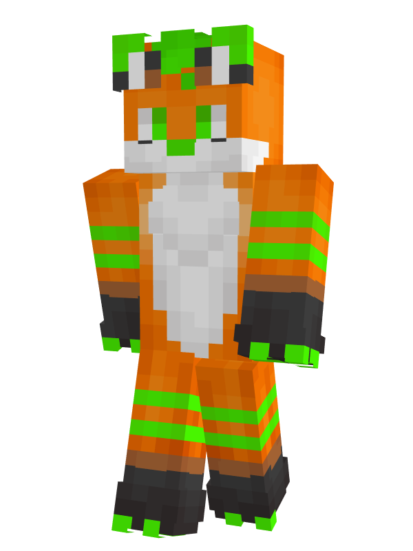
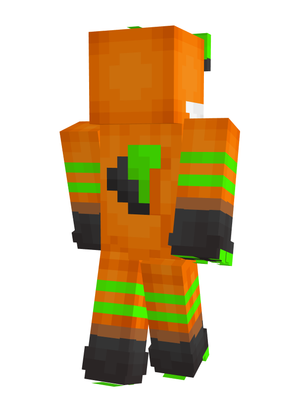
I saw this as an opportunity for me to see how much more I have learned about proper smooth shading in pixels, because I had made another anthropomorphic fox skin before this one, but I wasn't too happy with how I shaded that one. The other and honestly main reason I made him this skin is because I just wanted to do it; he's a really good friend, and I still talk with him to this day. I chose to do smooth shading for this one because fur needs to look soft, and characters like these especially need to maintain their round look in a square medium, which is quite a challenge to hold up to.
Here's the other skin I'm talking about. As you can see, shading was inconsistent in different areas, and I didn't use the best color darkening technique so he ended up dirty.
How It's Made
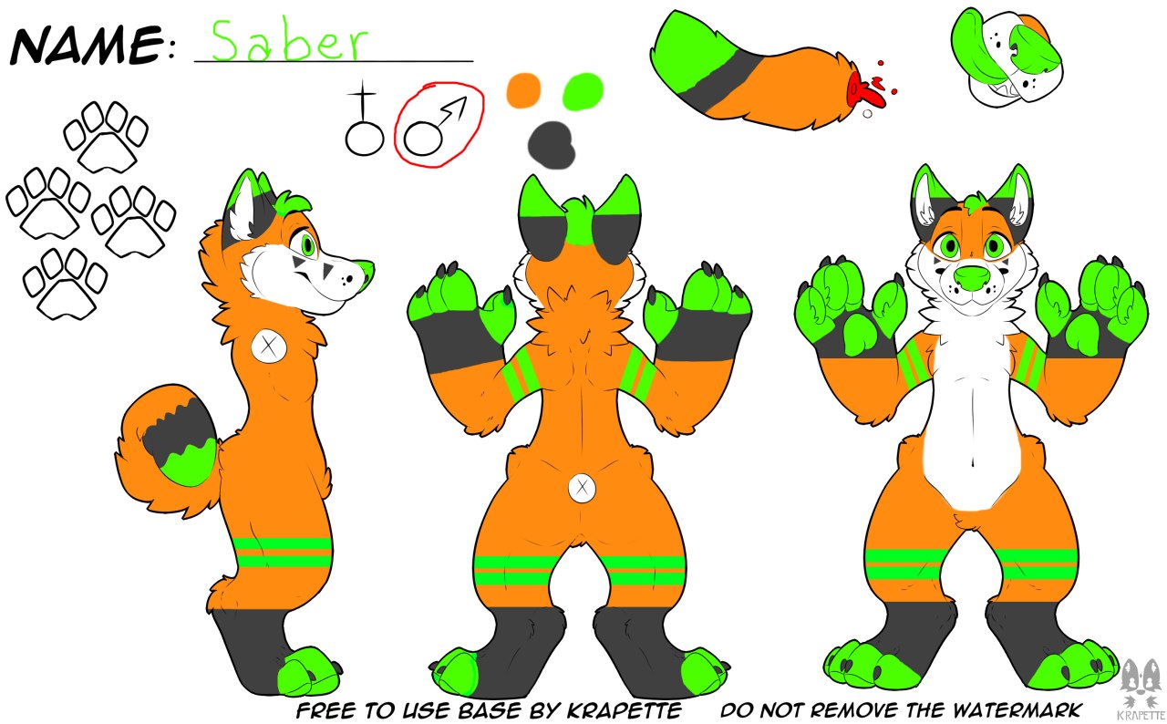
Since this time I'm making someone else's character, I asked this friend for a reference sheet of this original character of his. This is what it looks like. It's a template but that's okay, I only needed to know what colors go where relatively.
It's the exact same process I used for PieSamurai's skin, using PMCSkin3D.
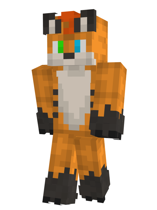
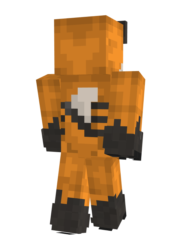
The only difference is, doing PieSamurai was a lot easier for the reason that I was never adapting him from a non-pixelated form; he was being created right as I drew him in pixels. This character though, on top of adapting from a non-pixel context, has extremities that call for some outside-the-box cleverness to translate into pixelation, like his upward-extending ears and backward-extending tail. The most significant but least noticed one are the black marks on his snout/cheeks. I was so glad when I found a way to make them thinner than the width of a pixel — by using the outer later, which just a hair bigger than the inner layer, to cover a part of the inner pixel.
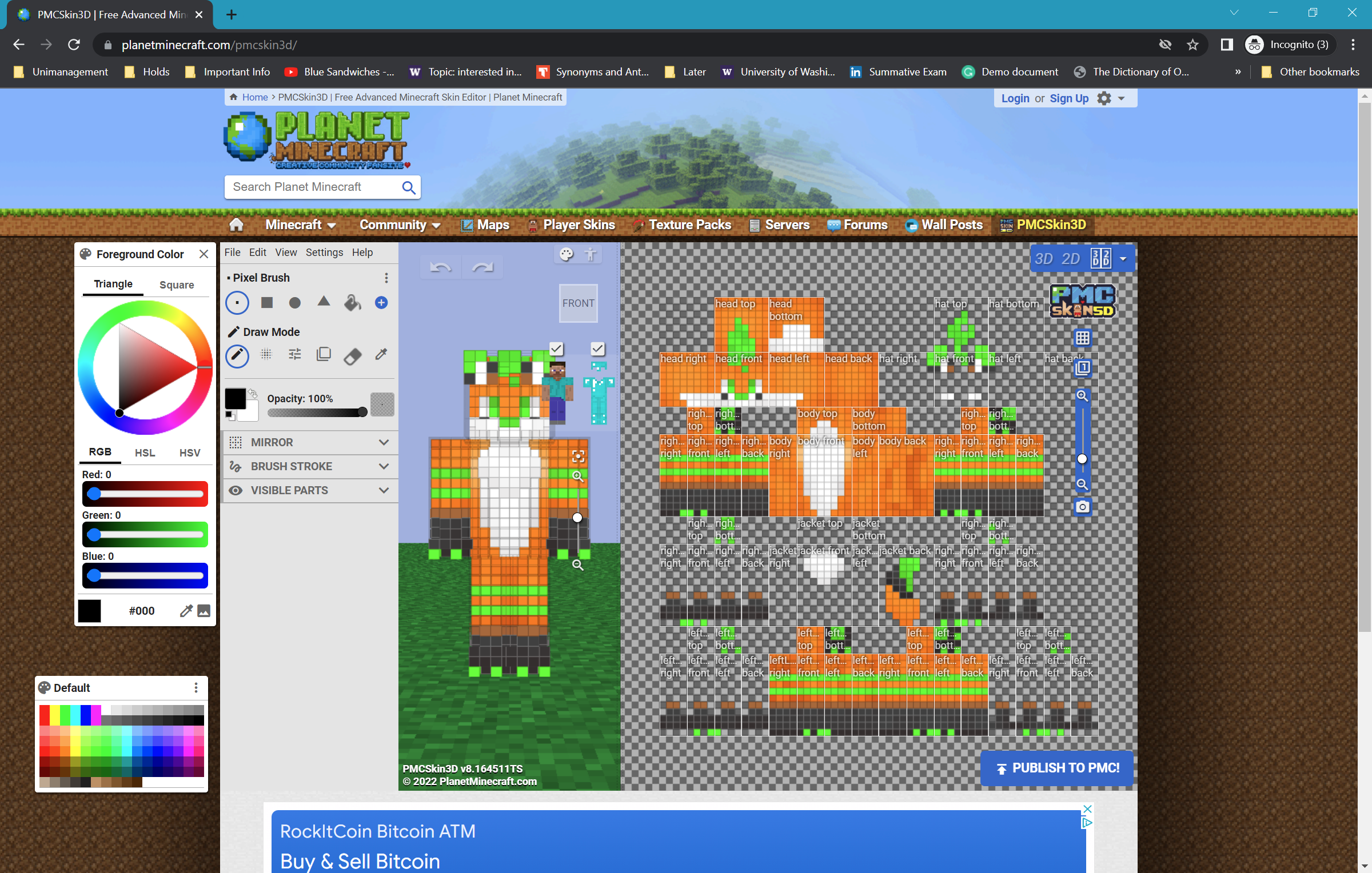
The ears have been done by a lot of other people, so I just made small adjustments to fit them on him. The adjustments I'm talking about are mainly using color; I made the inside part of his ear loops a mix between the two meeting colors to give the face that round look without having edges that are too rough. You can also see this technique being used for the line between the two colors on his arms and legs; I wasn't able to tell which pixel the different colors end, and because it's just between those two pixels, I just decided to mix the two colors additively and make that the line.
To give the illusion that the tail is a distance behind his back, I continued using the shadow around its outline technique. It instantly makes the tail float over his back.
Regarding shading in general, I just made sure it was consistent that points on the surface nearer to the viewer are lighter than points that are on the part curving away from the viewer.
The Reflection
What I Learned
Working on this gave me an opportunity to really think about what's significant and what's negligible, and how much one small unit influences the whole piece. A variety of unconventional and experimental approaches needed to be taken to render what doesn't inherently work with pixelation in a way that still looks pleasant to the eyes.
My Next Steps
This one actually didn't take that much out of me to do, especially compared to Talvassus. I guess it's also because a Minecraft skin inherently doesn't allow that much of impromptu modification and addition, although it definitely can still happen; I can think of someone continually saying to add a hat on the skin, then a tie, then change the color of the shoes. I just can't believe I've never thought of doing commissions for Minecraft skins until the very moment I'm writing this, though.