- ▢
- –
- ✕


About
When COVID was announced a pandemic, we all started isolating ourselves home. Those circumstances has made me and my friends play more online games together, specifically Minecraft. Before this point in my life, Minecraft wasn't really a respected game in my circle. The only time I play it is when I visit my cousin here in the US every six months. When people including myself started playing the game more and more, though, I knew I needed a Minecraft skin that I made myself; it's often how I settle with online identity. I need to have something that I made myself to represent me.
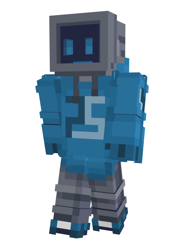
There was no other reason for my decision for PieSamurai to be a monitor-head robot other than I simply like how characters like that look. I know my username is "PieSamurai" (inspired by an episode from one of my favorite childhood shows The Backyardigans, called "Samurai Pie"), but I don't actually like how samurais look. Besides, I wanted to have some space to have a friendly cartoon face instead of a small opening under a bulky samurai helmet.
How It's Made
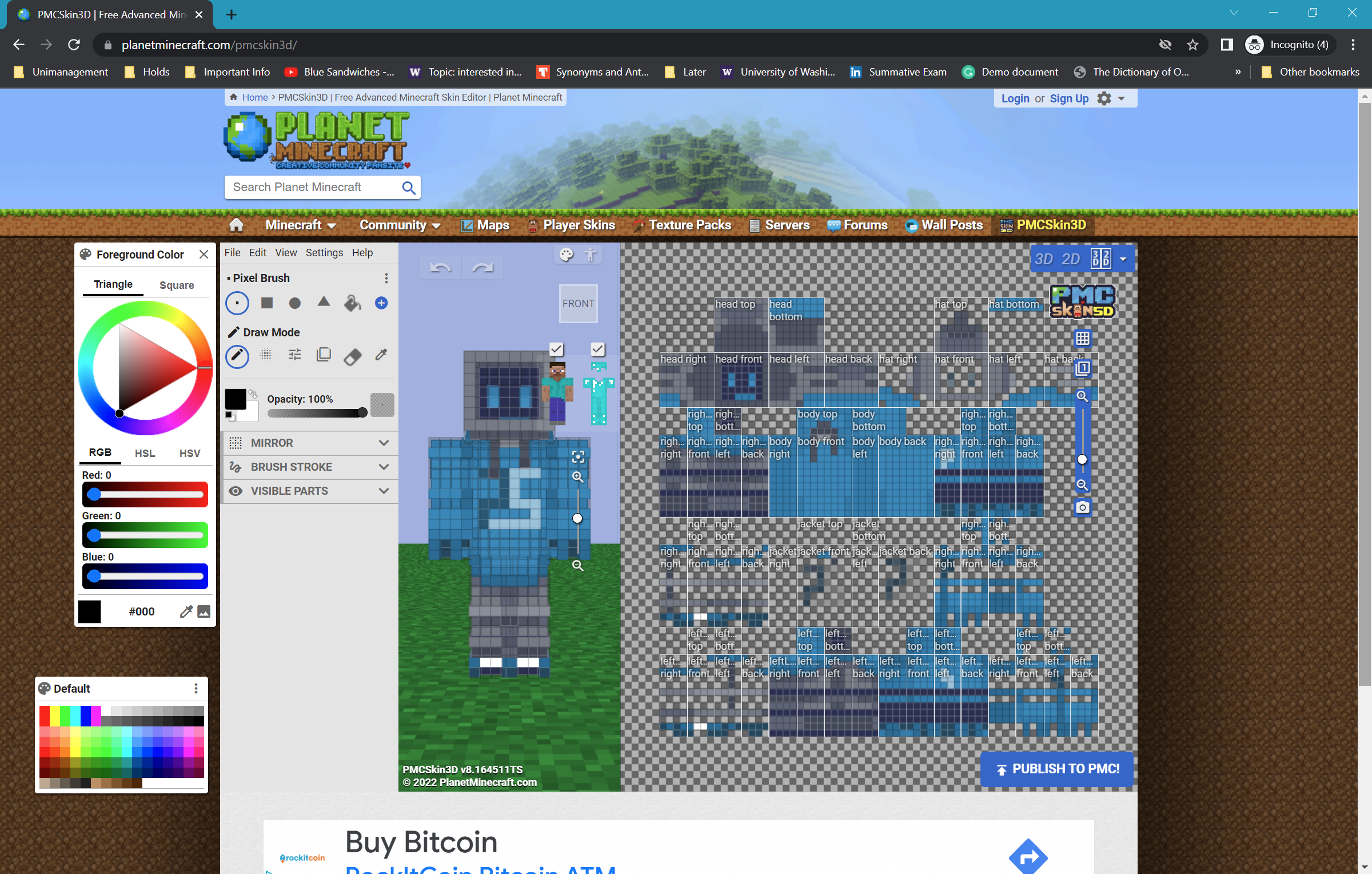
I painted PieSamurai pixel by pixel using a free online tool called PMCSkin3D.

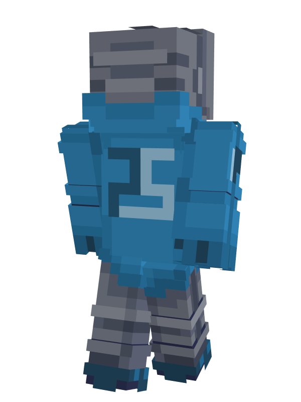
The color choice for his hoodie is motivated by favorite hue of color, but I still don't know what it's called; it's not exactly teal or turqoise, so dark cyan? There has to be a better name. It's a very specific range in the greenish-blue spectrum. I also thought of making the eyes a brighter color so that it looks like it's actually glowing, but it goes off the palette too much so I stuck with the same blue hue. There are two layers for every part of the body — the opaque base layer, and the outer layer that allows you to place transparent pixels. I took advantage of this to make up for that eye glow. I attempted to make his legs look like flexible metal pipes and I think it worked out well with the 3D rings for depth on top of the layers of different shades of gray. They go well with the head design, too. Other things I had fun with are the design of his upper arms that look like batteries. I'm also just really proud of the logo on his chest that I managed to come up with; simple, symmetrical, and meaningfully representive, spelling out "PS". It also looks like a robot face. One last thing to comment on, I love how his mouth turned out. I was struggling to find a method to make it thinner than a pixel's width, so I hid more than half its height behind the bottom frame of his screen face.
The Reflection
What I Learned
Pixel drawing is very different from regular drawing. The common sense is the more restricted you are, the more creative you'll have to be to work around and with those restrictions to achieve a certain quality for what's possible for your initial idea. It loops back yet again to the creative process — adapting your ideas, working with what is possible, to bring it out to reality.
My Next Steps
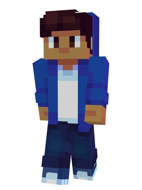
There are a lot of styles of shading that I still have yet to learn wiht pixel art. I was going for an intentionally simple shading style for my skin (that I think is called hue shift shading) like the one below, as opposed to the other skin I made for Saber_Foxxo where I implemented the smooth shading style. But I don't think I got it right for this version of my skin. When I have some free time, I'd like to fix some of the coloring and shading, maybe find a better palette that allows me to have actual glowing eyes.
// hue shift shading example (Bitzel)

The Reflection
What I Learned
I would say that the main thing I learned here yet another instance of adaptation to another medium, and expanding on that it's also a lot about giving character to something whose previous medium of representation limits its expressiveness. A secondary but also still significant takeaway is working with colors. I think this is the first time I deem my attempt at coloring lines successful, and I love the way it turned out. The way I see it, this sense is important for the aspects in designing digital interfaces that I have not personally seen people give a lot of attention to: outining shapes. Having the wrong border colors can be very distracting a lot of times.
My Next Steps
This is a very simple representation of a character, which makes it very open to customizability. I'd love to turn this into a theme for a lot of other people if and when I have the time to make more of these; imagine a group of friends all having their original characters drawn in the same style for their profile picture, all having a comically mildly disappointed face for a reason they can make up.