- ▢
- –
- ✕

About
This was done about a year after I started drawing characters digitally. I seemed to have developed a style of making eye reflections, but this piece is the first one whose outcome of shading actually matches the eye reflection's level of detail and quality. This was also when I have not started coloring lines — I just left them black — which honestly has its own style still. It just doesn't look as cohesive as the style I do now in my personal opinion, especially because the rest of this one leans towards 3D and semi-realistic.
How It's Made
This took me way longer than I would like it to, but it was honestly done the same way I would do any other more detailed character portrait. In summary, these were the steps that I took — sketching, line art, color area and base color, coloring (except eyes), shading, and eyes (colors, shadows, and reflections) lastly.
Sketching
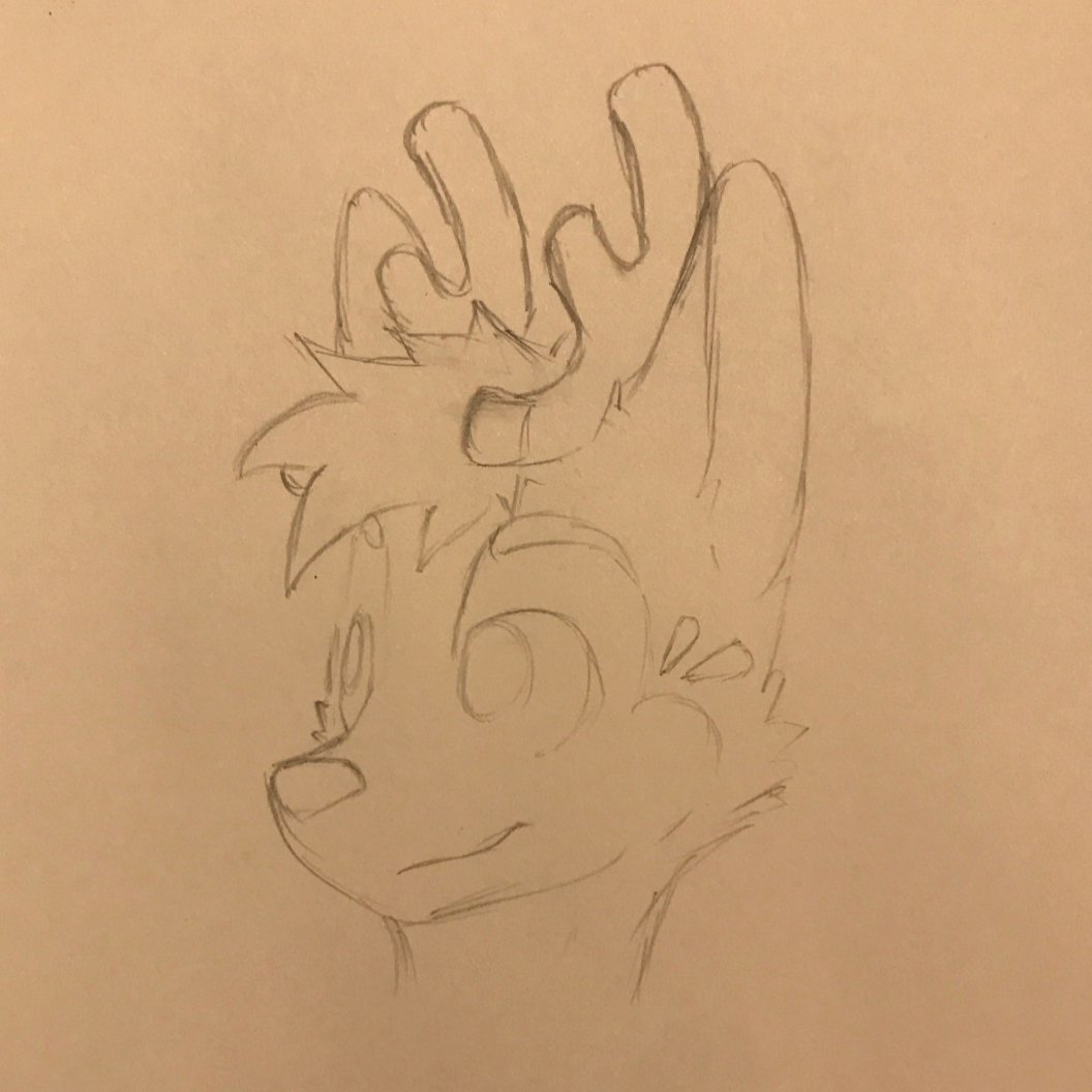
Sketching has always been easier on paper for me. Thinking about it is counterintuitive because you purposely want expressive, rough lines instead of single, smooth lines for a sketch, so the reason that paper has more texture wouldn't make sense. So I think it's mainly the directness of doing lines on paper, and what I mean by that is with digital mediums, you draw either on a screen, on an external tablet that becomes your screen, or on an external tablet that entirely separates your input (the strokes you make on it) from your results (the actual lines you produce with the movement of the pen). But, even with drawing directly on the screen, I still often feel a separation between those two. Maybe there's a very slight but significant delay between your pen and the line, maybe it's also the glass that seemingly prevents you from ever actually feeling that the lines you're drawing actually comes from the digital pen you're holding. Whatever it is, sketching on paper just feels more "direct." You have a tool that makes lines, you put it on the paper, slide it, and the lines make exact sense why they're there.
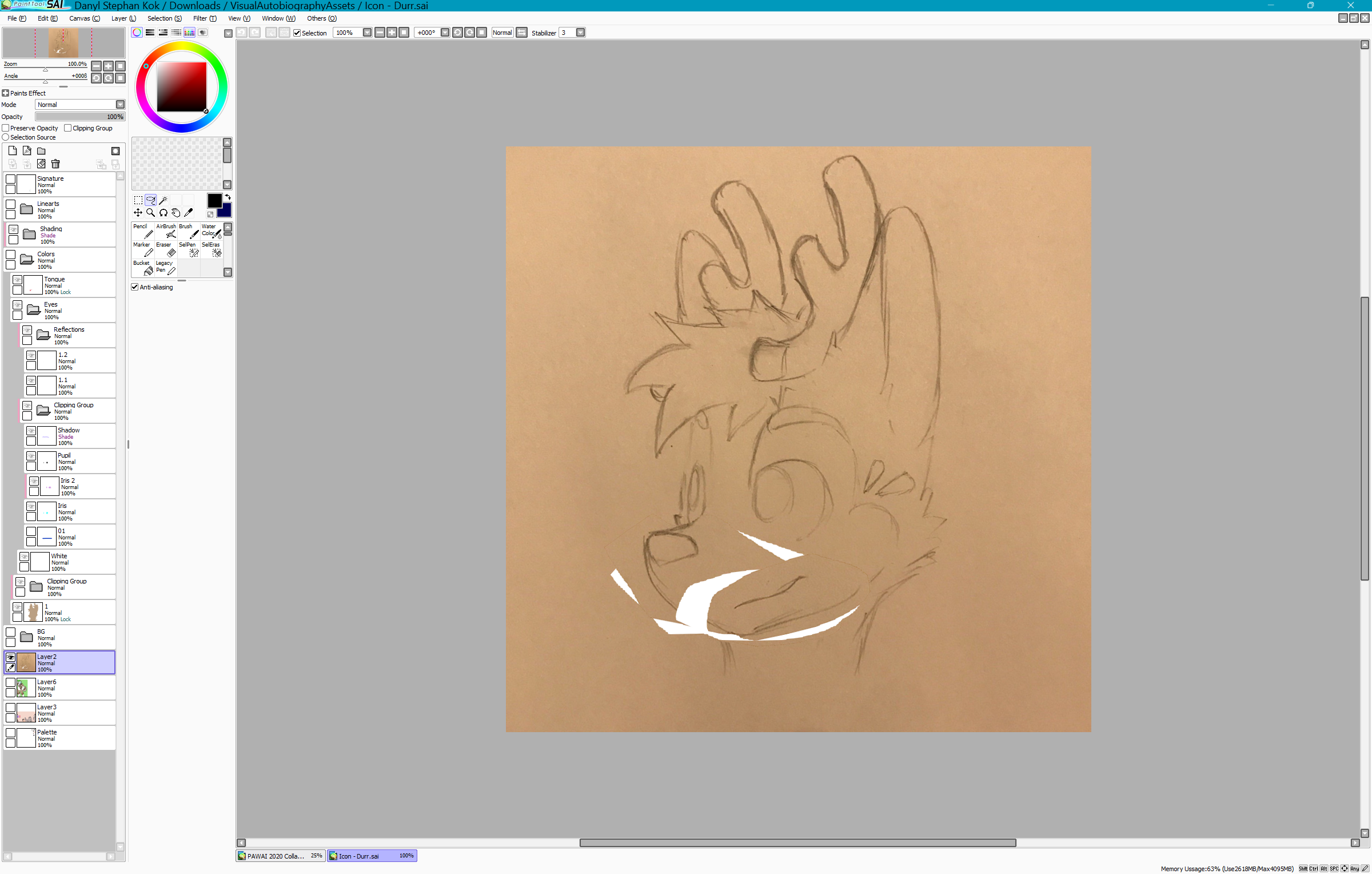
After sketching it on paper, scanning it, then importing it into Paint Tool SAI, I noticed that I could've made a couple proportions more appropriate. Using the lasso tool and transform feature of Paint Tool SAI, I was able to make the proportions a little better, as a couple other people agree as well.
// original sketch on paper
// digitally corrected sketch
Line Art
Making the line art for any drawing always takes me the longest time, and I'm glad that it's done before the rest of the drawing, because finally being done with the line art with this mindset makes me feel like I've done over half of what I need to do.
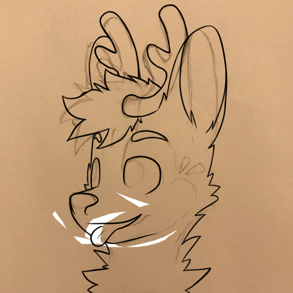
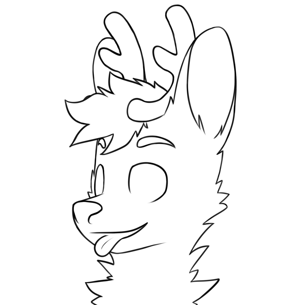
Now, with pieces as big as this one, I like to do one more half-sketch-half-line-art after doing the sketch and before the final line art. In this step, I would make the line art the way I would for a final line art on a new layer, except this layer serves as a second/last chance for me to make any modifications to proportions that might have turned out weird, using the lasso tool and transform feature like for the sketch. These modifications only serve to move the drawn lines to their better positions, and in this layer I didn't care about how it'll turn out because this layer is not to be used as the final line art. Those modifcations would also usually ruin the smoothness of the lines, which is why this layer is to be traced one more time on a new layer that will then be the final line art. It'll be up to you to notice it, but there are some significant differences in how the sketch and the final line art looks.
Oh, I also ended up making him blep.
// line art over sketch
// line art only
Color Area and Base Color
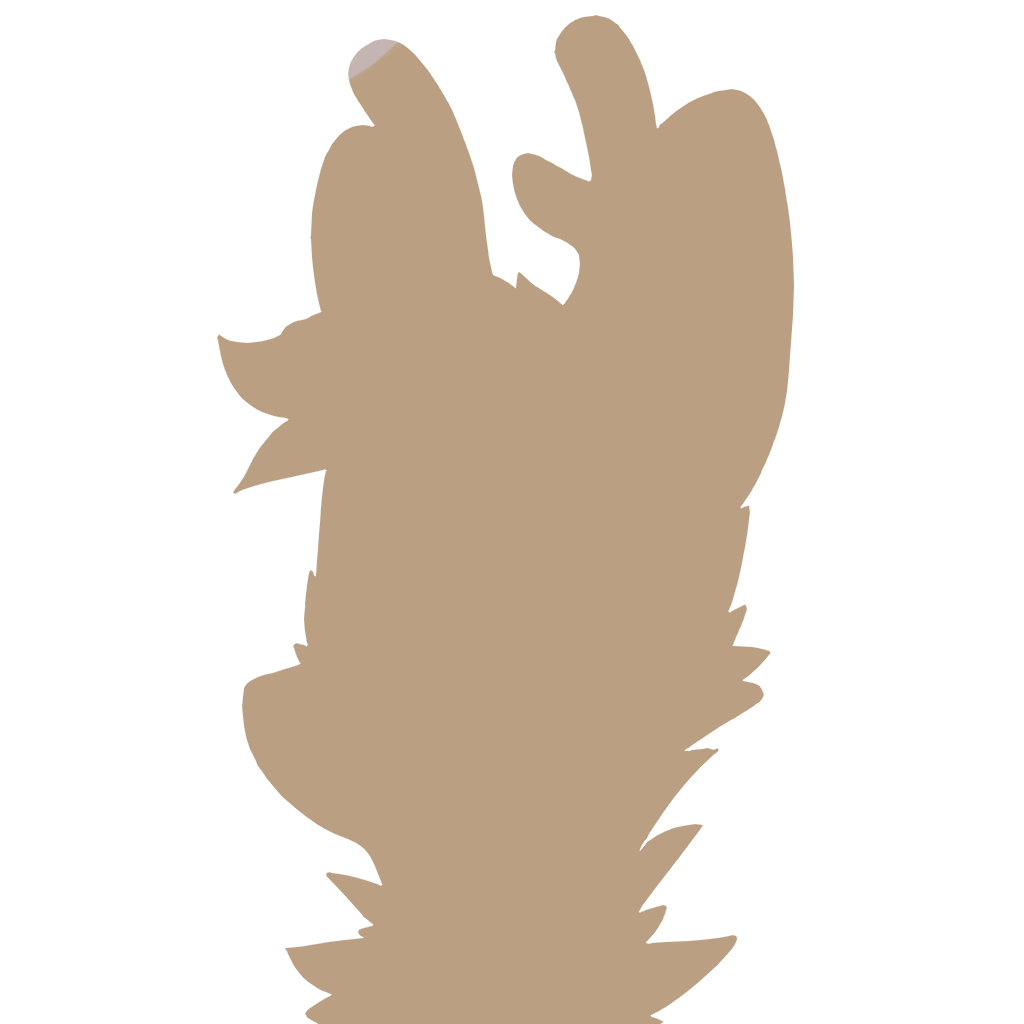
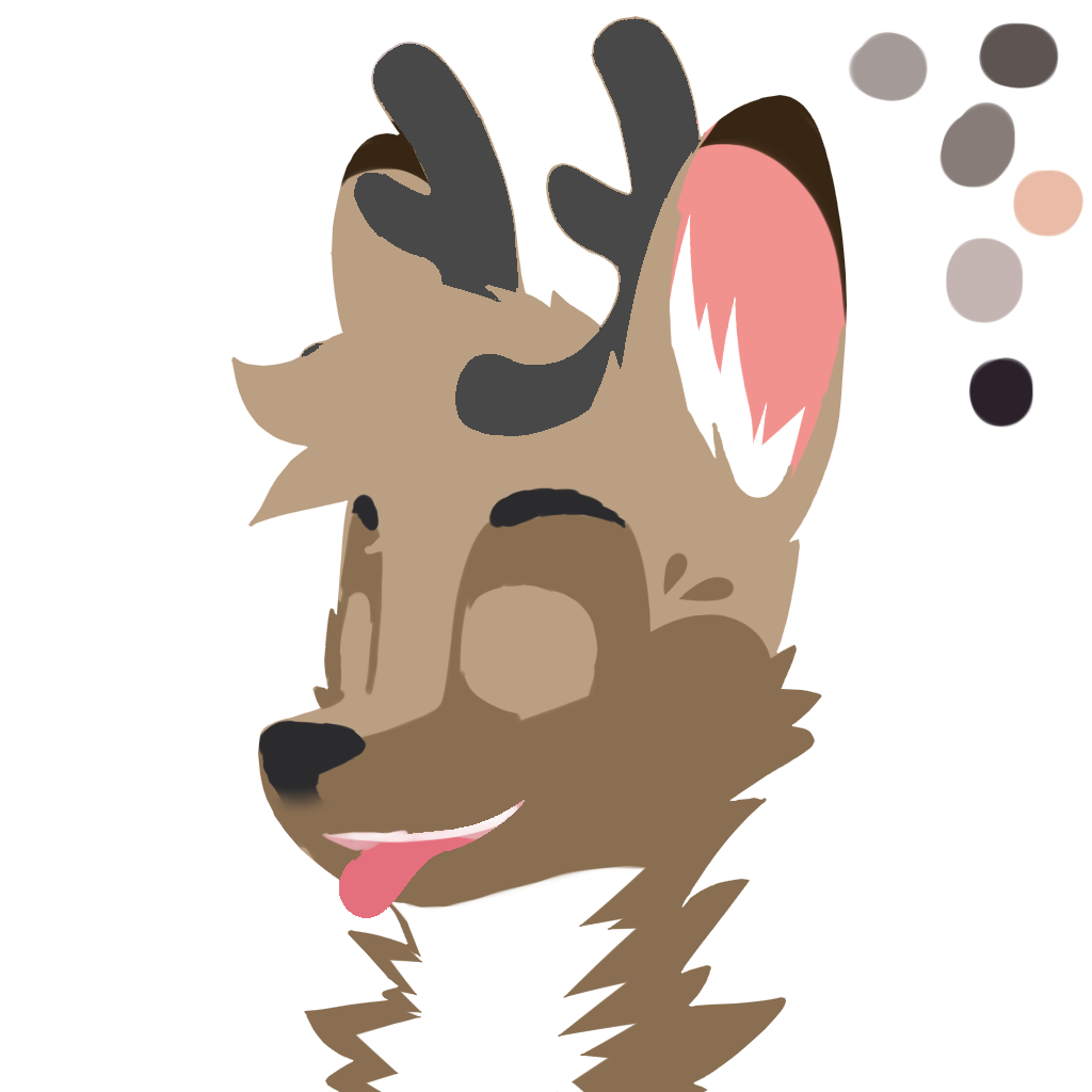
I usually get that relief of having gone through the nightmare of doing the line art when I get to this point in the making process; I haven't found a name for the relief yet. Coloring is relatively easy and quick. I always start by coloring over the lines using a random light color, selecting the area outside the lines, and erasing that area all at once to give me the exact area that needs to be colored. I would then lock the layer so that it only allows me to change the color of the paint that's already on the canvas — neat little trick that makes this quick!
// base color

// color only
Coloring
So far, the only thing that's important is that the character is a deer. Once I had the 'shape' of the color locked, I was able to easily fill in the area with the actual colors. The friend behind this character gave me a couple images for reference, but there seemed to be several versions. I took the one they said to be more updated.
// the official reference sheet
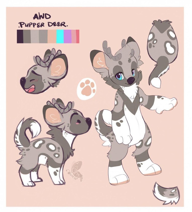
// another artist's art that I used as reference
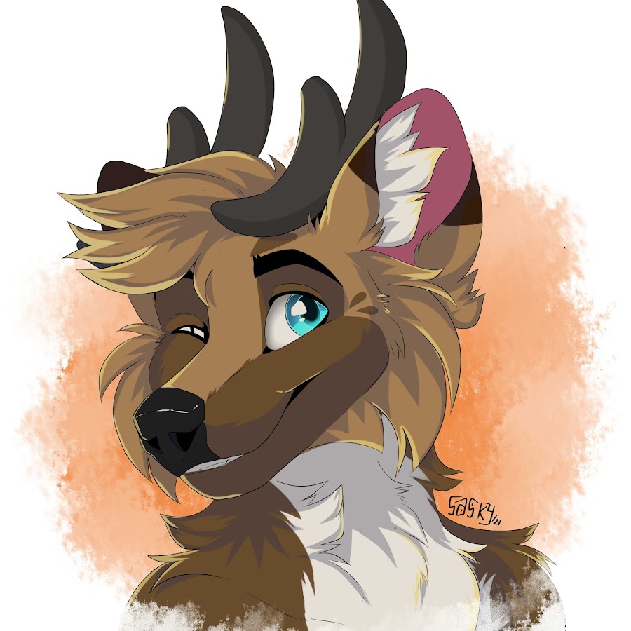
// his suit that I also used for reference

// colors completed
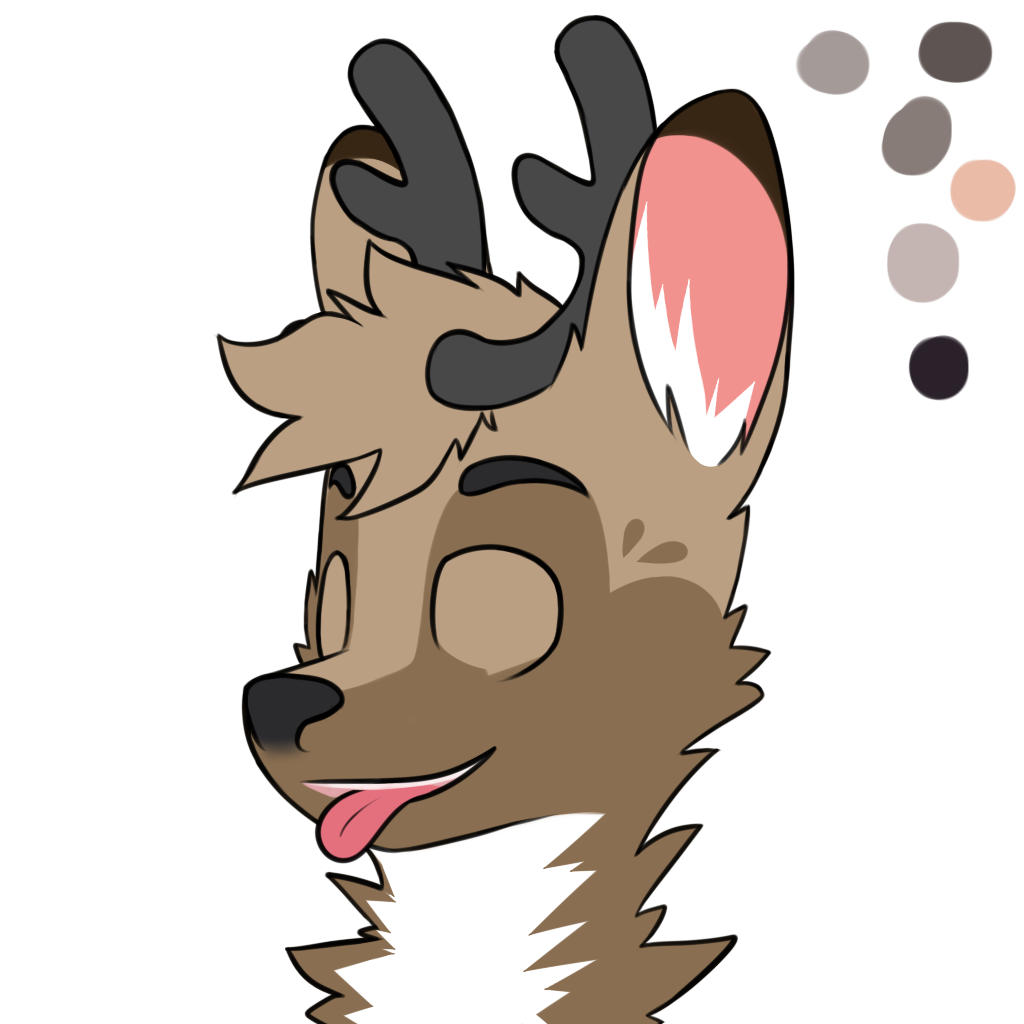
// colors without lines
// makes a great lineless if cleaned up a bit, honestly!
Shading
It is a commonly used method to draw the shading with a light color, then setting the layer's blending mode to either 'shade' or 'multiply', and it's the method I used here. This is to consider the fact that different colors get darker in their own ways under darker lighting; things don't just 'become more gray', and especially not the same gray, when it is placed under darker lighting conditions (if gray is the color one uses for shading, instead of a light color and blending the layer).
Different hues of a light color creates different lighting conditions.
The hardest thing about shading in this smooth semi-realistic style for me is defining the curves for this cartoon head shape-object that I have never seen in real life; it's cartoon after all. I looked at a lot of references, too many to list, to help myself out, and it really did. I took note of the sharp edge on the top base of the muzzle, the puff on the left cheek that picks up more light than the left side of the head, the shadow of the hair on the forehead, and the shadow that the muzzle makes on the neck fur. The inside curve of the ear was intuitive for me, but I still love it. The hair itself was the hardest in my opinion; it was just impossible for me at the time to define the shape of the hair which is outlined in 2D, into 3D — so the center area of the hair ended up being a little left out from shading.
// with shading layer, unblended
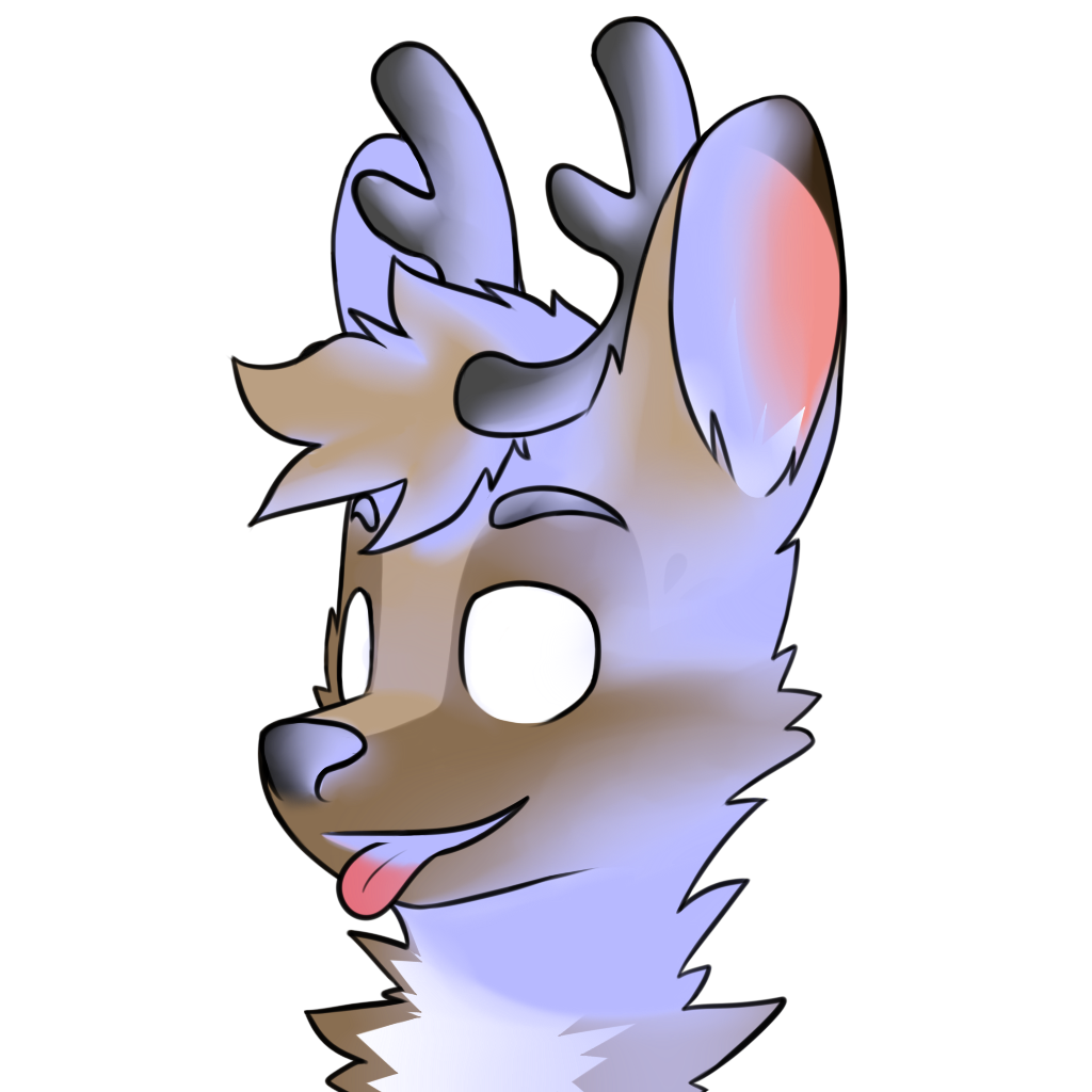
// with shading layer, 'shade' blending mode

Just for fun, here are some additional layer combinations with the shading.
// this would be a solid semi-realistic lineless piece of art with some cleaning up

// this looks like a 3D clay sculpture!

Eyes
Though it's hard to see on the reference sheet (I wasn't able to see it at first), he told me the eyes are a gradient from purple to cyan from top to bottom. After filling in the white area for the eyes, the iris is what I did next. I had a layer of one of the colors (the cyan), locked it, then airbrushed the other color on top to create the gradient.
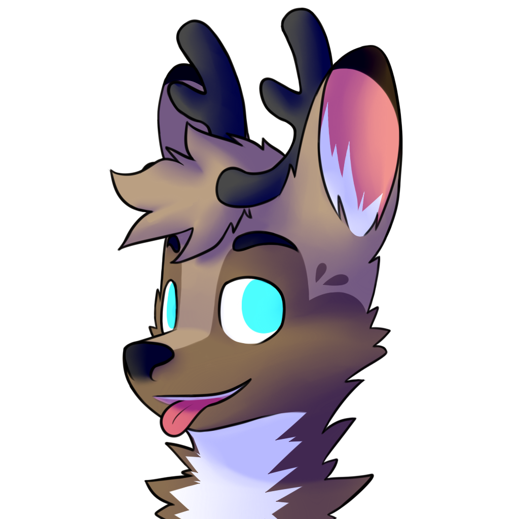
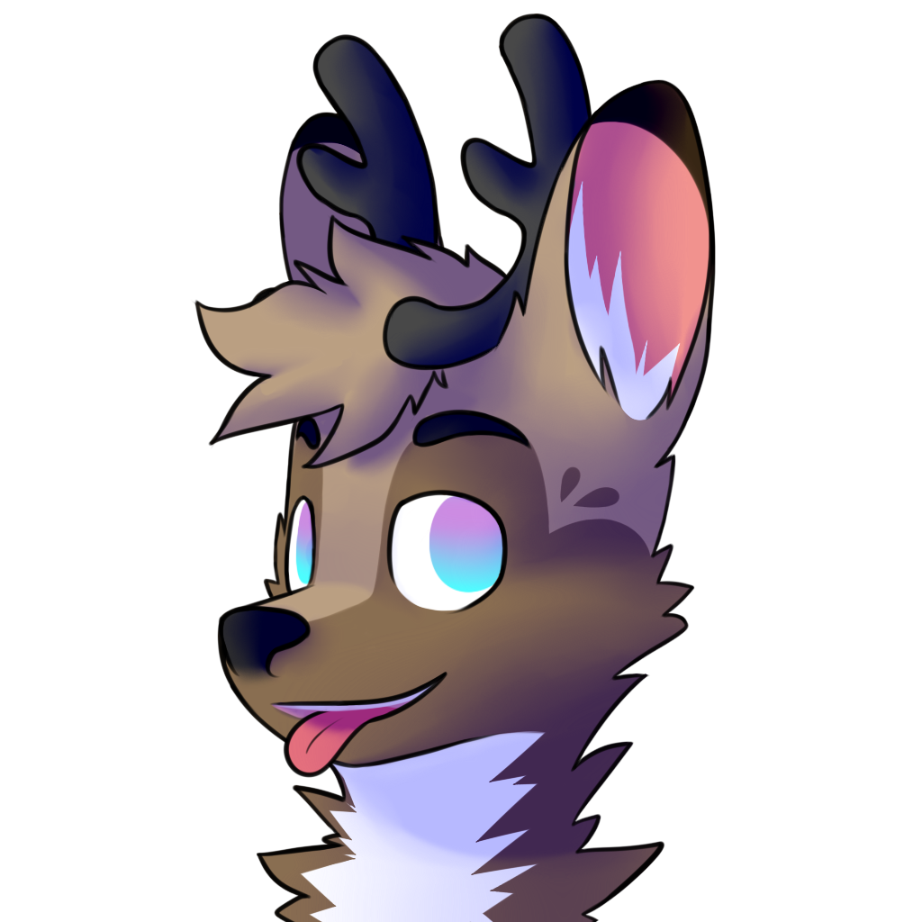
After the iris are the pupils — an easy black oval proportionally in the center of each iris. The eyes have climbed out of the uncanny valley, and the while piece is almost done!
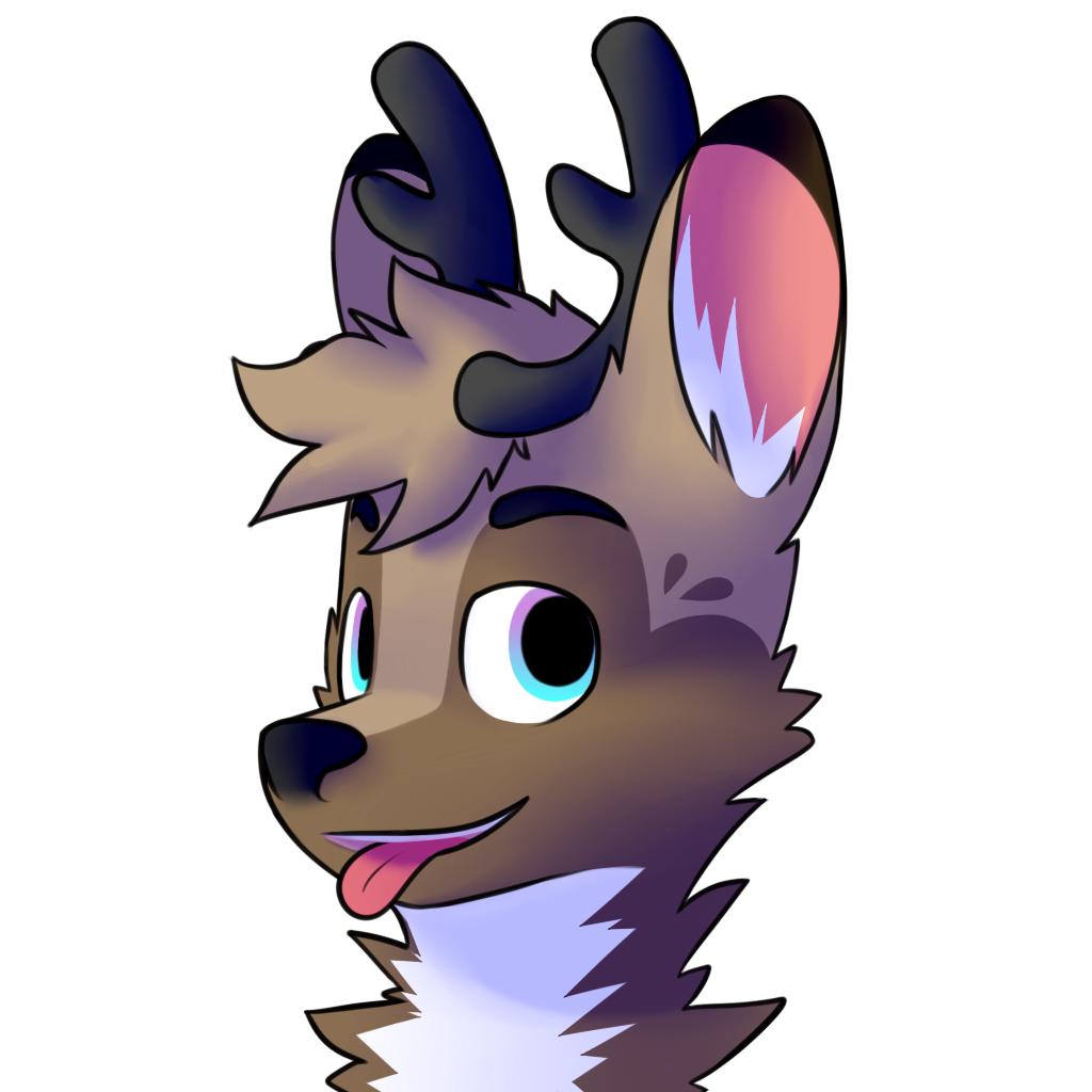
Next is the horizontal shadow created by the eyelids above, giving the eyeball its depth.
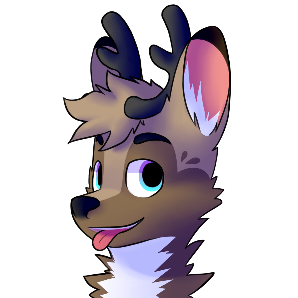
Lastly, the eye reflection. I've been doing the same technique for many pieces, and it's honestly easier than the outcome it produces makes it look. All I did was make a new layer, and on that new layer airbrush some pure white that'll act as the lighted part of the reflections, then just draw a little scene inside the eyeballs with a pressure-sensitive erase. The effect is bizarrely convincing, if I say so myself.
Here, I felt like being in a nice mountain villa, so that's the scene I painted in the reflection.

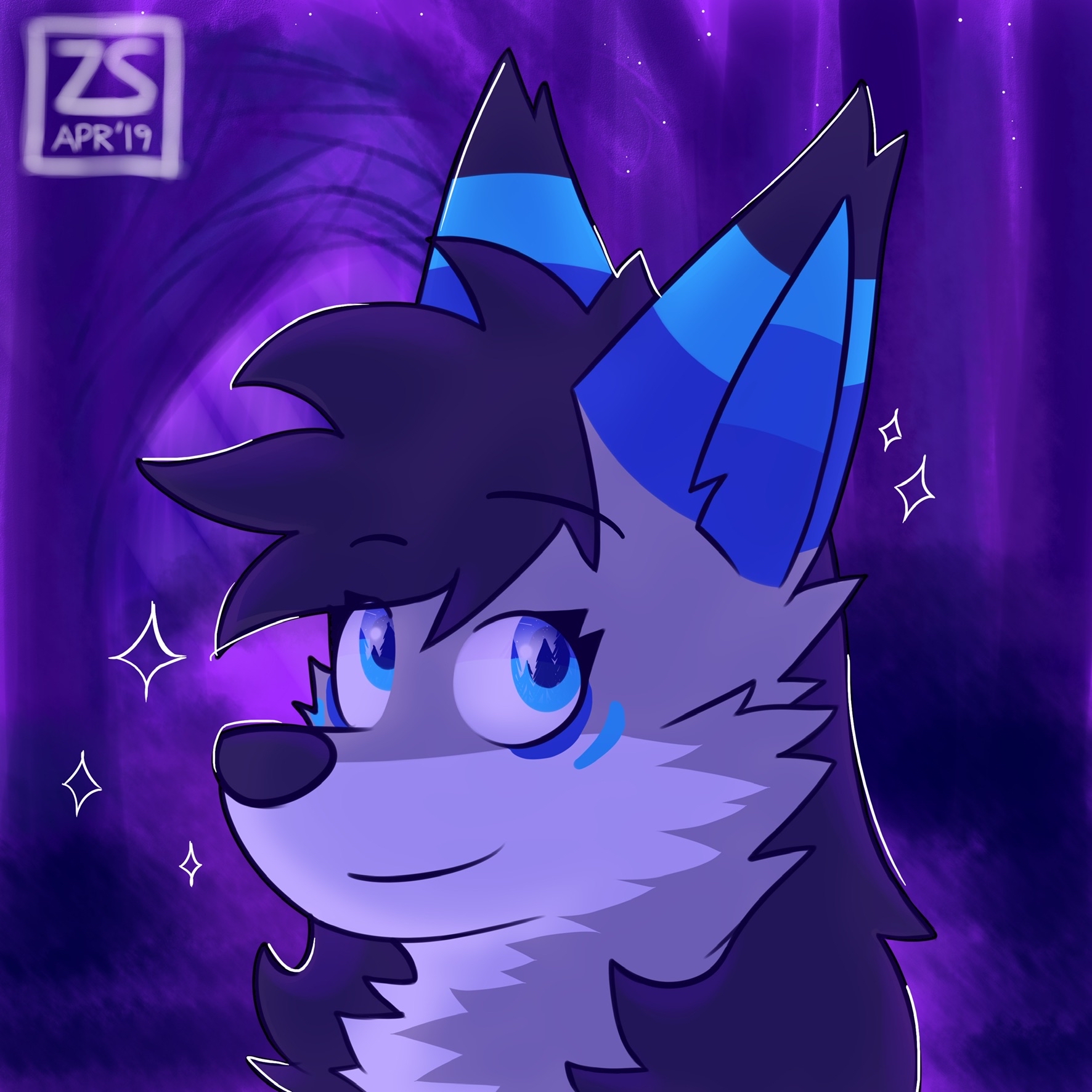
// here's an example of the eye reflections that I do, on another character in a similar pose; this one was done in April the same year, and you can see how I don't do the 3D semi-realistic shading then
The Reflection
I was really happy with how this turned out and still am especially because I hadn't actually had a lot of practice with semi-realistic shading, so it really surprised me that I was still able to achieve this despite that. Of course, there are still shading mistakes in terms of correctly representing its 3D curves that really good artist eyes could point out. It was also fun to see how a character changes when drawn in a different style (or when drawn at all if compared to the real life suit) yet still emanating the personalty and vibe of the character originally.
What I Learned
There are certain simple tricks you can do with visual art to fool the eyes — the eye reflections, the 3D shading. What a user sees might not always reflect what was done to make it possible; the other way around is true as well, what was done to make something possible isn't always what a user will see. I can apply my understanding and knowledge of this concept to the idea that, as much as we want to create for the user in IMD, it's important to take our focus off as designers and take a step back to look at the outcome from the user's perspective.
My Next Steps
An art style like this is something I don't practice as often. What I would like to do next, knowing I was able to achieve this, is to work on variations of this style — semi-realistic lineless, flat lineless, and all the other combinations. The most practical next step would be to clean this up and make it a lineless piece of art like I have been saying throughout. Once I get the feel of it, I'll start on entirely new pieces and recreate this style again, along with the other variations of it that I mentioned in the previous sentence.