- ▢
- –
- ✕
About
Although this project was initiated by a B IMD 250 assignment, that doesn't make it any less significant. My team saw a realistic problem that has emerged from the isolating conditions of the pandemic at the time of the making of this project.
THE PROBLEM STATRMENT: Our users find the current design of Canvas confusing when they are trying to send a message. They want a more direct and intuitive design that still possesses the necessary tools and features needed to keep up meaningful communication with their teachers.
THE DESIGN QUESTION: How might we go about modernizing the messaging platform within Canvas so that students can more efficiently and more confidently utilize it to communicate with their teachers?
The Process
The Initial Plan
The plan was to improve and modernize the messaging platform on Canvas so it can serve a better purpose in compensating for the difficulties of communication during online class circumstances. We didn't know what it would look like yet, but we have a clear goal. We have addressed a struggle and we have something to aim for, so our next step was to collect opinions and perspectives from the very users of the messaging system.
The Approach
We first conducted interviews using the critical incident technique, asking users about their best and worst experience with the platform, what constantly bugs them, what they wish was different. Getting to know the specific problems that are being experienced helped us narrow our focus down to direct issues from a more general problem. On top of the data collected from interviews, my team also did some secondary research, collecting insight into what makes a good quality communication in a classroom setting, and we took into account how we can satisfy those qualities once we start designing our solution.
Results from primary research (CIT interviews):
- Person A (First-Year Student): we summarized their preferred method of and
experience with contacting professors so far
- said "Desktop web Canvas doesn't notify me properly when I receive a new message or announcement."
- Existing system is quite stiff and limiting when it comes to the different ways
communication can go
- Sometimes a they send one-line messages like a follow up question to a previous conversation, and that means they have to wait again for the new reply as another whole message. Short replies and long messages cannot use the same form of messaging.
- Person X (IMD Student): we summarized their preferred platform for messaging
professors (Outlook), and why it's not the Canvas messaging platform.
- Canvas inconvenience: when sending a professor a message to let them know about something, and not asking a question, they don't know whether or not the professor has seen or received the message when no response is received, which happens sometimes.
- would like "just one place for all emails/messages"
- Canvas inconvenience: messages don't have a proper place to be organized to if needed (junk mail goes into its own folder, just no spam folder in Outlook)
- Canvas inconvenience: professor was mad about not keeping up with announcements, but their announcements were hard to find and don't send out notifications.
Results from secondary research:
- “Communicating with students effectively during online learning”
https://inservice.ascd.org/communicating-with-students-effectively-during-online-learning/
- positive, supportive, respectful communication = success for both teacher and student
- “(PDF) College Teacher Misbehaviors: Direct and Indirect Effects on Student Communication
Behavior and Traditional Learning Outcomes.” ResearchGate,
www.researchgate.net/publication/232878674_College_Teacher_Misbehaviors_Direct_and_Indirect_Effects_on_Student_Communication_Behavior_and_Traditional_Learning_Outcomes.
- teacher's behaviors directly impact student participation
- bad communication = discouraging students from reaching out, thinking that the teacher would not care about their concern
- McIsaac, Marina Stock, et al. “Student and Teacher Perceptions of Interaction in Online
Computer-Mediated Communication.” Educational Media International, vol. 36, no. 2, 09 July
2006, pp. 121-131.
- online classrooms lack immediate feedback & make the class feel 'educationally unsatisfying'
- teacher's participation in discussions = student's better confidence and understanding
- easier methods of asking questions about assignments or homework is needed
- Vonderwell, Selma. “An examination of asynchronous communication experiences and
perspectives of students in an online course: a case study.” The Internet and Higher
Education, Volume 6, Issue 1, 2003, pp. 77-90.
- students do not get to know the professor personally
- ask questions face-to-face = get better help ; ask questions online = long response
- collaborating, communicating, and interaction differed on online platforms
Once we have all the data we were looking for, we compiled and blended the problems into two distinct ad hoc personas that will represent the people we will be designing for:
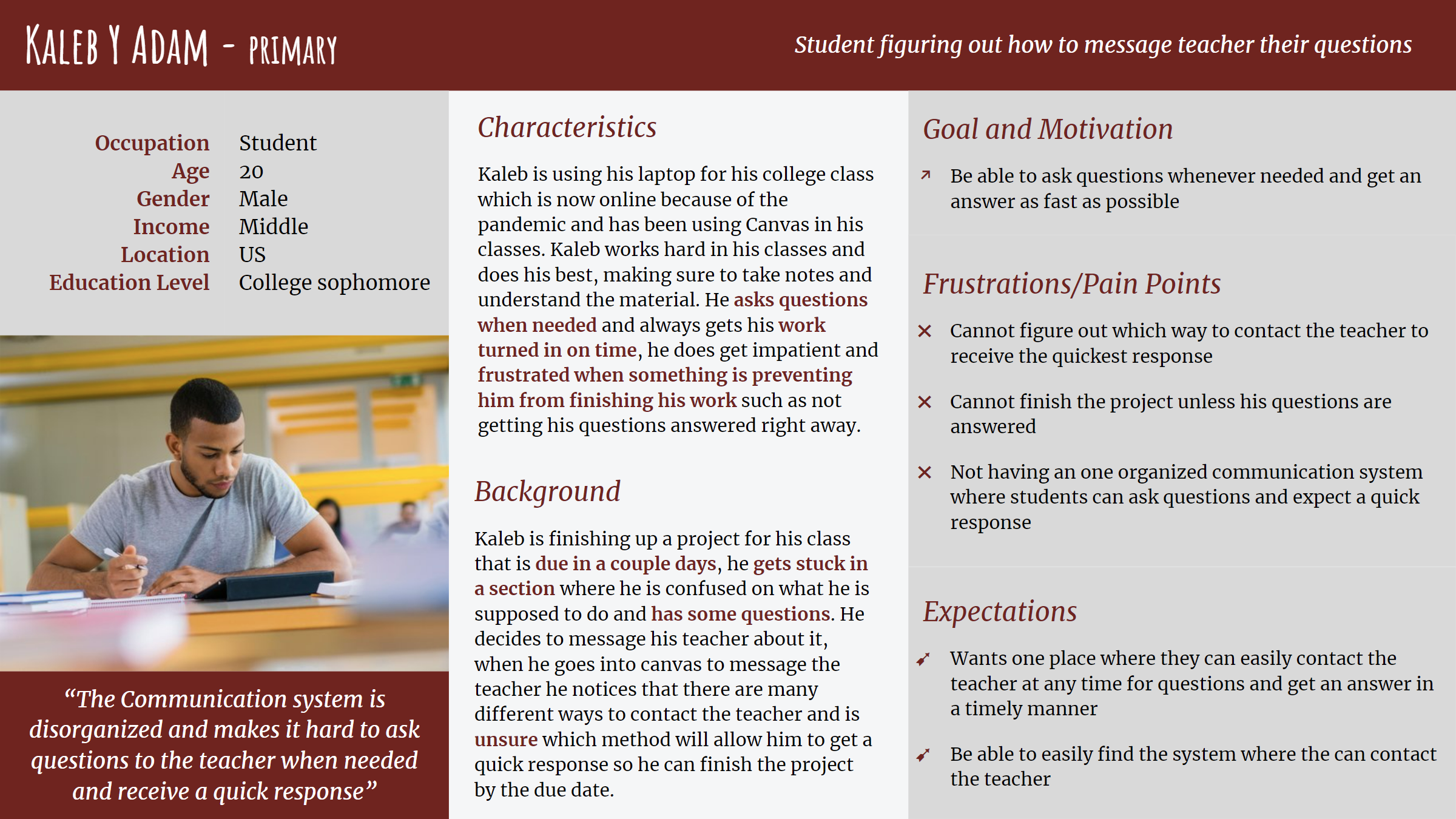
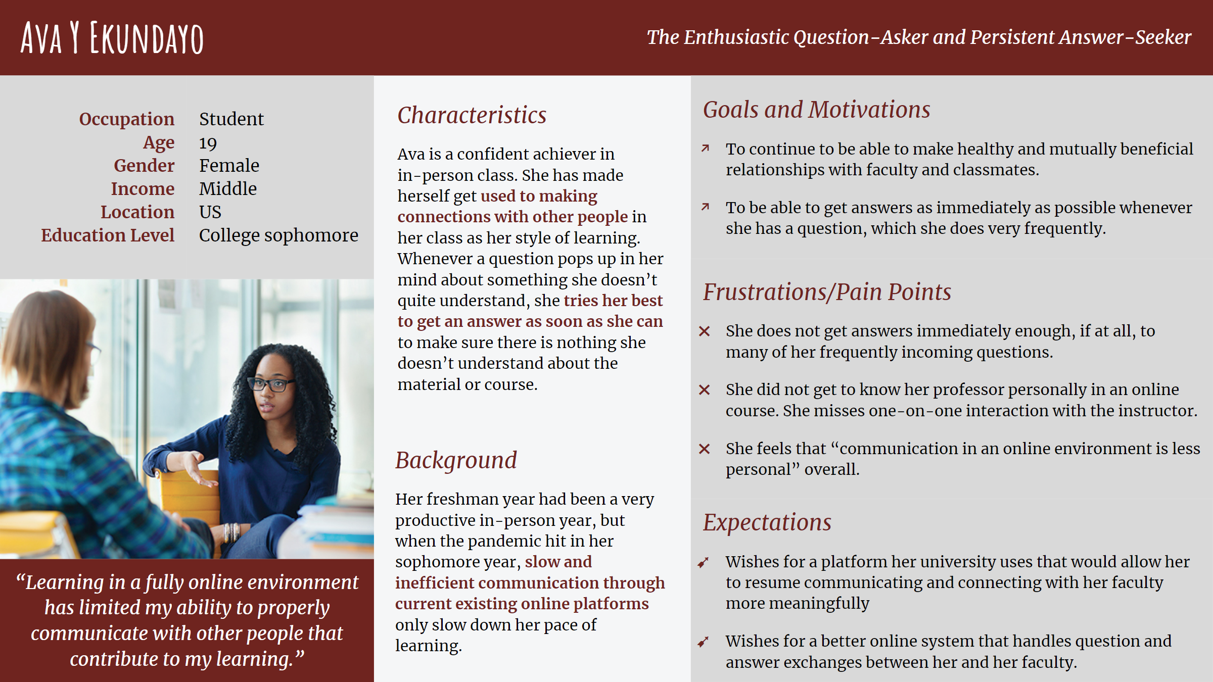
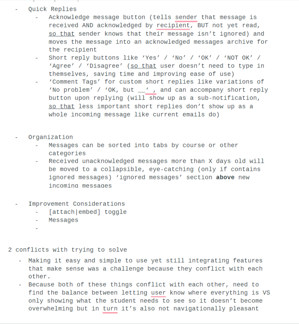
Then it's time to ideate the actual solution. Quick specific brainstorming was done on a shared docuoment, while idea generation was done on a platform called Miro that lets the whole team work smoothly together.
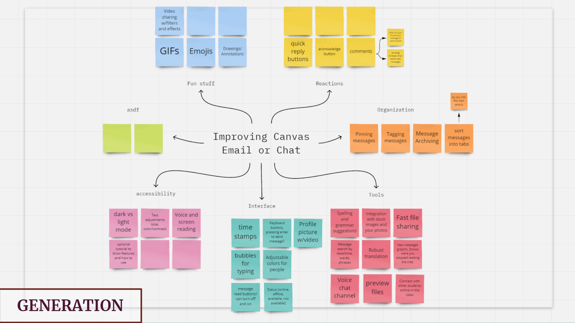
Ideating, which meant noting down simply anything that came to mind, inevitably resulted in a positive mess. The next step is to review these ideas and determine which ones actually have potential and which ones are to be deemed not relevant enough. Converging our ideas was also done on Miro
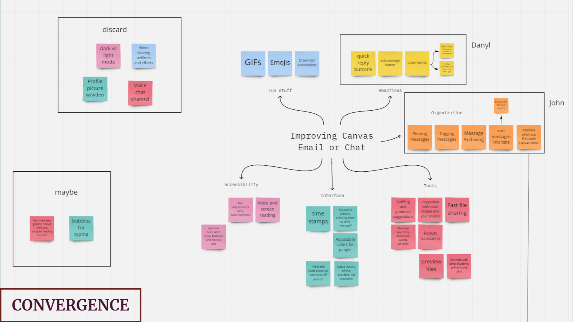
And finally, we arrive at the point where we start making something. We've collected and organized all that we need, and now we just have to put together a solution.
The End Result
I would include a final product here, but we sadly only went as far as coming up with design concepts and putting together some deliverables to present, primarily a mock user interface. The following interfaces are put together using Adobe XD.
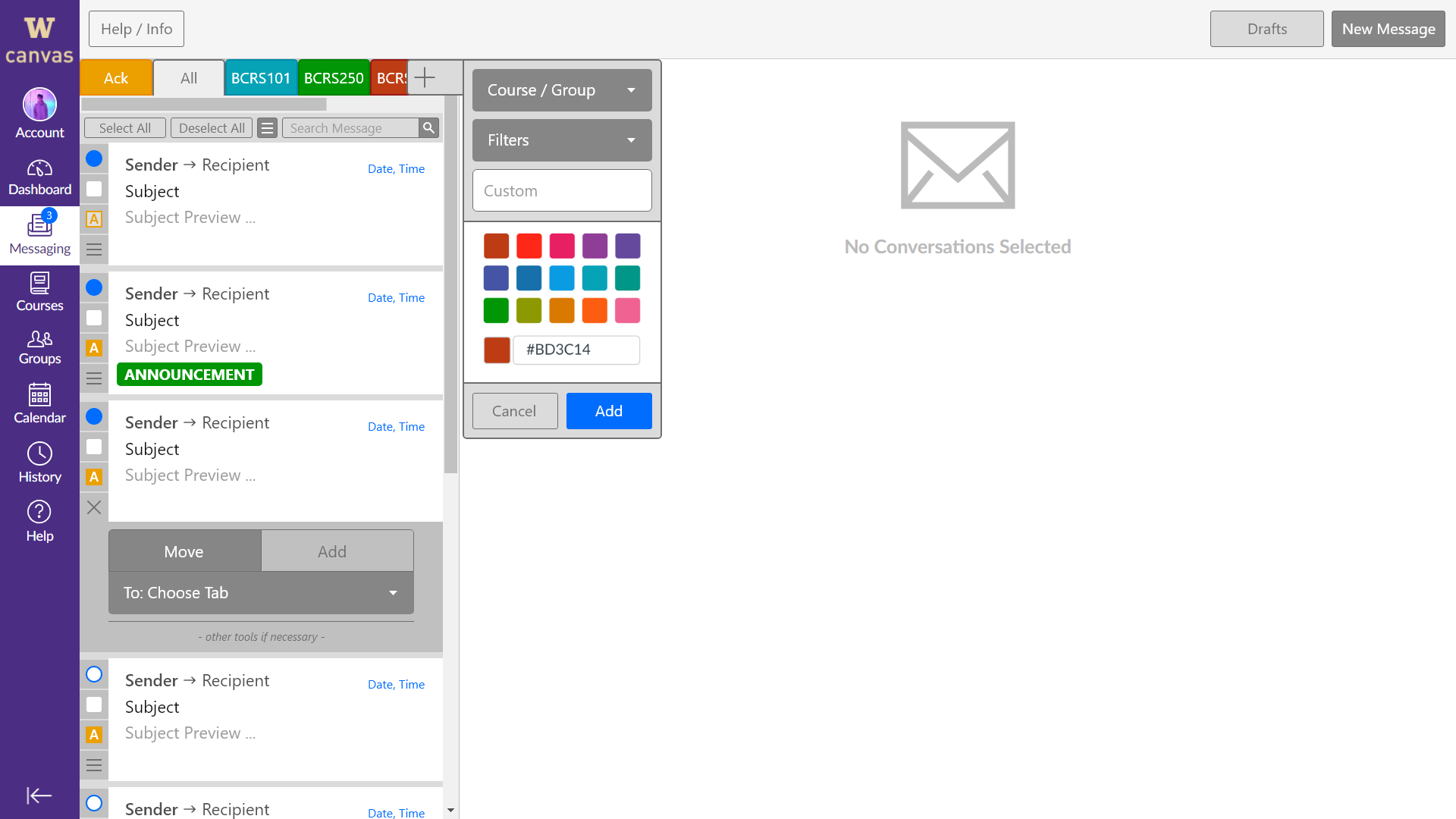
To solve the notification problem, we have made it so that announcements, on top of showing up on the course's annoucnements page itself, will also show up on the messaging page with a bold tag clearly indicating itself:
To solve one-line message waiting problem, we have implemented a secondary method of communication whose core are pills and inline Google-Doc-style comments that act as replies. These pills can be attached to a highlighted part of a previous message or can be a reply on its own. Reactions like these also removes the inherent coldness that stiff messaging platforms emit. This might help improve the quality of conversations between students and professors.
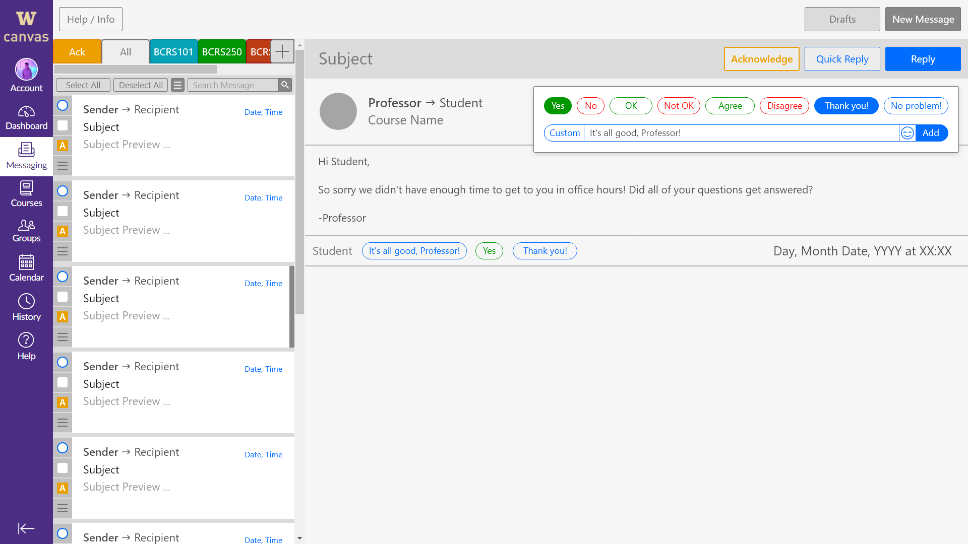
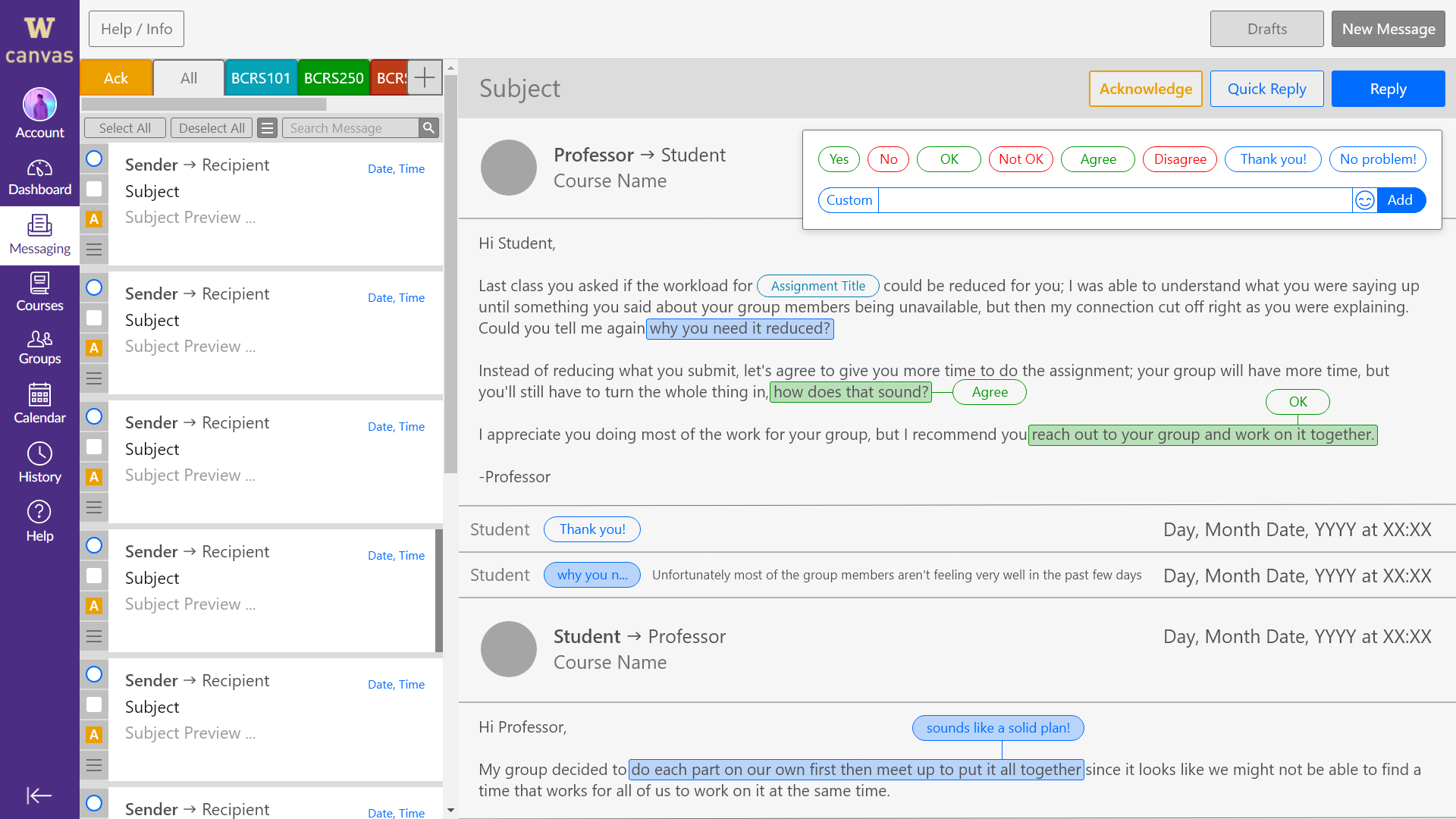
To solve the anxiety of potentially having a sent important message ignored or missed, an "Acknowledge Message" button has been created. This button appears with every received message, and when the recipient clicks on it on a message, Canvas will let the sender know that the message has not only been received but also acknowledged by the recipient, but the recipient has not yet chosen to read its contents. I would compare this to how chat platforms mark sent, delivered, and read messages, but I still think it's different in that there would be no way to mark a message as being acknowledged; the closest any current chat platform allows users to do is to leave the incoming message marked unread. Going back to the renovated Canvas messaging platform, users could choose to have messages that are marked as acknowledged to be added into their own tab for the user to go through at a later time.
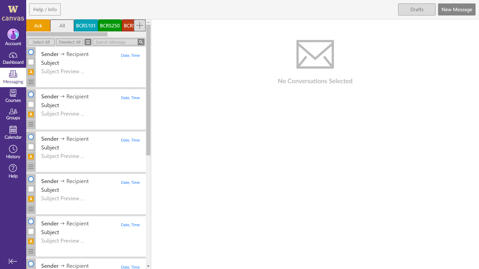

Looking at the screenshots above still, the added message management system should also help with reducing clutteredness when having everything in one place. Tabs filtered by course will clean up a user's inbox. We tried to have as much customizability as possible without being too confusing to use.
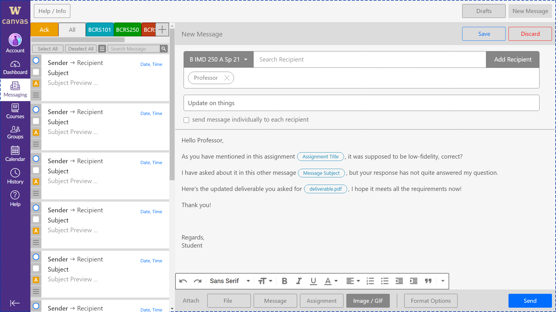
Having lots of functions in one place can also be improved by the feature below. It allows you to tag assignments as universal links on the platform that directly refers to the assignment a student might be asking a professor about. In addition to assignments, Messages can from the sender's inbox can also be encased in these pills to be directly viewed by both ends. This feature also tries to enhance the ease of communication between students and professors for students who are more used to a class setting.
The Reflection
What I Learned
Design. This project has exposed me to the fundamentals of the professional design procedures.
Processing ideas. Practicing the design process, especially generating and funneling many ideas into only one product that makes sense, sets me up to be a clean designer.
Carefull planning and execution. It's satisfying to see all the rigorous work done prior, to then effortlessly execute the plan because that work has paved the path.
Teamwork. Working in a team is obviously very different from working alone, especially in communication and commitment because of the presence of other minds.
User-centeredness. This project helped me conduct a more appropriate user-centered data collection procedure.
My Next Steps
I would love to create a high-fidelity working prototype for users to test and review. Once we have a working prototype and reviews from testers, we can continually iterate and get closer to a final design, because what we have now is merely a first iteration uninteractive mock interface.