- ▢
- –
- ✕
About
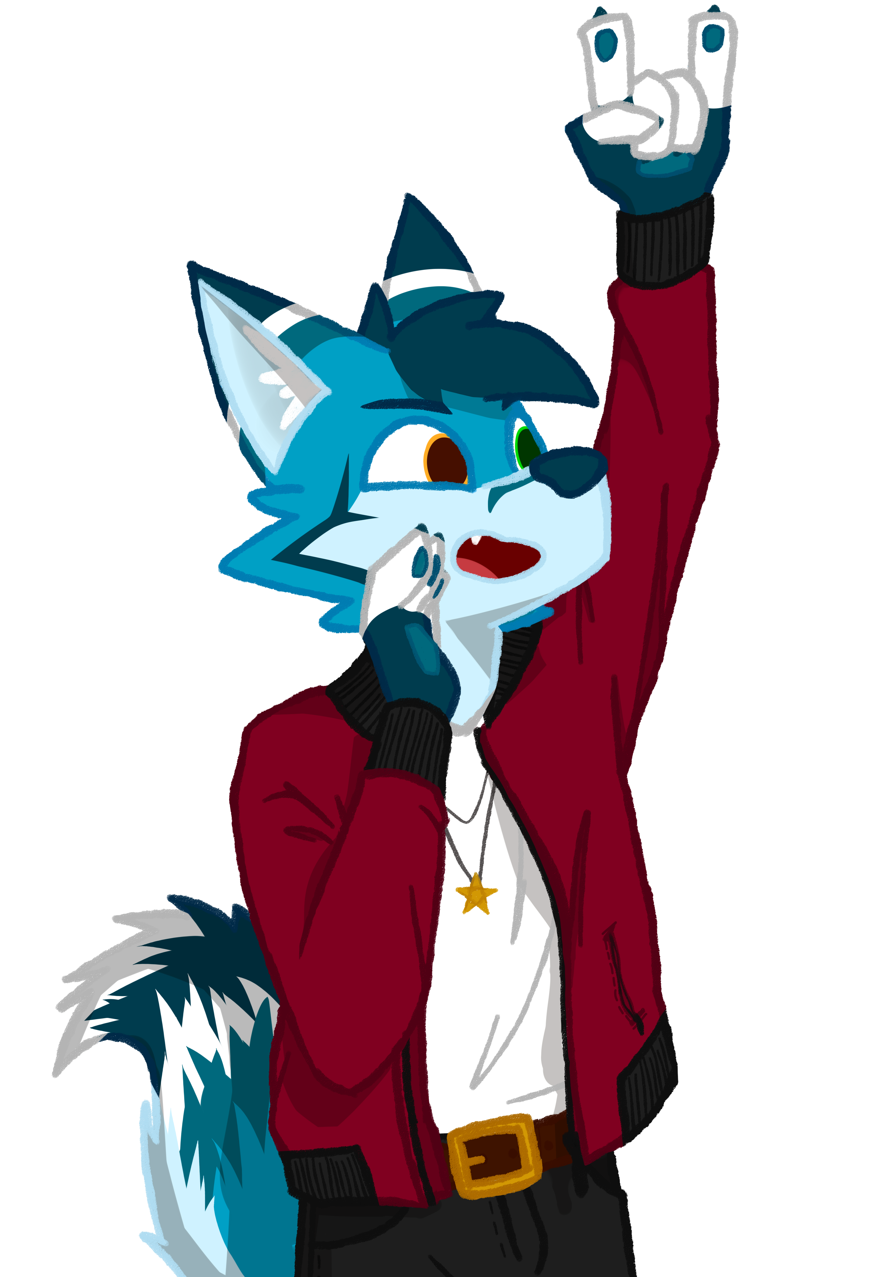
As mentioned on the cover card, I drew this as a contribution to this huge art collab with over a hundred others. This collab project was motivated by the convention that was supposed to happen in the summer of 2020, and it was done to make up for the postponement of the convention because of the pandemic. The theme for the convention that year is 60s-80s rock, so that's the theme this project was done in too. Everyone was told to draw their (or a friend's) character in an outfit appropriate for the era, either the 60s, 70s, or 80s, and the team would put them all together in a music video.
I personally love the bomber jacket, and Google says that it "became popular in the non-military audience in the late 1960s to 1980s," the perfect era for the theme, and also that they "changed the color to burgundy in order to distinguish themselves and their bomber jackets from the original military flight jackets," but my parents disagreed when I asked them about this. Maybe the 60s-80s was different for Indonesia, or maybe the jacket only started gaining momentum in the era, but did not become truly iconic until the 90s. History is hard enough for me, and I took the risk and went with the burgundy bomber.
How It's Made
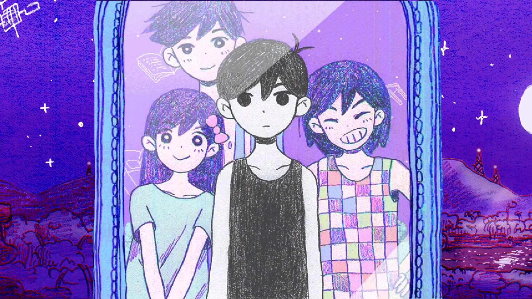
This was also complex enough to go past my simple category, hence I called Paint Tool SAI instead of ibisPaint X for the job. During the time of planning, I was seeing some new styles of line art, and I was especially attracted to crayon or pencil textures, which fortunately also allows me to be a little less neat and more expressive with my lines on the final line art along with the fact that textured lines just give the piece more character.
// here's one example of the style (OMORI)
I used my standard steps with minor modifications to the procedure to adapt to this piece — sketching, line art, color area and base color, coloring (except eyes and mouth), mouth and eyes (just colors this time), recoloring the lines, and finally shading — except because of my struggle with full body anatomy, I needed help from a friend to make my proportions proportional.
Sketching
This time, I decided to sketch digitally right away, which was probably the first mistake I made. I was using a separate screenless tablet to draw on Paint Tool SAI, which makes it harder to gauge my proportions on top of already lacking a sense of anatomy.
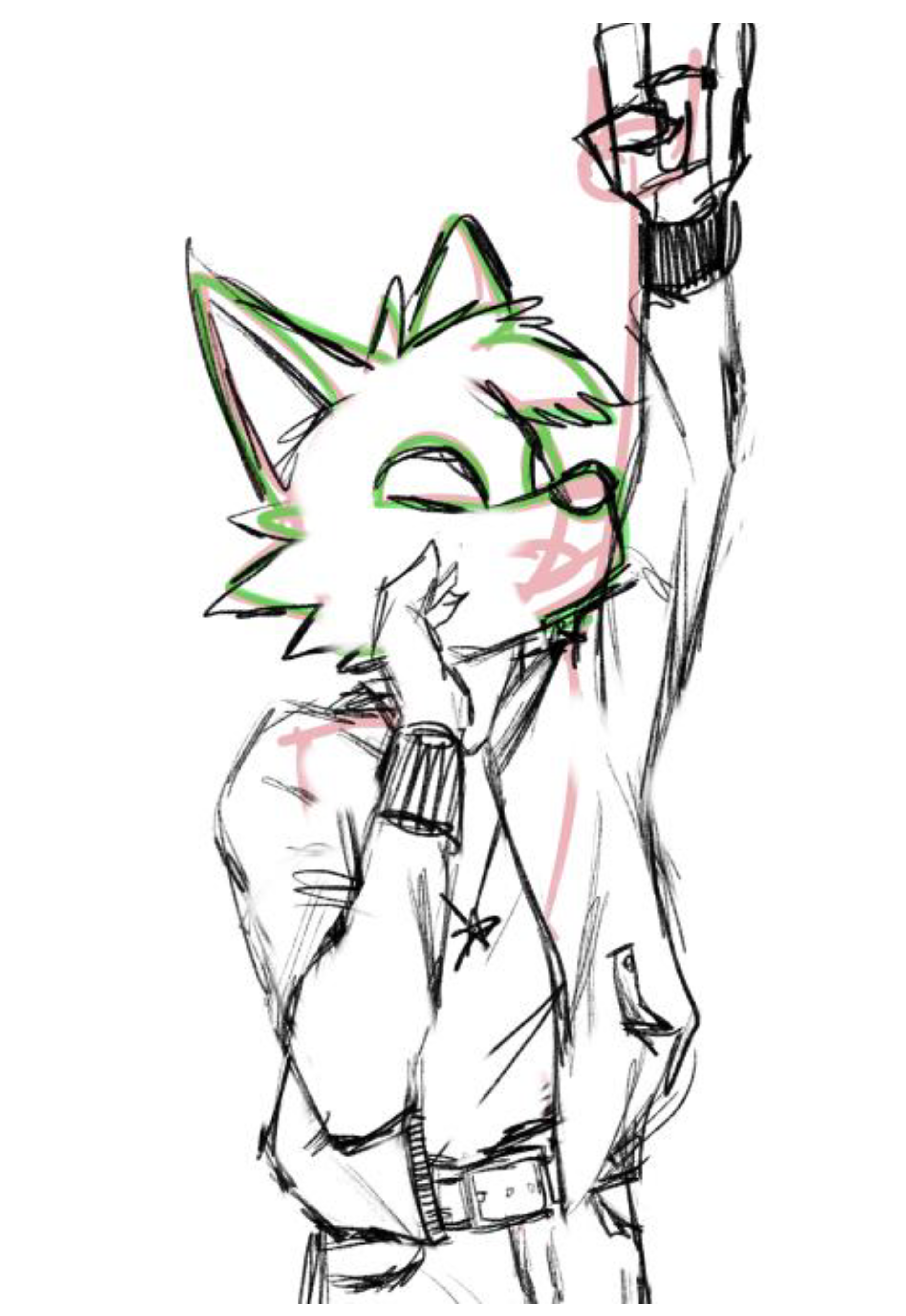
I thought I had a good start, but after as far as I went with the first sketch attempt, I was stuck. This was where I had a friend (Evo Manuel Agus) help me with the rest. I sent him my sketch, described to him the outfit I intended, and he sent me back a full sketch in less than half an hour; he really is the best artist I know personally, and we still are very close friends to this day; Minecraft and Star Citizen are the two games we play most often along with the rest of the friend group.
// my first sketch attempt, horrible proportions
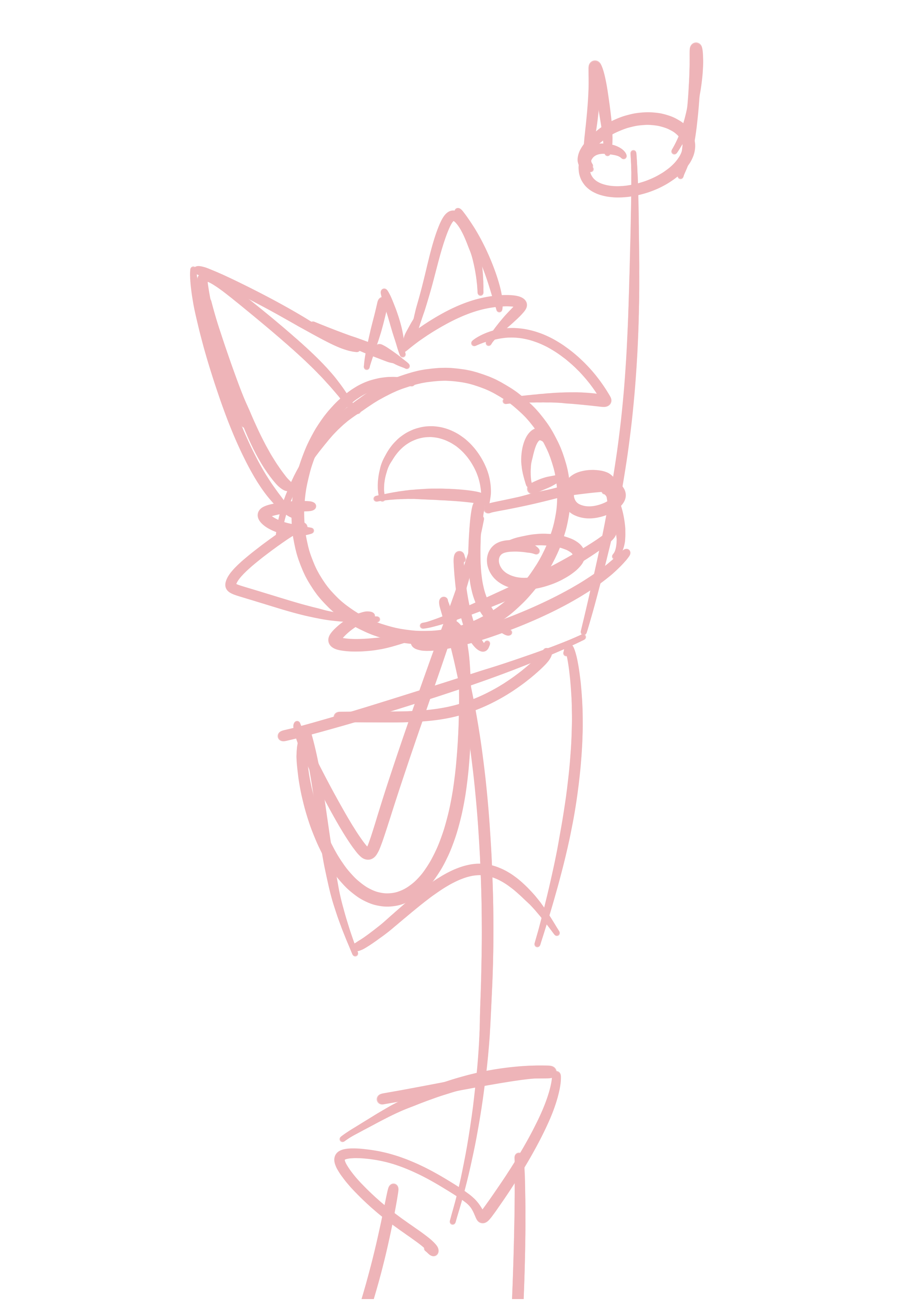
// the sketch Evo sent back
Line Art
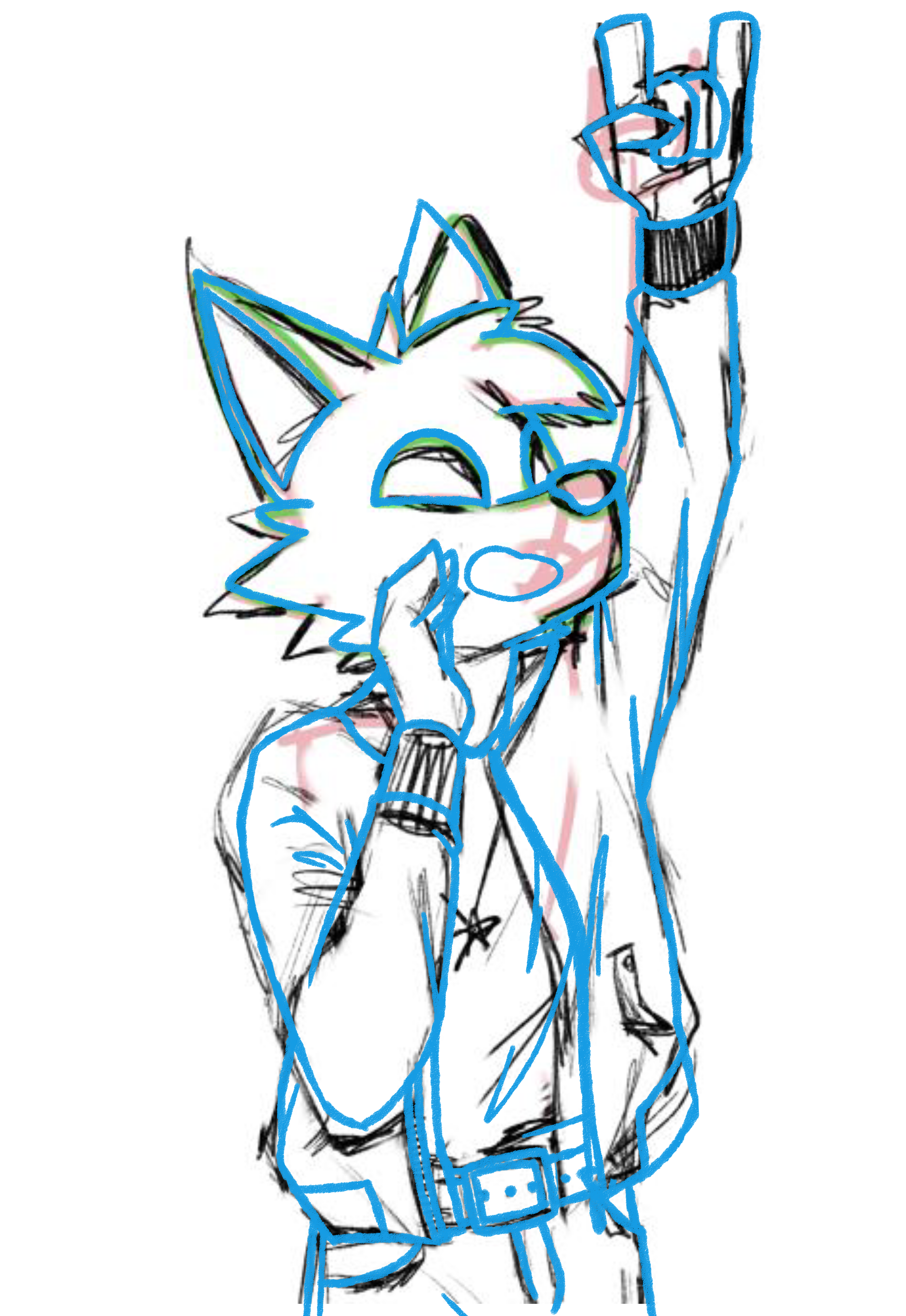
Because of the huge help from Evo, all I have to do from here is basically trace; this is why I'm giving him huge credit for this one. He influenced significantly how it looks, and in addition, I consider the line art to basically be almost half of the entire process.
I still did, though, made my own adjustments to the line art from the sketch, like the folds in his clothes, his hair and ears, basically translating it through my usual style.
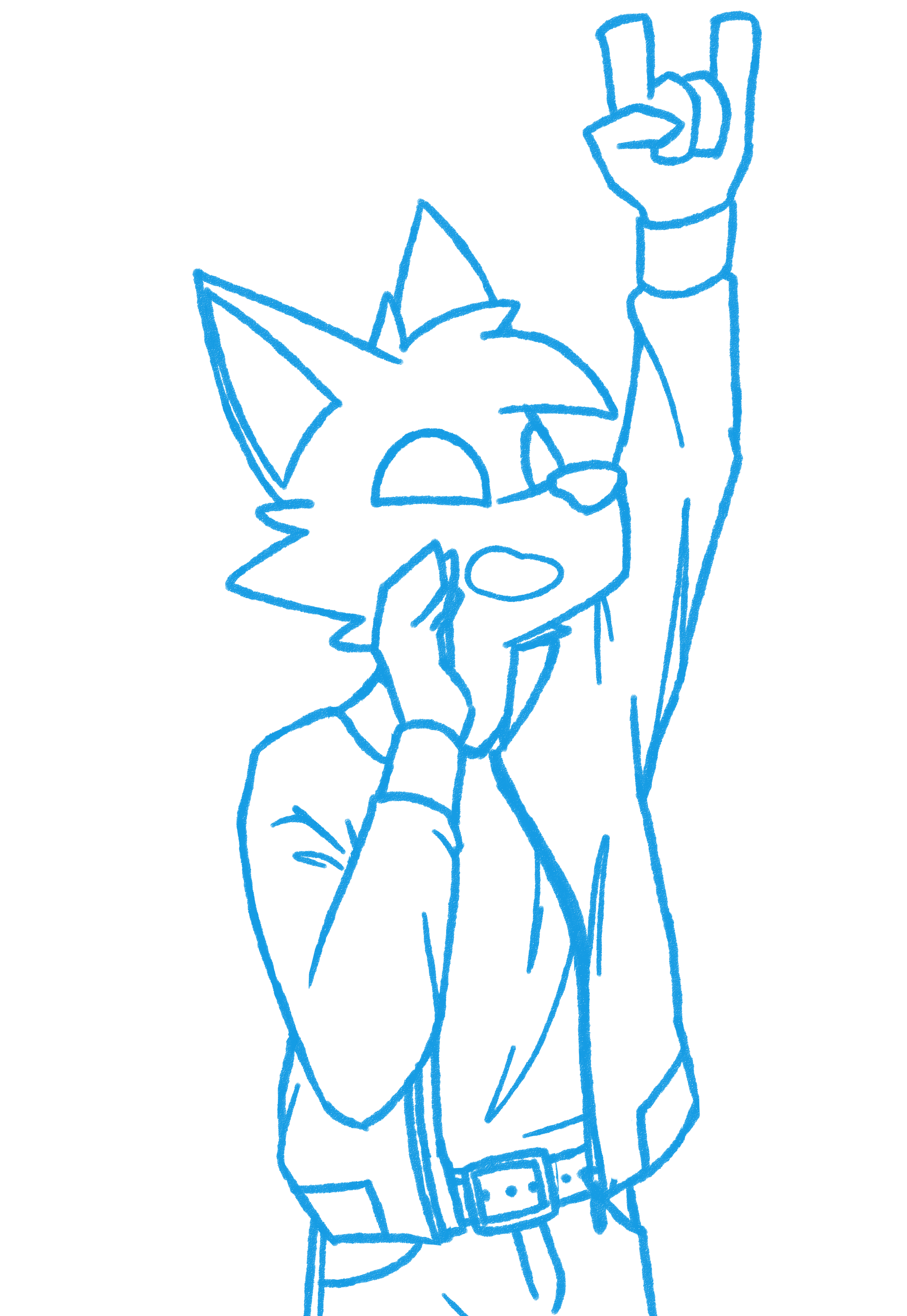
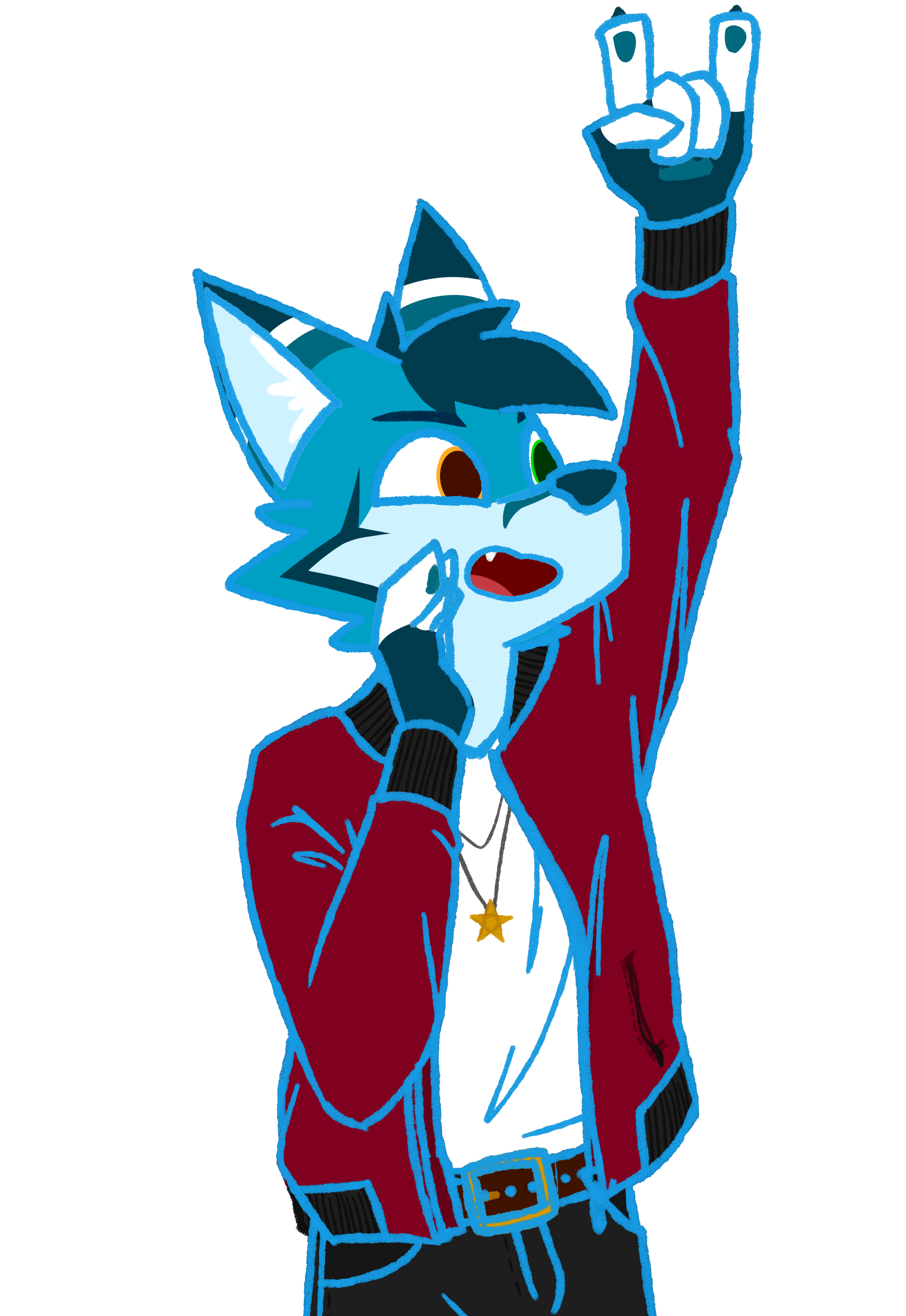
I decided to make the lines blue at first to make it easy to distinguish from the colors of the sketch. By locking the layer's opacity (which stops me from drawing any additional lines other than the ones already on the canvas), I was able to change the color at a later time simply by drawing over them. The crayon texture gave me some room to keep the sketch messiness in this final line art.
// line art over sketch
// line art only
Color Area and Base Color
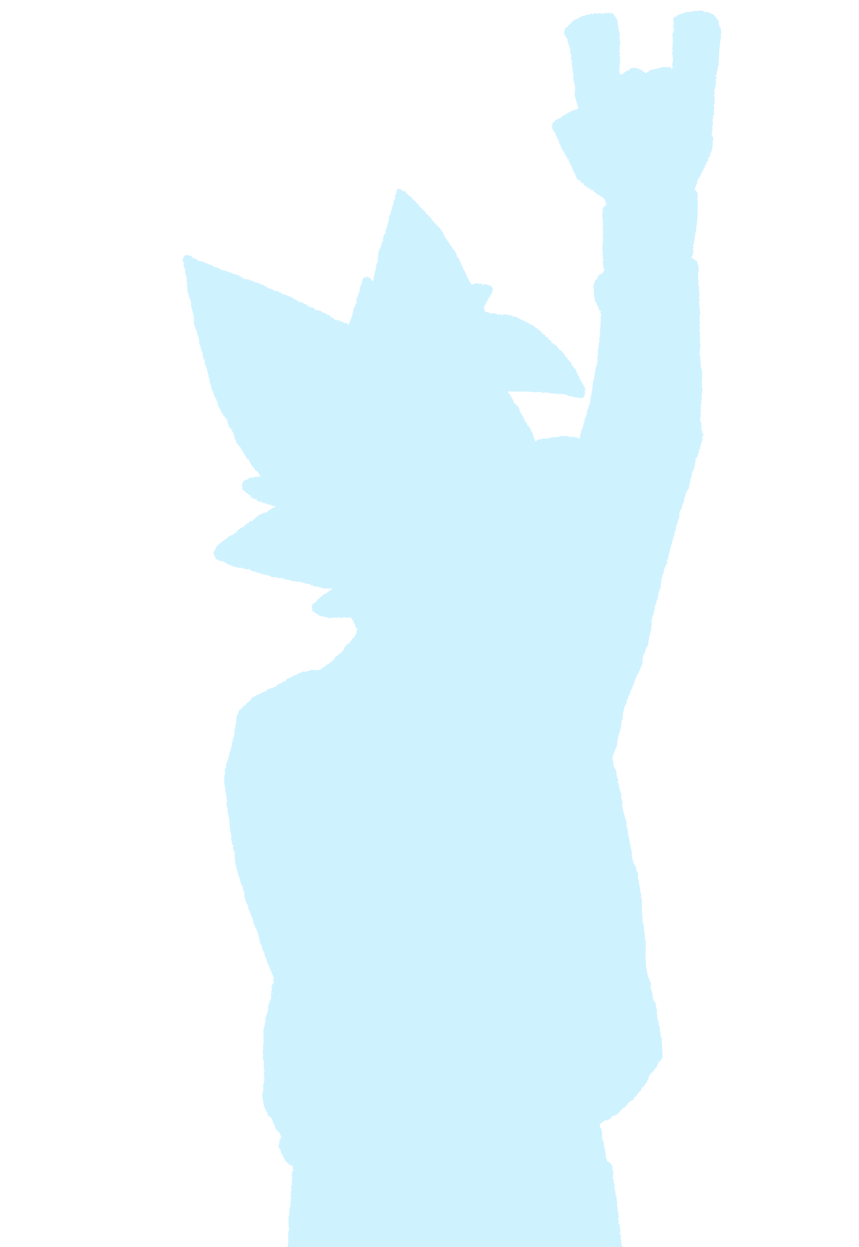
This is again where I perform my usual procedure of getting the area to color — color over the lines with a light color, select the area outside of all the lines, and delete the color in that area.
// I am left with this

// color only
Coloring
Coloring took a bit more time for this piece because of the slightly greater number of elements. I separated coloring into three major steps — the character's colors, his clothes, and finally the details. I figured once I color the lines, this style will give me a half-lineless look, so I drew in the details using colored lines immediately.
// coloring the fur
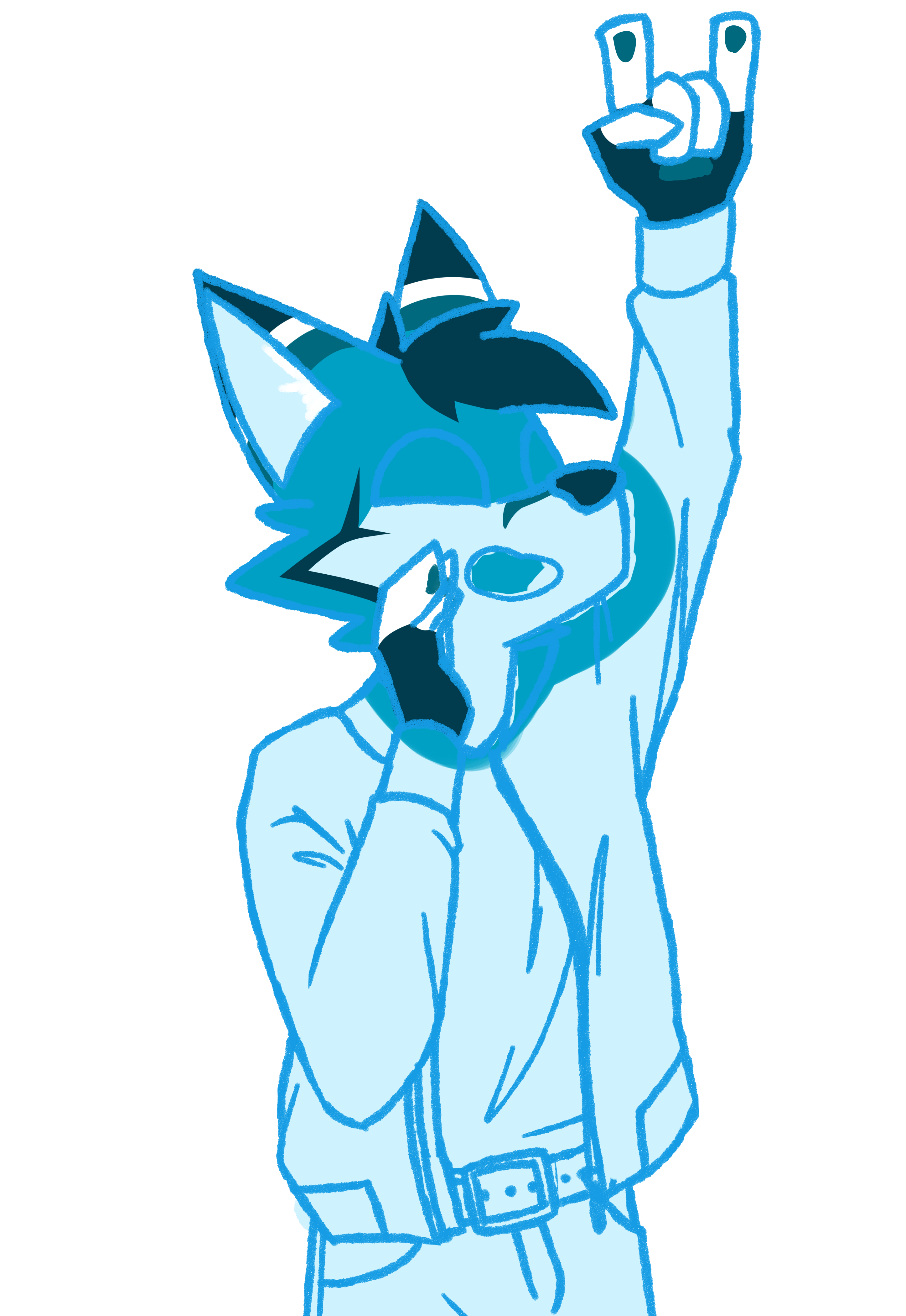
// coloring the outfit
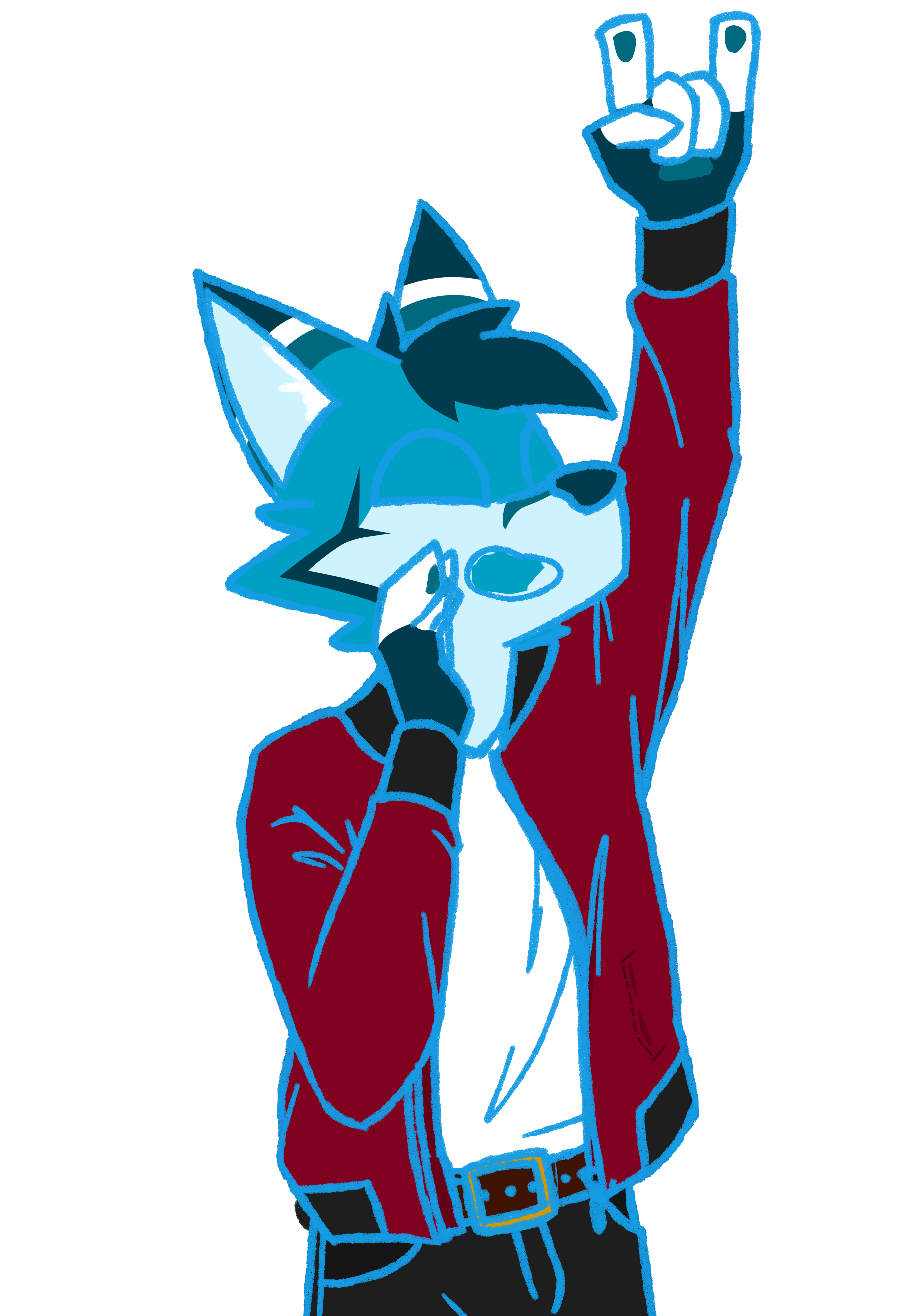
// adding smaller colored details
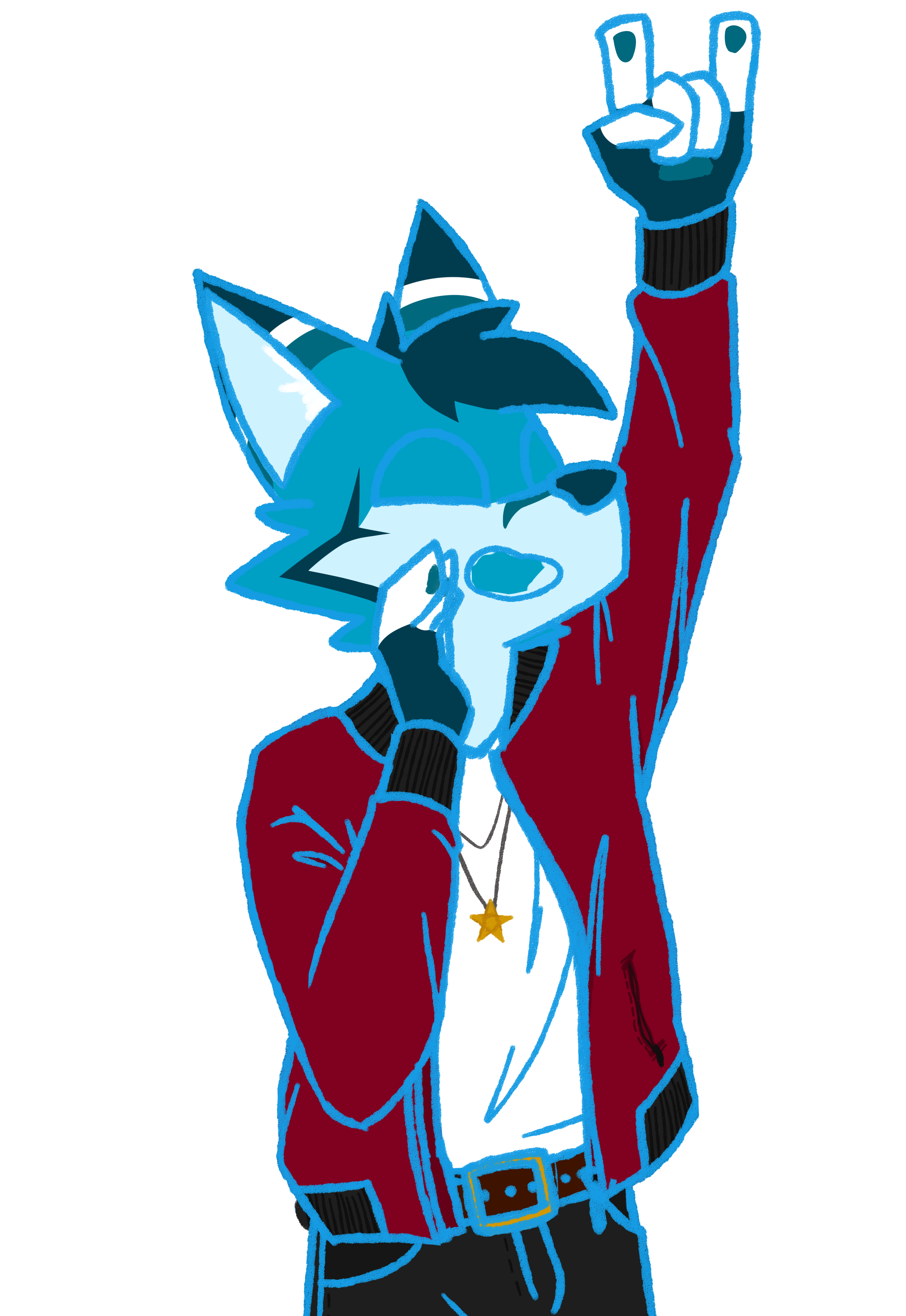
// I also had a more complex palette
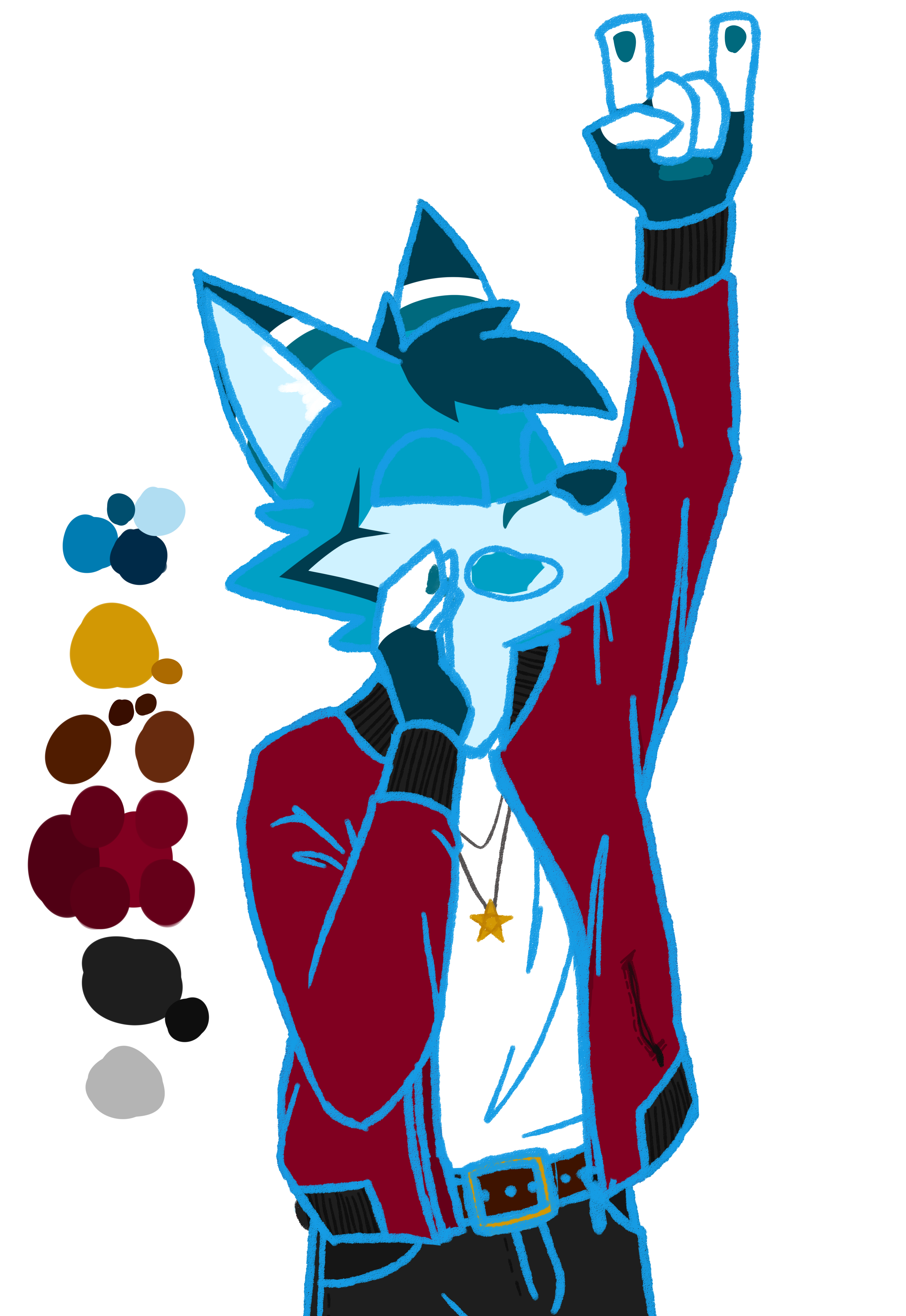
Eyes and Mouth
No fancy shadow or eye reflections this time; this is more of a low fidelity cartoon look, albeit still high fidelity.
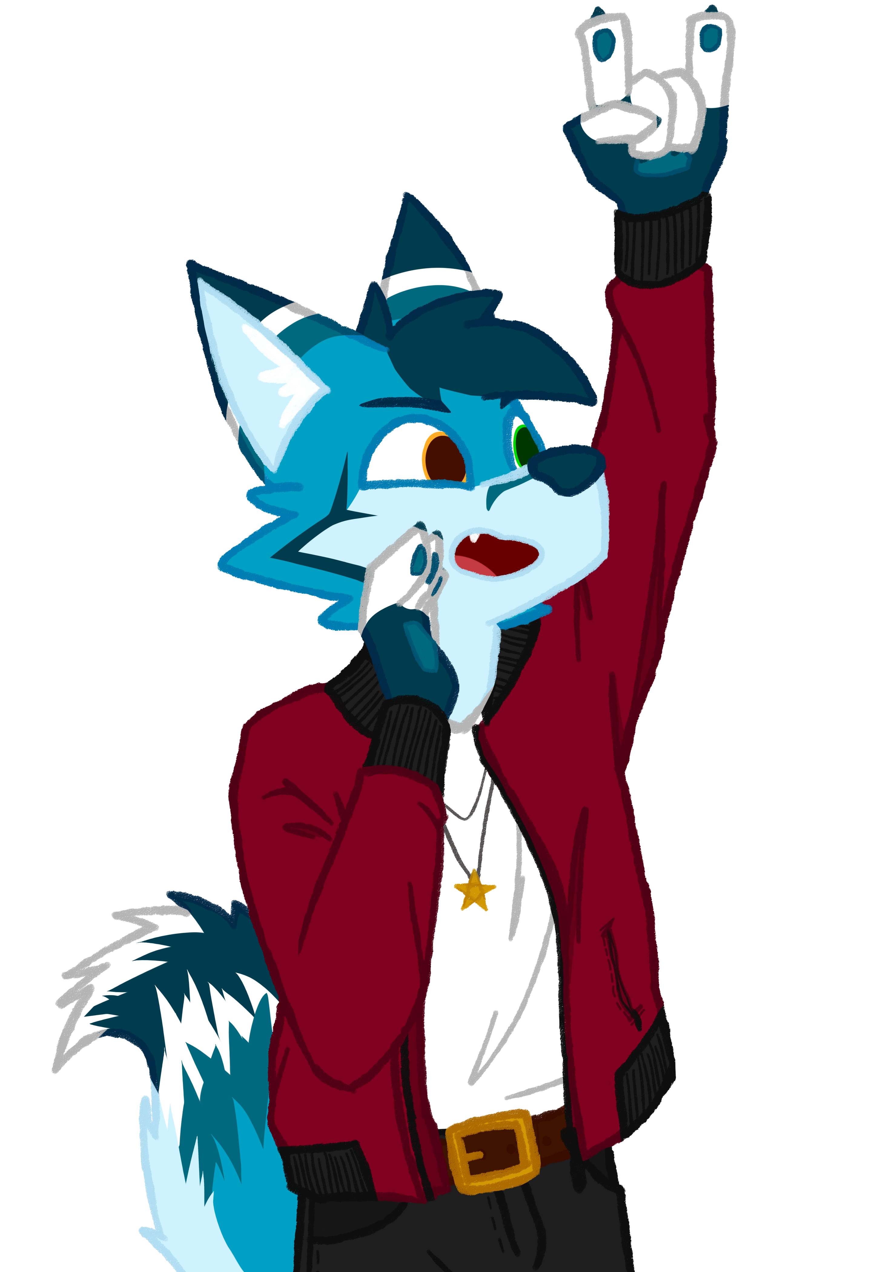
Recoloring Lines
At this point, because it's been so long, I also just realized I forgot to make his tail.
Shading
I didn't focus too much on the shading on this one, just rough areas of where I intuitively think shadows are going to fall. It wouldn't be too noticable for the purpose of this piece. I used the 'multiply' blending mode this time because it was producing more balanced shadows.
// with shading layer, unblended
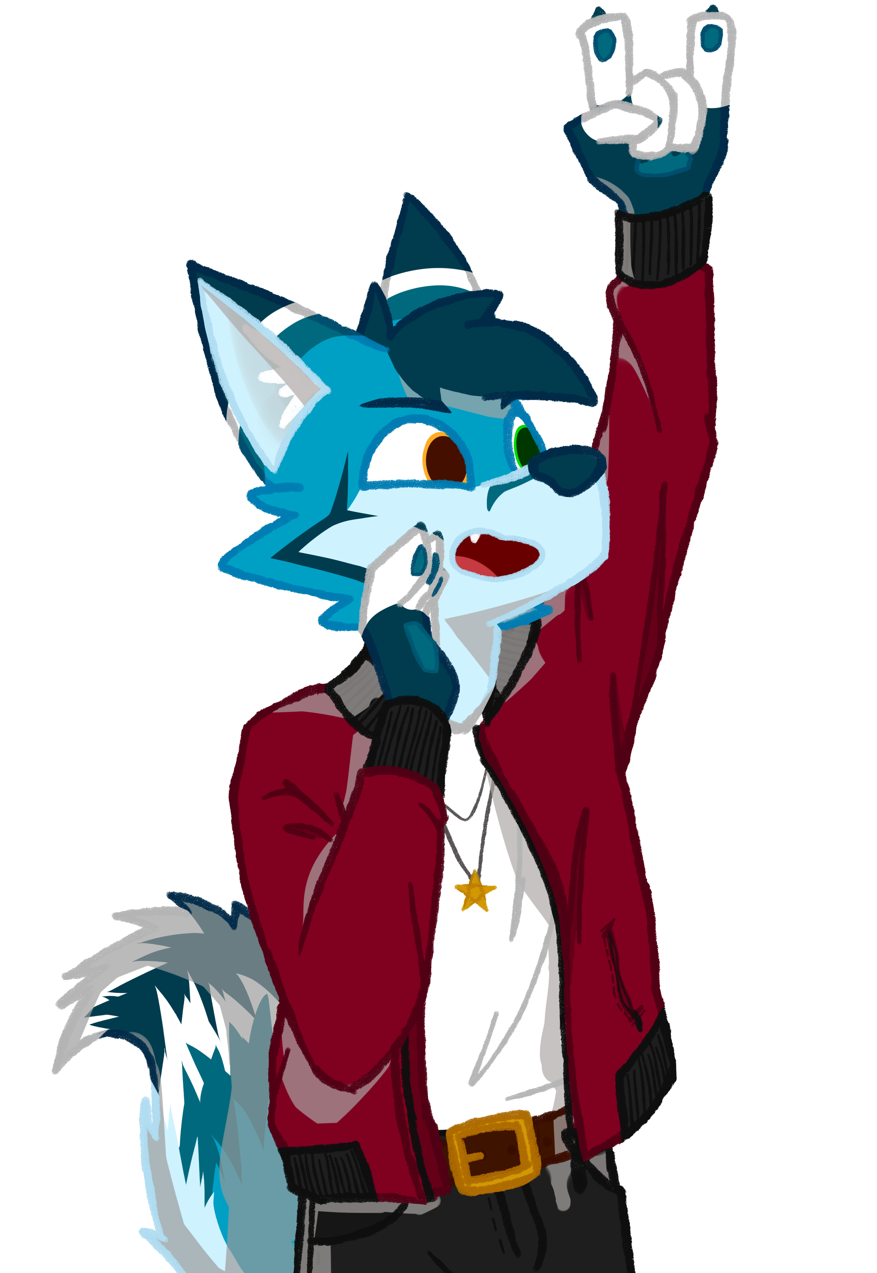
// with shading layer, 'multiply' blending mode (final result)

Just for fun, here are some additional layer combinations with the shading.
// shading over base color only

The Reflection
What I Learned
Collaborating is fun, but it feels even better to have people who can directly help you with things you are struggling with. Without Evo's help, I would have either messed the anatomy up to the end, or take a very long time even if I finally managed to get the proportions right. I also explored another style for drawing which I really love, and having variety in my pocket means I can adapt easily to many situations.
My Next Steps
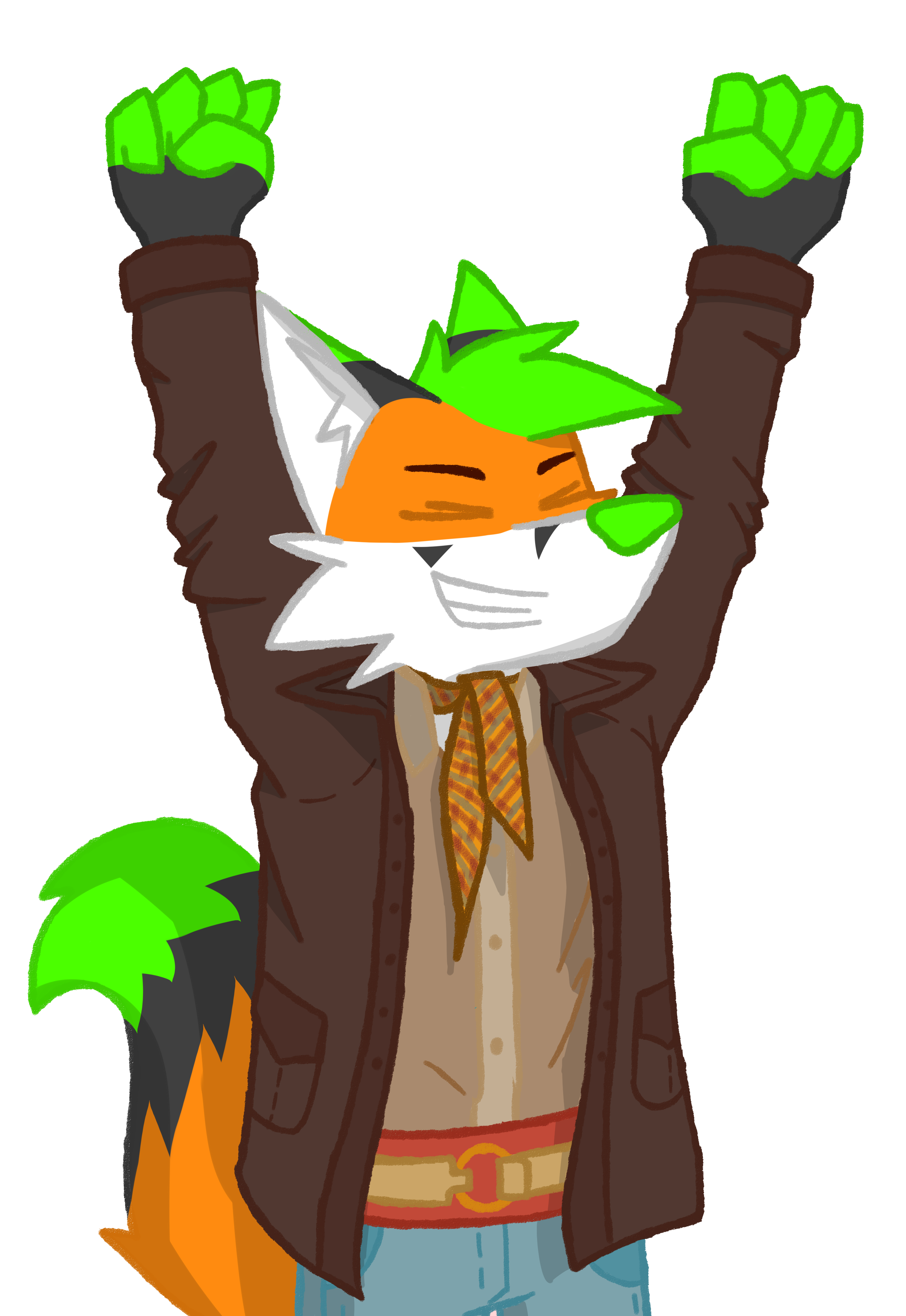
I really want to expand this style into drawings of many other things, like landscapes and objects. I actually made another of this with the same style for the same collaboration project, but it was for Saber_Foxxo's character. He turned submitted it for himself for the collaboration, and the editors put us next to each other in the music video! How quickly can you spot us?
// I forgot to tell you, this guy's name is Zoren

// and this is his good friend Saber, much more knowledgeable about the period's fashion
