- ▢
- –
- ✕
About
Bothell Beats is a newly established UWB club centered around music production. On Thursday, February 3, 2022 at 6:12 PM, Bothell Beats received approval from the UWB Club Council and was given their own Presence page.
My journey with Bothell Beats, however, started way back on October 17, 2021. I just happened to visit the HGC Discord server, and just happened to see a server invite to some music production club; I read around the message and quickly learned that they were just in the process of setting it up. Of course, being a huge fan of music and sound, I jumped onto the new server without hesitation, especially because I was aware that I still play more music than I make, so I wanted to make that turn in my music hobby.
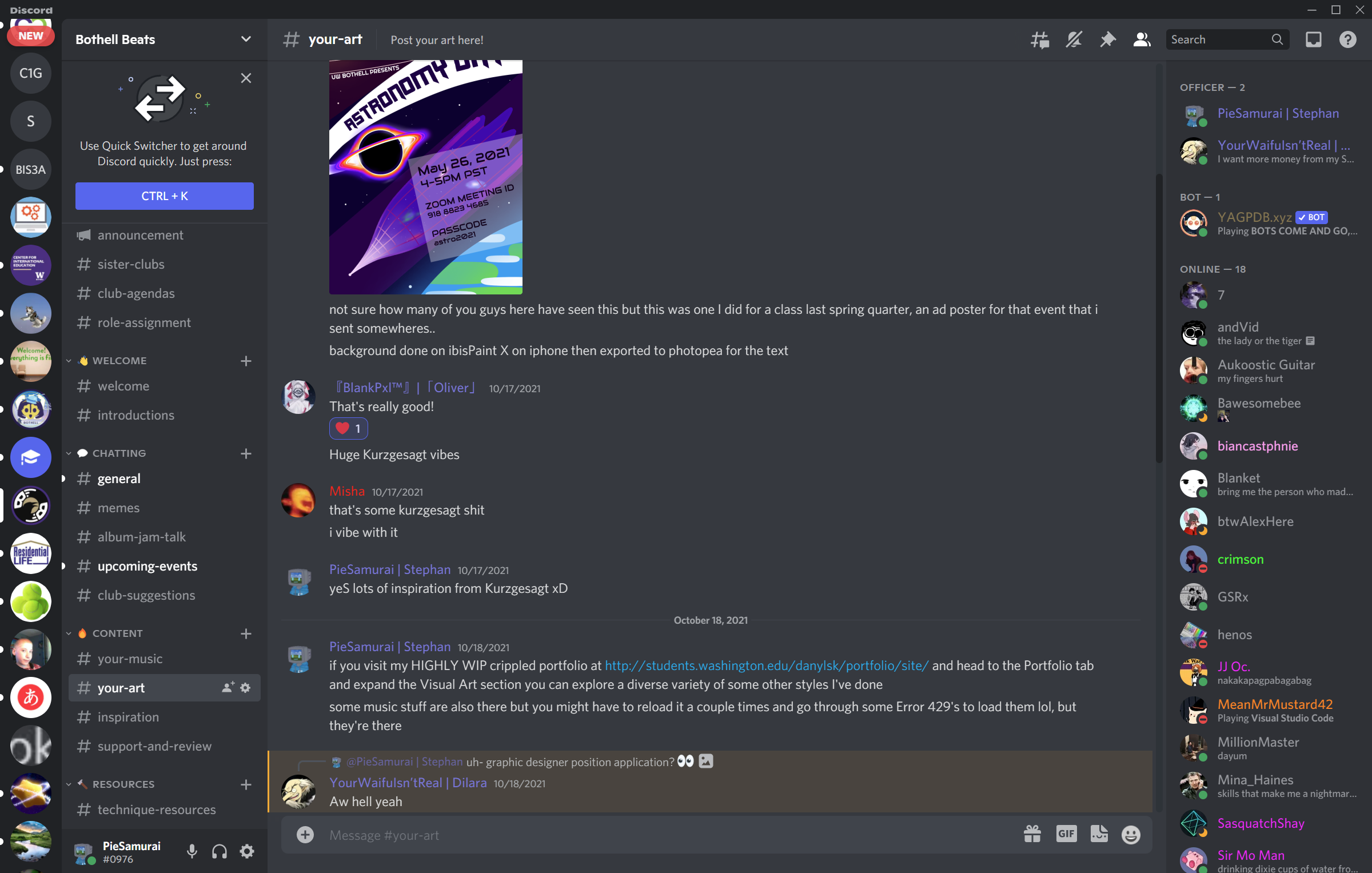
I introduced myself as another newcomer, but the very next thing I learned was that they didn't have a graphic designer yet. You know when all the greatest opportunities just suddenly jumped at you all at once? I quickly told them I would love to be their graphic designer, and actually sent them my other significant graphic design product, the Astronomy Day poster, along with the first iteration of this website!
The Process
The Initial Plan
The first responsibility given to me once we became official was to create a banner, an info sheet, and flyers for the Winter Club Fair on Feb 17, 2022. Although those were primarily what the club needed, some piece of visual was also needed to be in place of the logo; the club didn't have an official logo yet (and it continued to not have it until the start of Spring 2022).
The Journey
So the first thing to design in order to have those banners and flyers ready is the temporary club logo. As a personal philosophy in designing logos, I always aim to pack together as many meanings as possible into one iconic visual. For this club, officers including me brainstormed that the logo should have:
- something to represent the UW
- something to represent the Bothell campus
- something to represent music production
- something to represent the club name, Bothell Beats
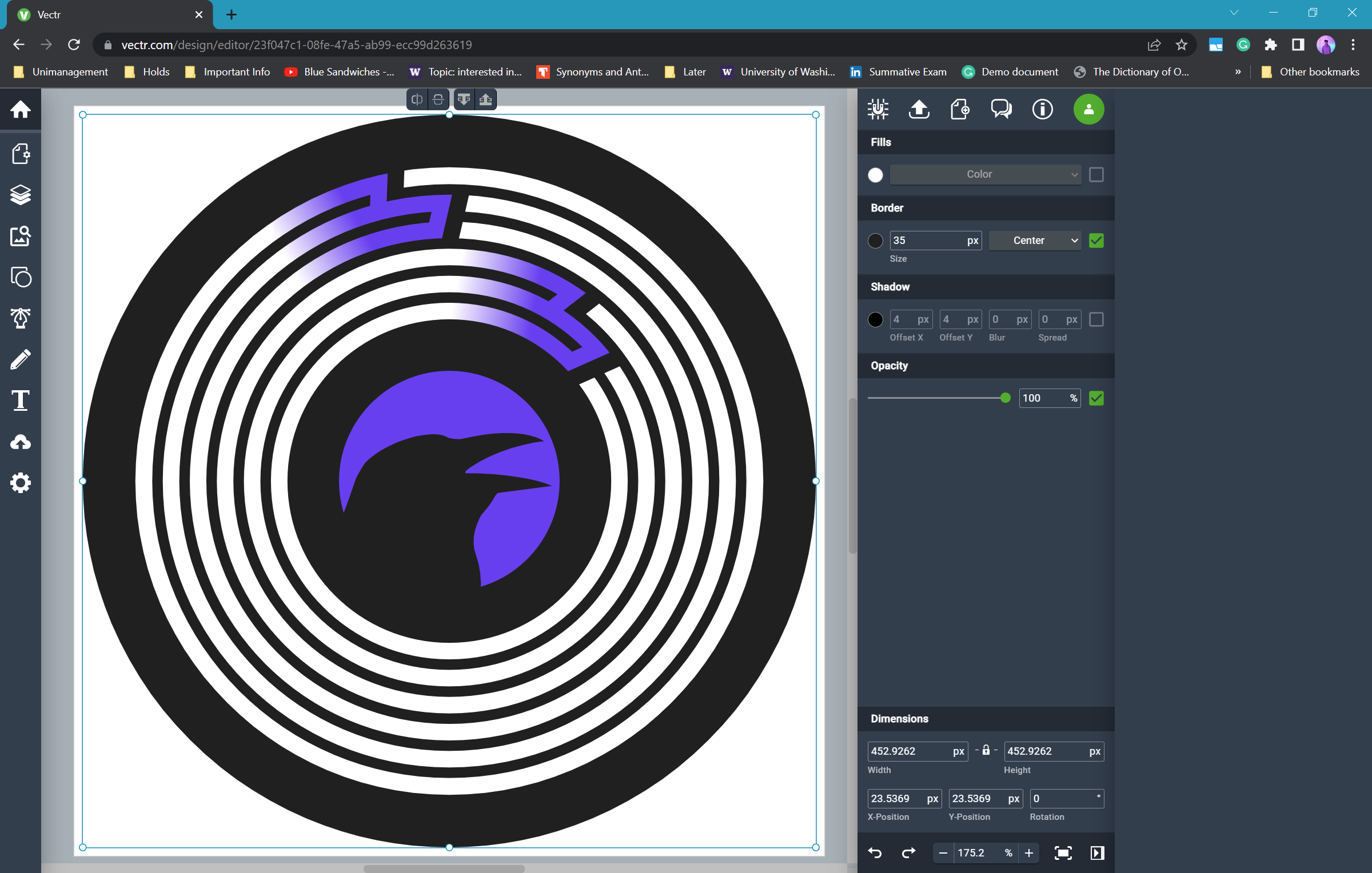
The first thing I thought of was of course a vinyl record, so that's what I started with. I know a sufficiently good free online vector drawing tool called Vectr. Here's where I left messing around looking for ideas in this stage of the design:
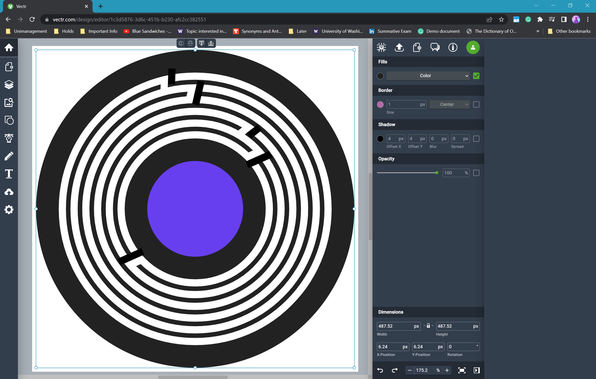
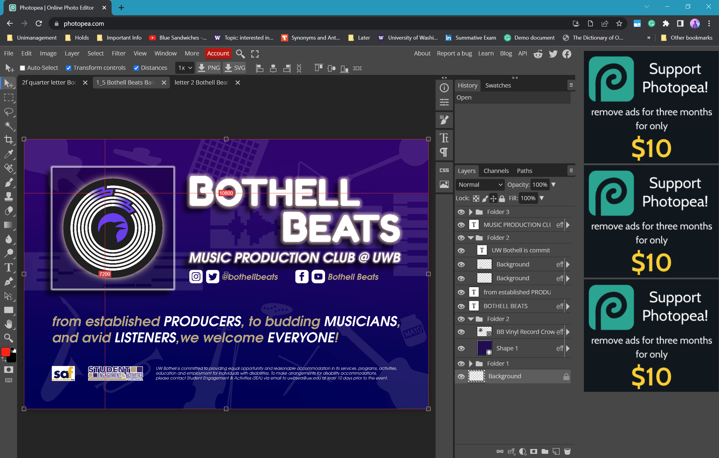
I got two, maybe three, of those points down. The purple for UW, the vinyl record for music production, and two B's for the club's name. So I tried tidying somethings up, went over to the one free online graphic designing tool I know, Photopea, and ended up with something that looks like an album cover.
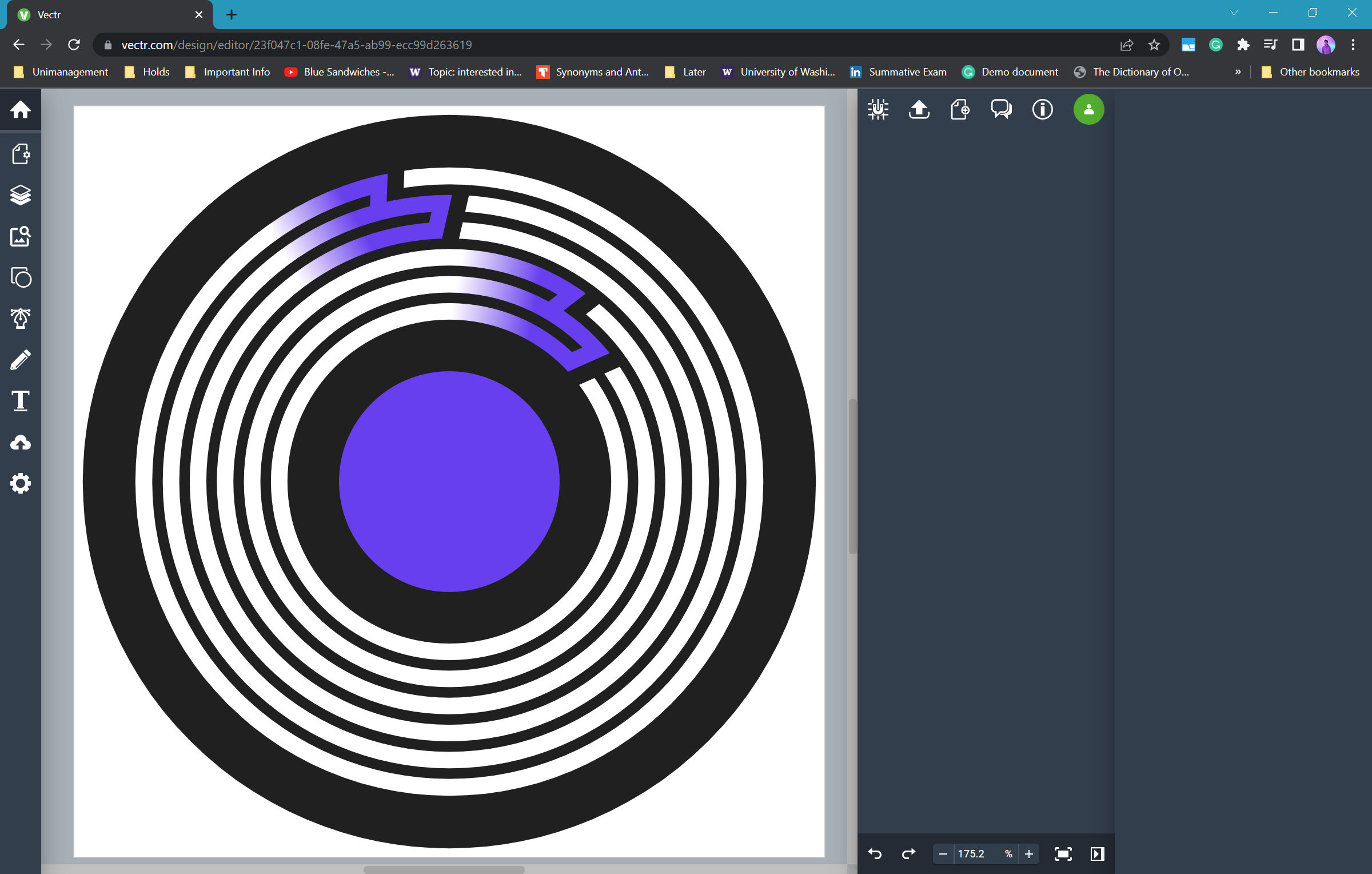
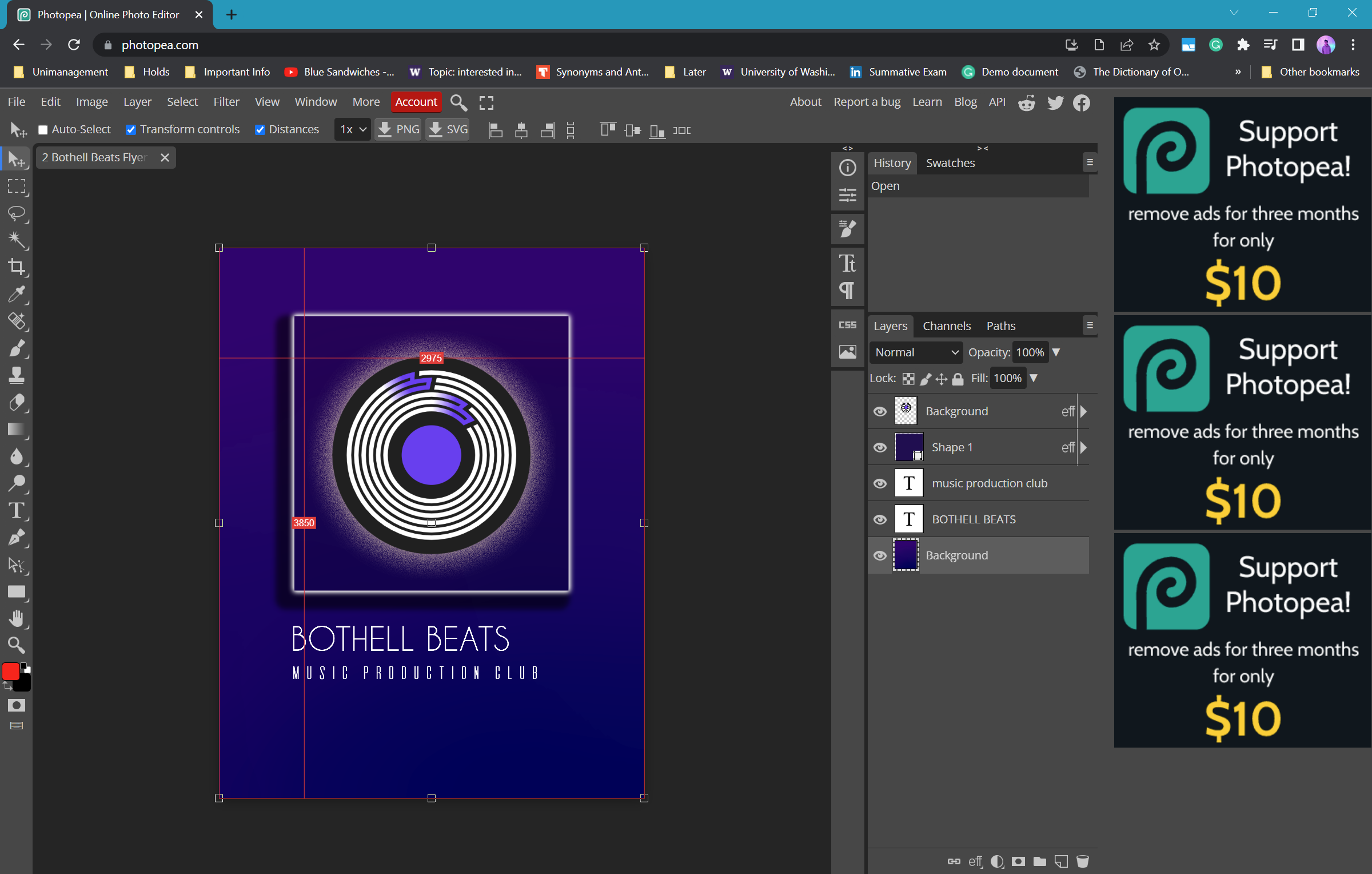
A lot of what affected the direction of this design is actually other people's opinions. I asked a lot of people what they think of certain parts of the visual, how they feel about it, what would make it better, and all the other constructive criticism I could get. Though I take credit for ideas and execution, the final product is a result of collaboration.
So after discussing and getting input from other officers of the club primarily, a crow was added to the center of the vinyl record in the design, and the Winter Club Fair banners are crafted right after. Even designing the banners and flyers themselves demands a lot of others' opinions, until there's enough agreement that the design choice is optimal.
// asking for opinions on font choice on the club's Discord server
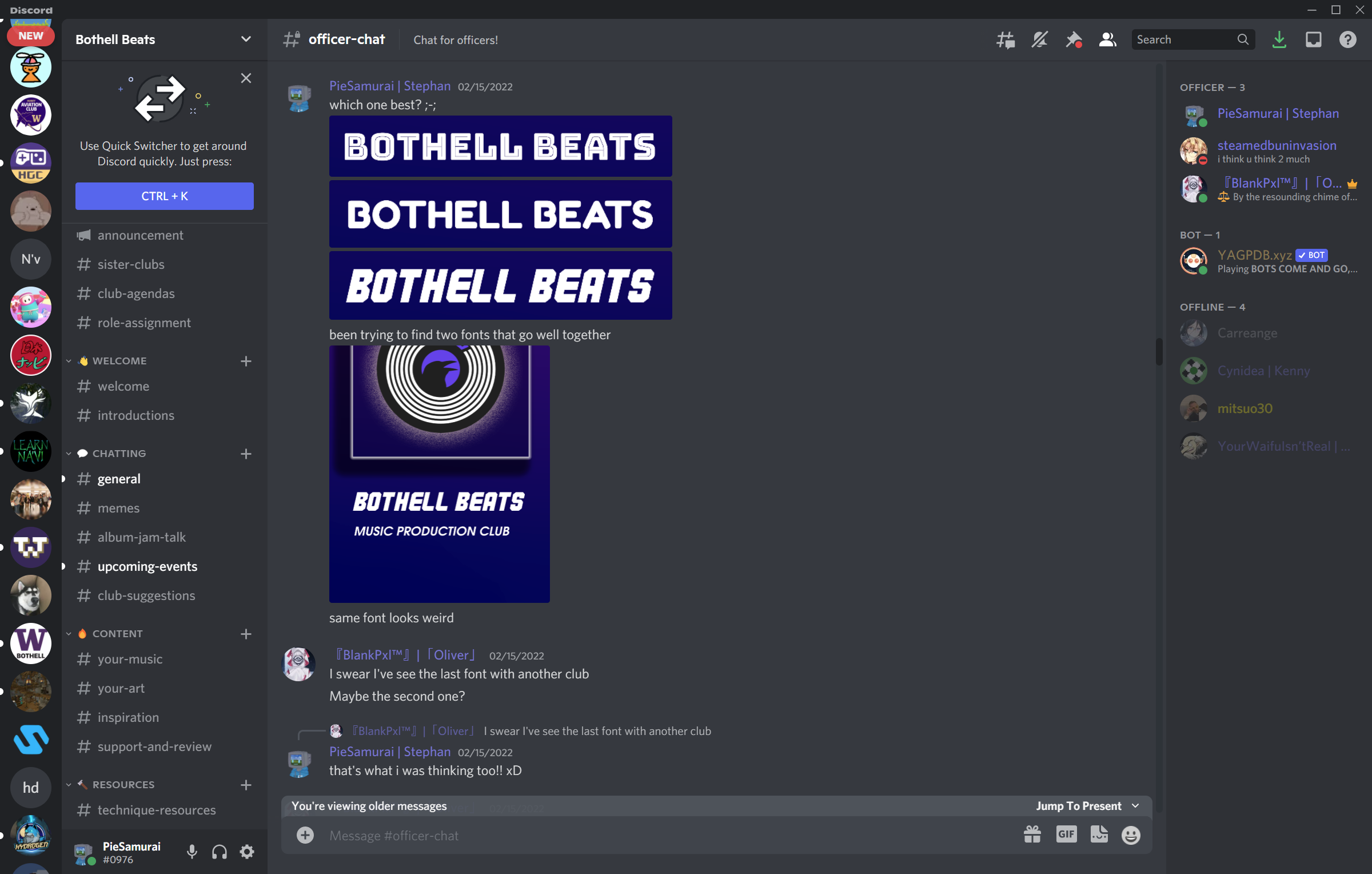
// more opinions
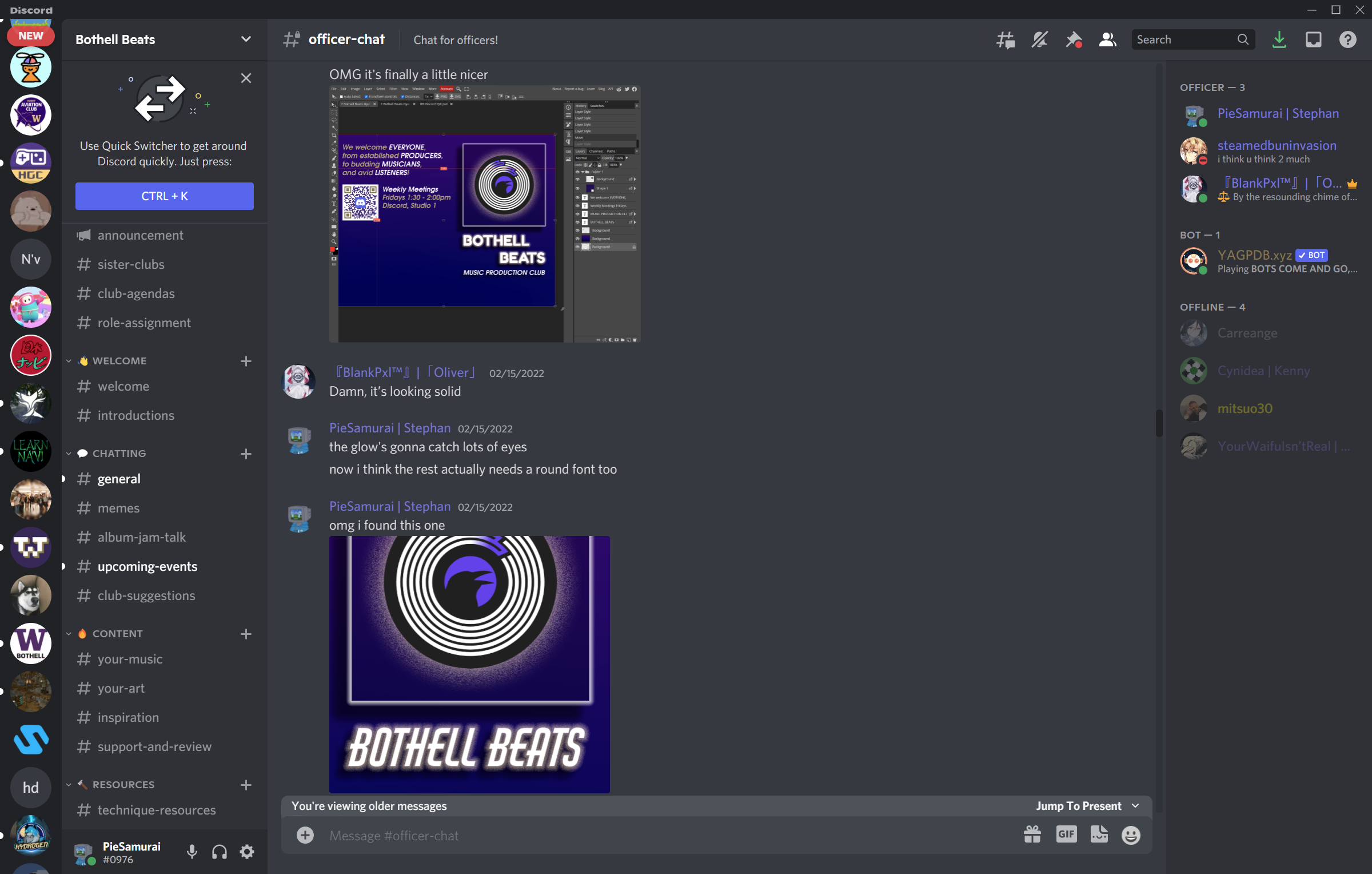
// temporary club logo
// winter event banner (36" x 24")
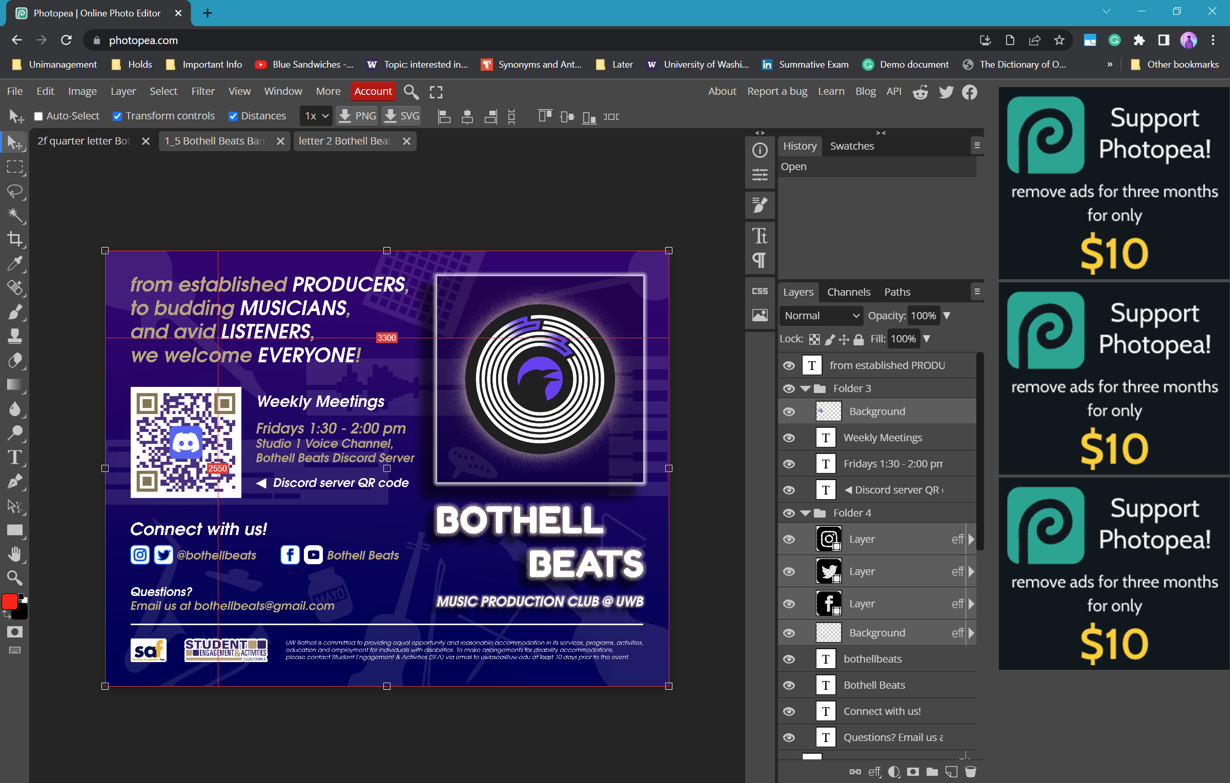
// winter club flyer (quarter US letter)
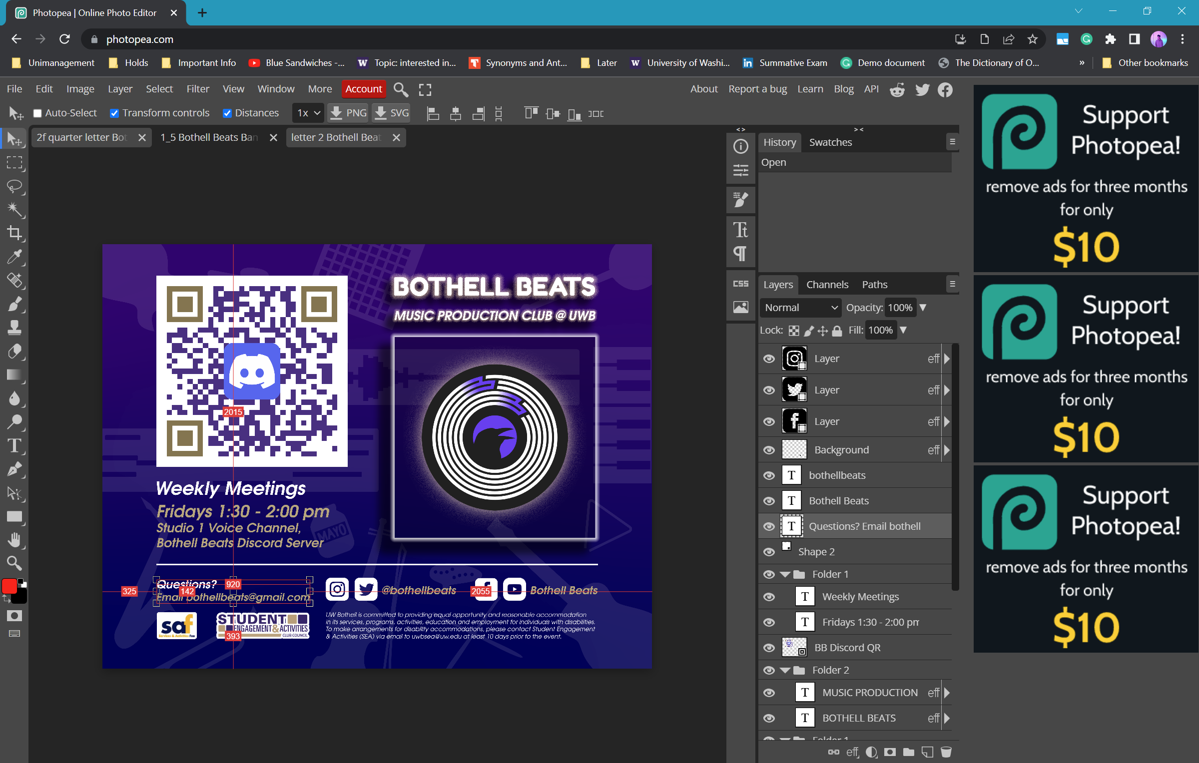
// winter tabletop info (US letter)
TEMPORARY TO OFFICIAL LOGO
It's the end of the Winter 2022 quarter, and the club had gone long enough without an official logo. Its social media profiles are empty and barren, and a new event is coming up (The Student Club and Resource Fair). The club needed an official logo soon.
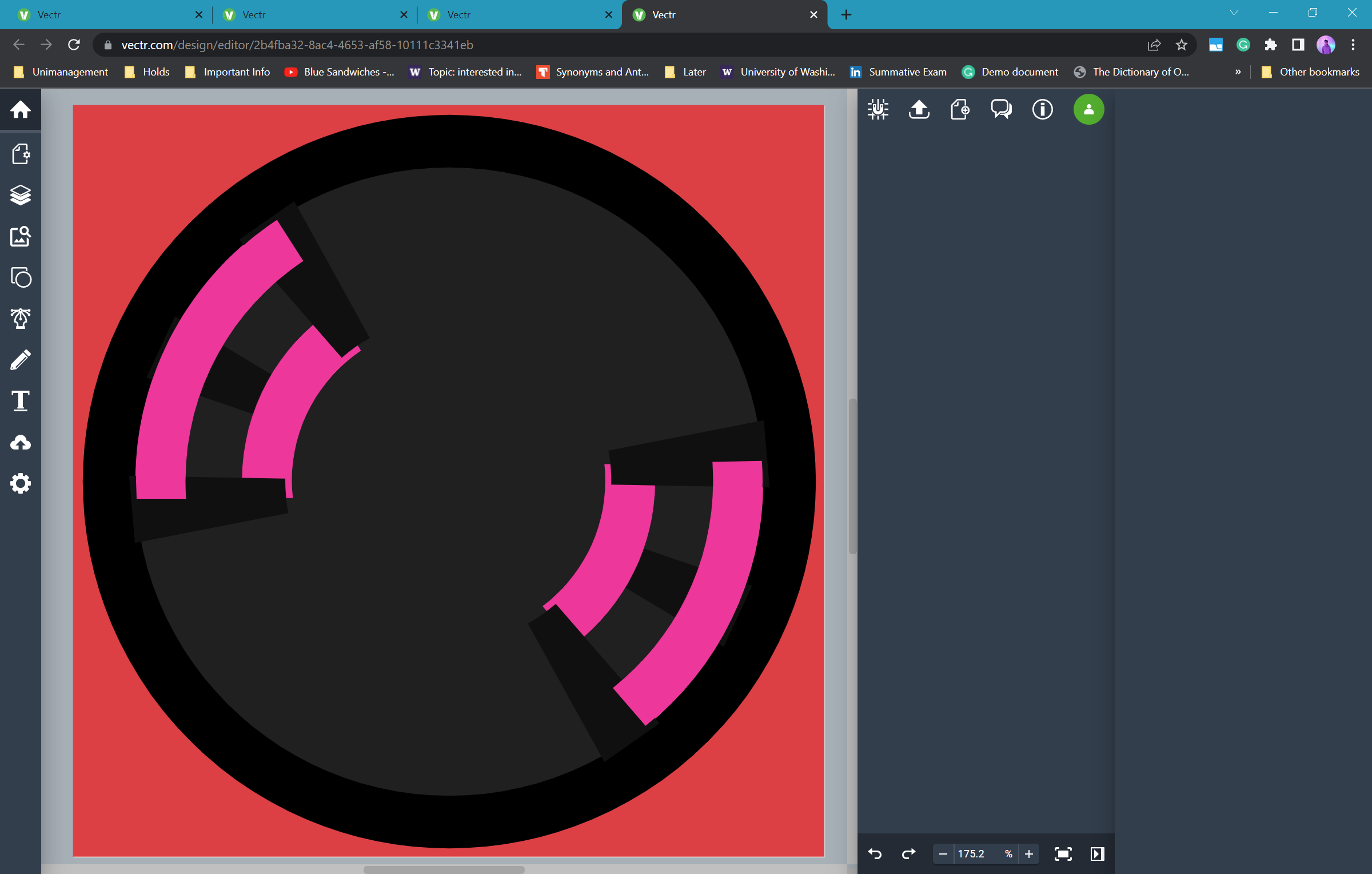
The first step was to improve all the reported problems from the temporary logo. Firstly, the "B"'s were too cluttered and small and doesn't look good in small sizes. The thin record lines also negatively affected the logo's small size appearance. So those two features need to be reworked, but the crow stays; and it was improved. It looked like a penguin to me. The new crow looks sleek, but the seemingly immovable obstacle at this point was to find a good shape for the two "B"'s. Unbeknownst to me, maintaining the iconic curves of a capital letter B while warping them to follow the circular curve of the vinyl record was the most challenging thing in the world.
Vectr is a huge help of a tool, but it's relatively very bare-bones; I had to utilize all sorts of shape transformation techniques to make sure everything was digitally aligned and symmetrical.
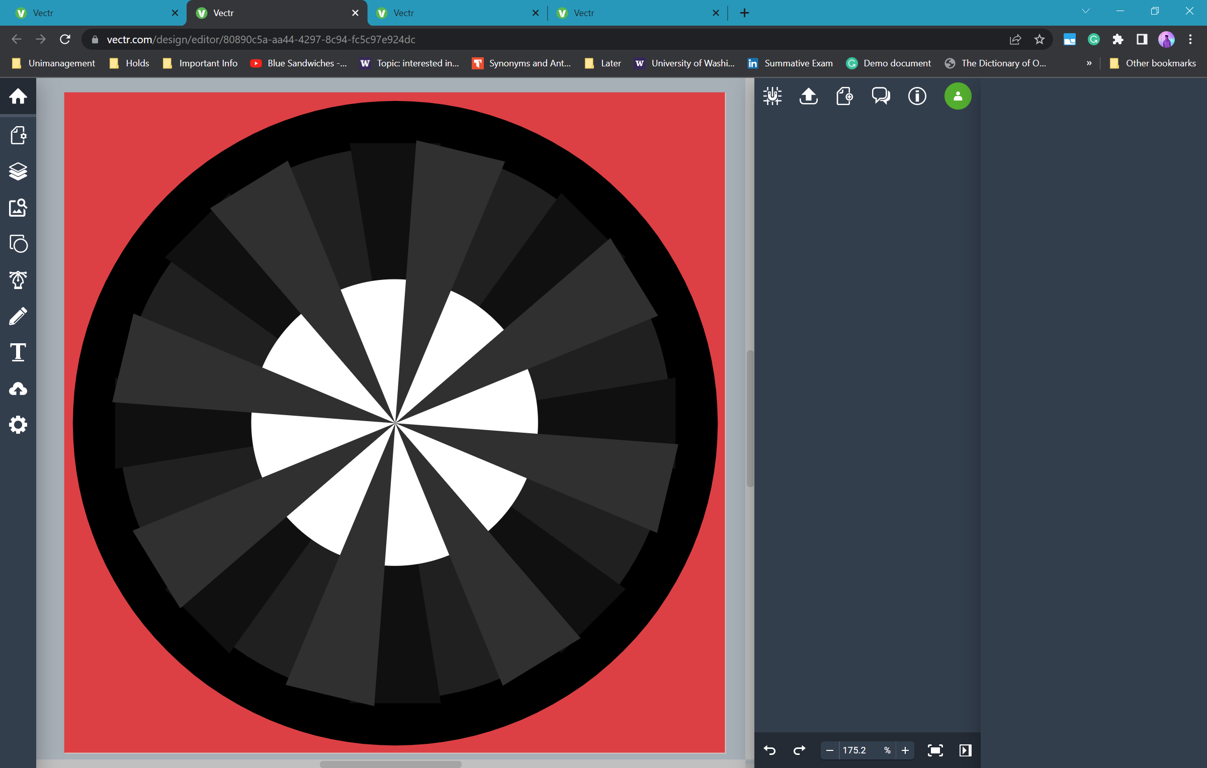
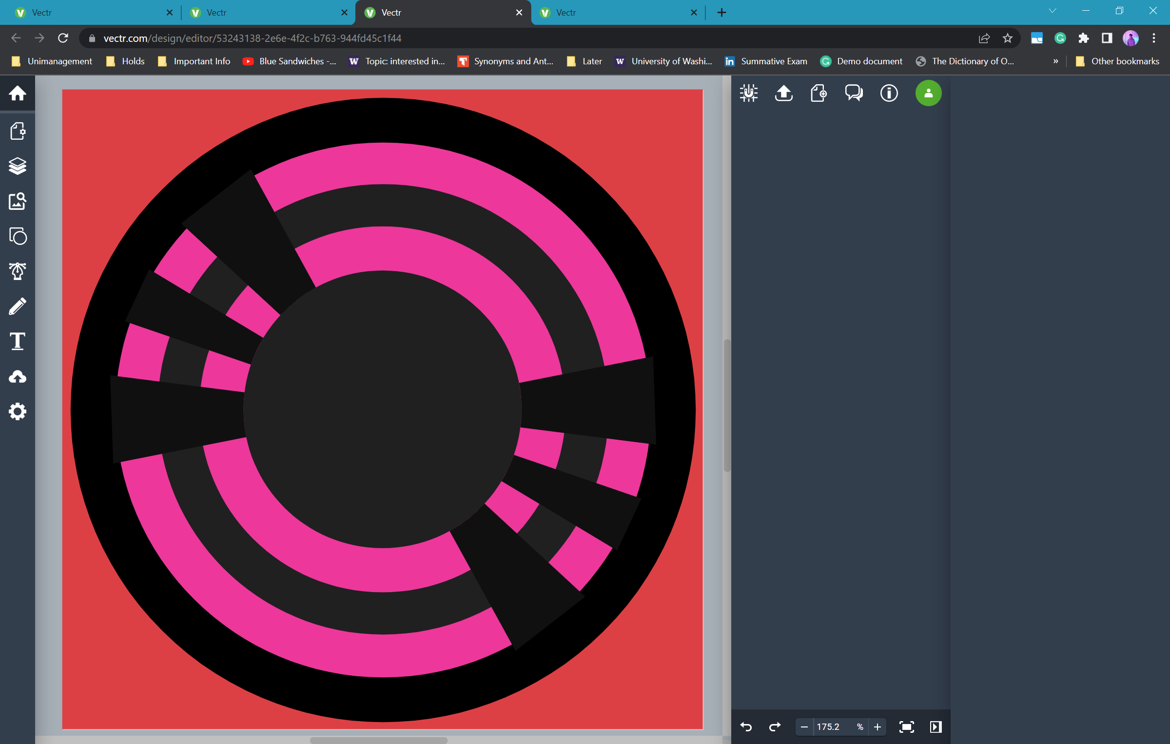
The first iteration of this new design emerged with somewhat squared B's.
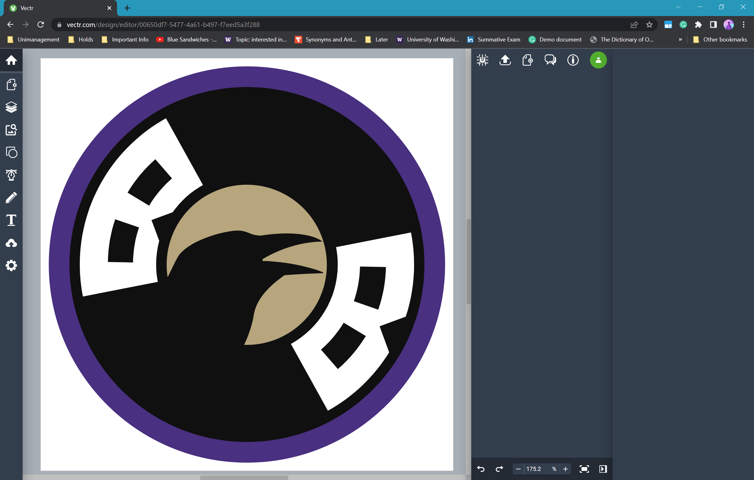
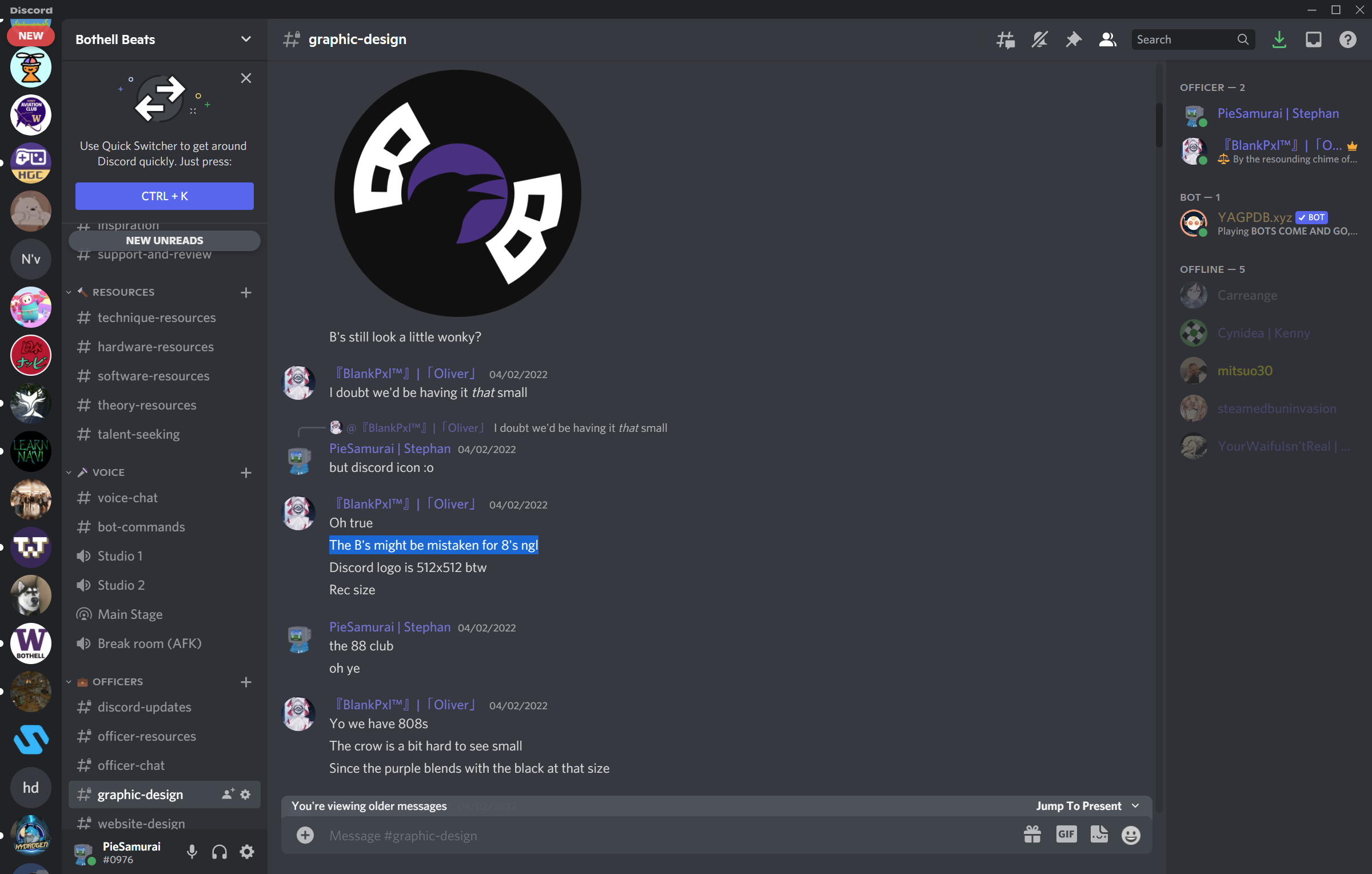
But Oliver, the club president, had an input that they could be mistaken for 8's, which I wouldn't have thought of alone.
Trying out a lot of other things myself didn't take the design anywhere.
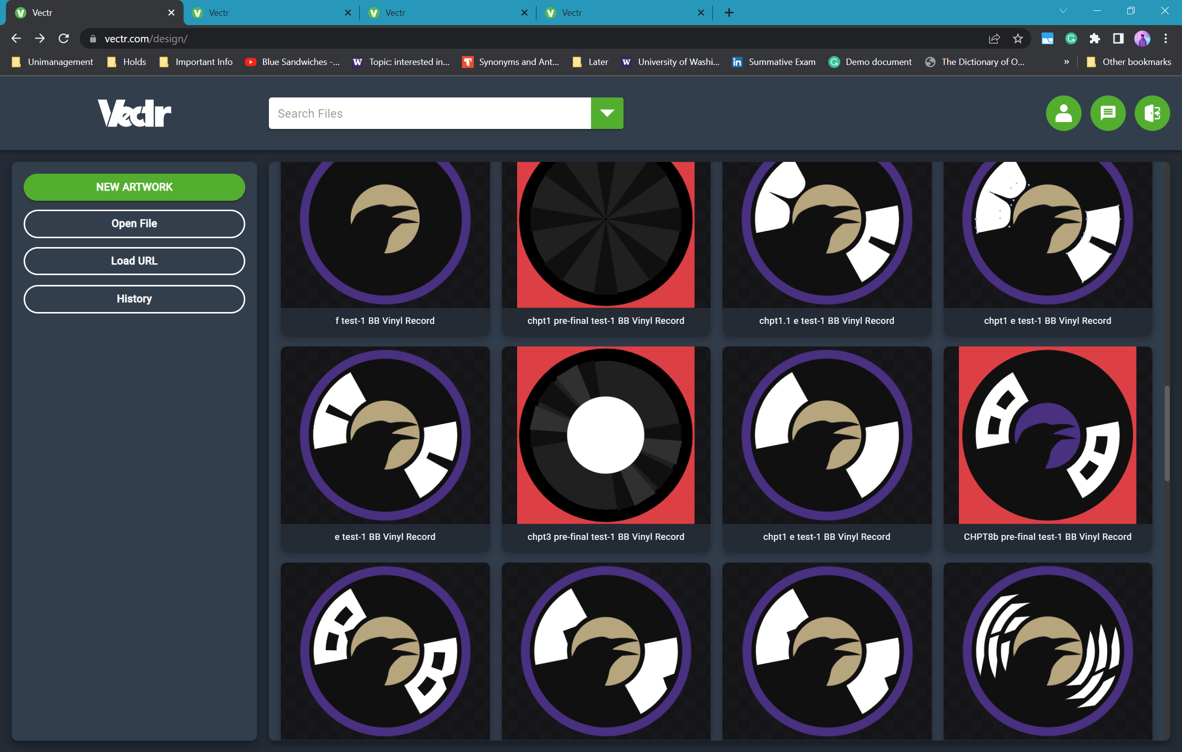
At the time of trying out more designs for the B's, I had just met an awesome person named Blake. I have to give credit to him for incepting the idea of and pushing me to go for rounded square B's. I avoided it because I was discouraged by the thought of trying to curve curves. Trying them out, I again asked for opinions on from officers on Discord.
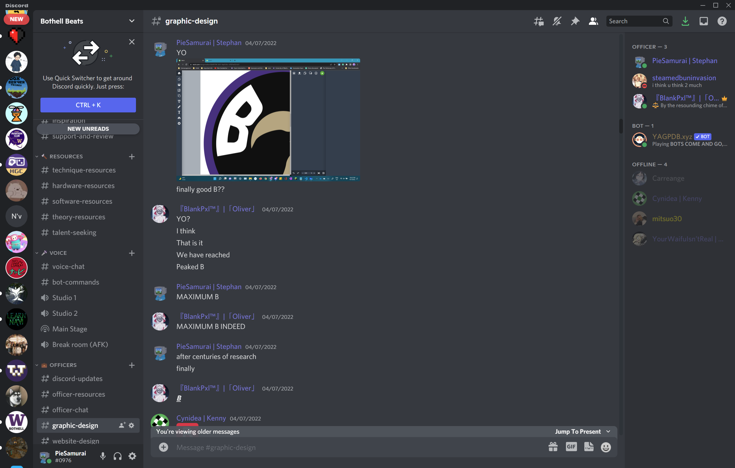
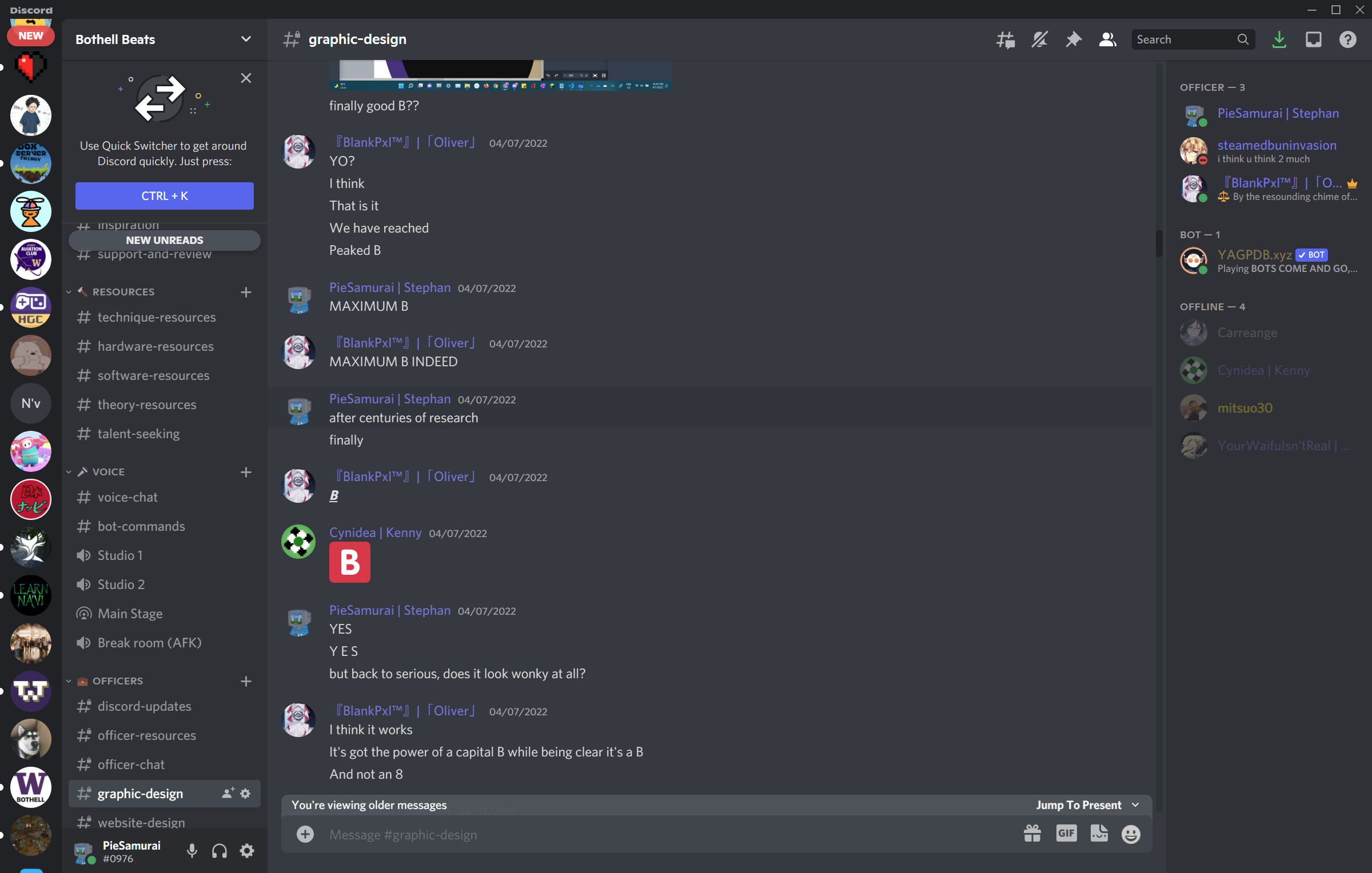
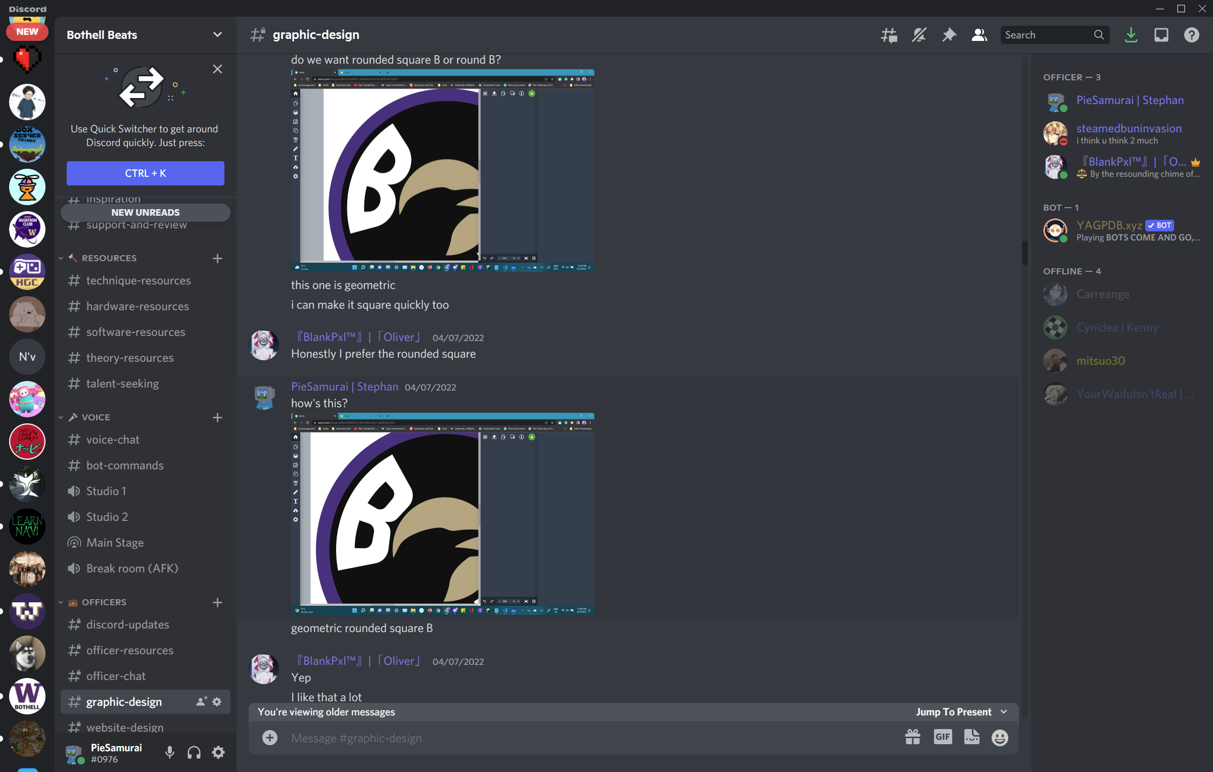
This last step is where Oliver became MVP in the design. This last step is to somehow fill in the rest of the space around the record. The most fitting thing would be lines along the curve of the record, but my first design was far from the final version.
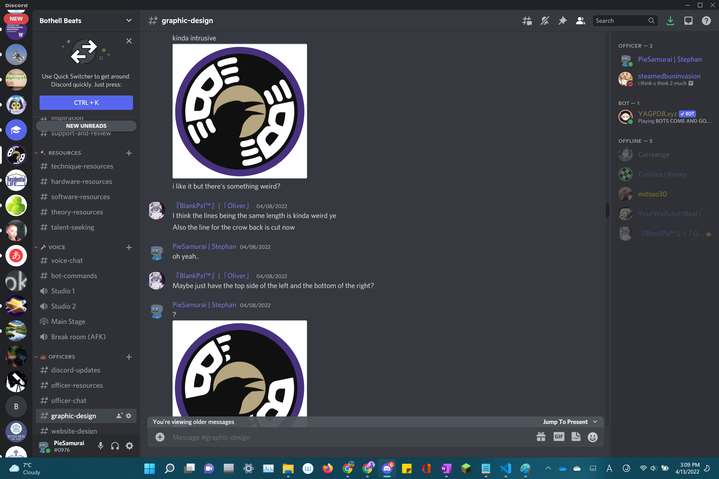
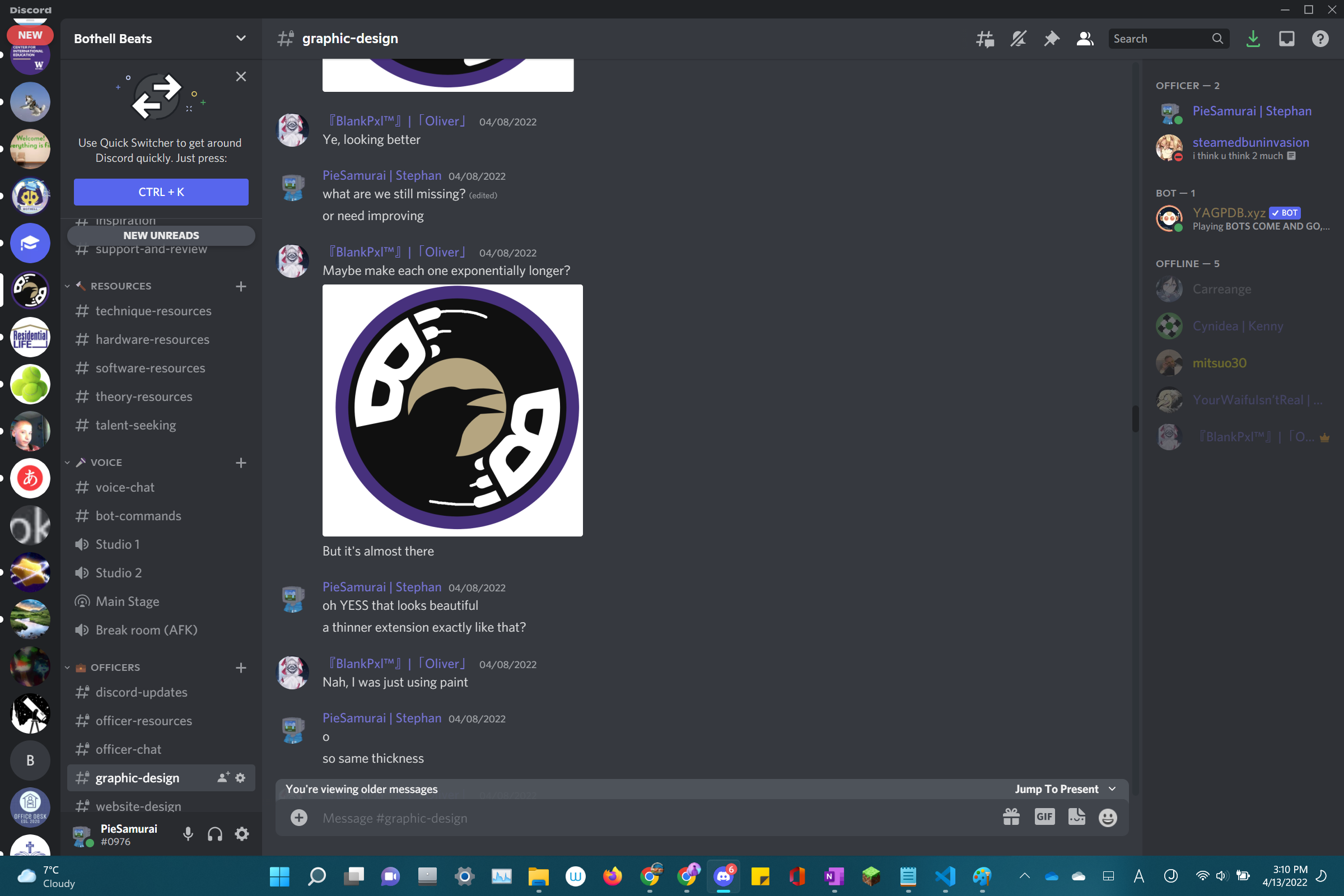
And so with Oliver being my guide all the way, the final design was achieved. I wouldn't have gotten the ideas he had if I were to work on this myself; I would've stopped at the versions I sent to him for opinions. At least I thought they were good enough, but with Oliver's help, the club's logo was brought to a whole new level I wasn't even aware of.
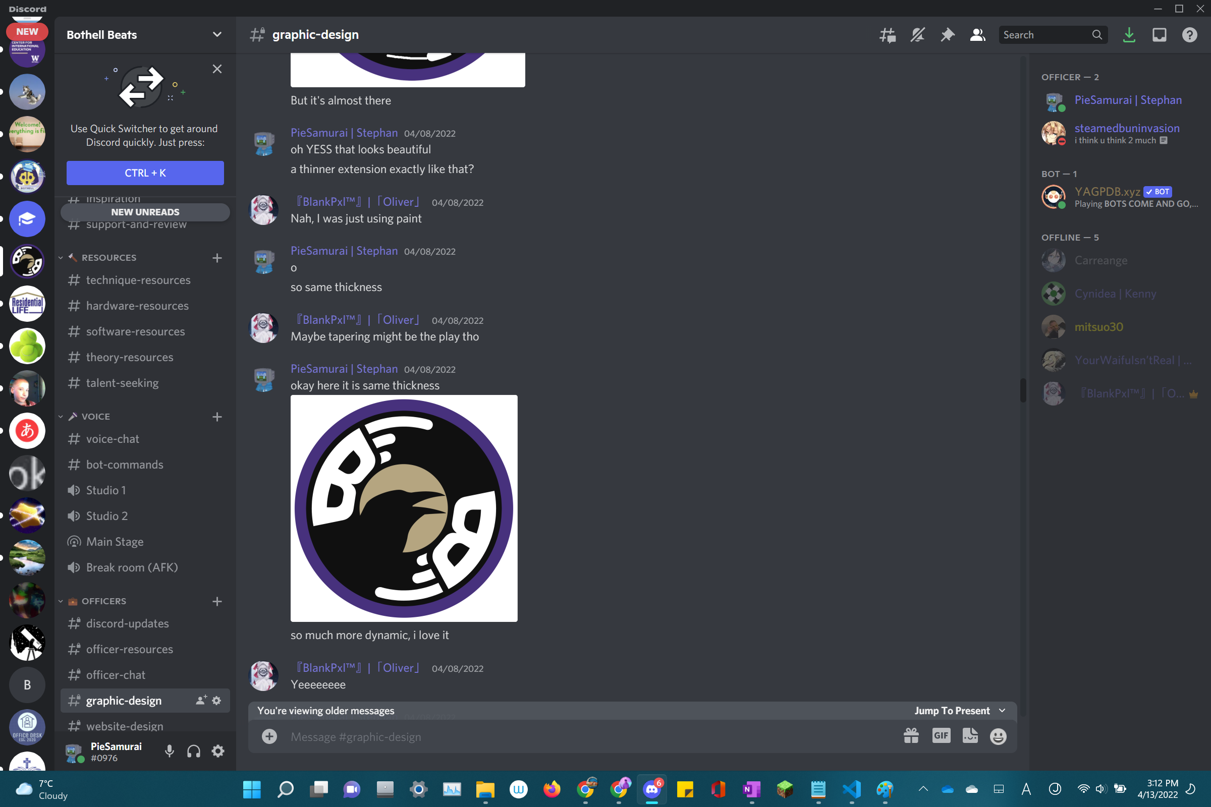
The logo couldn't have been this good if Oliver weren't there to help.
The End Result
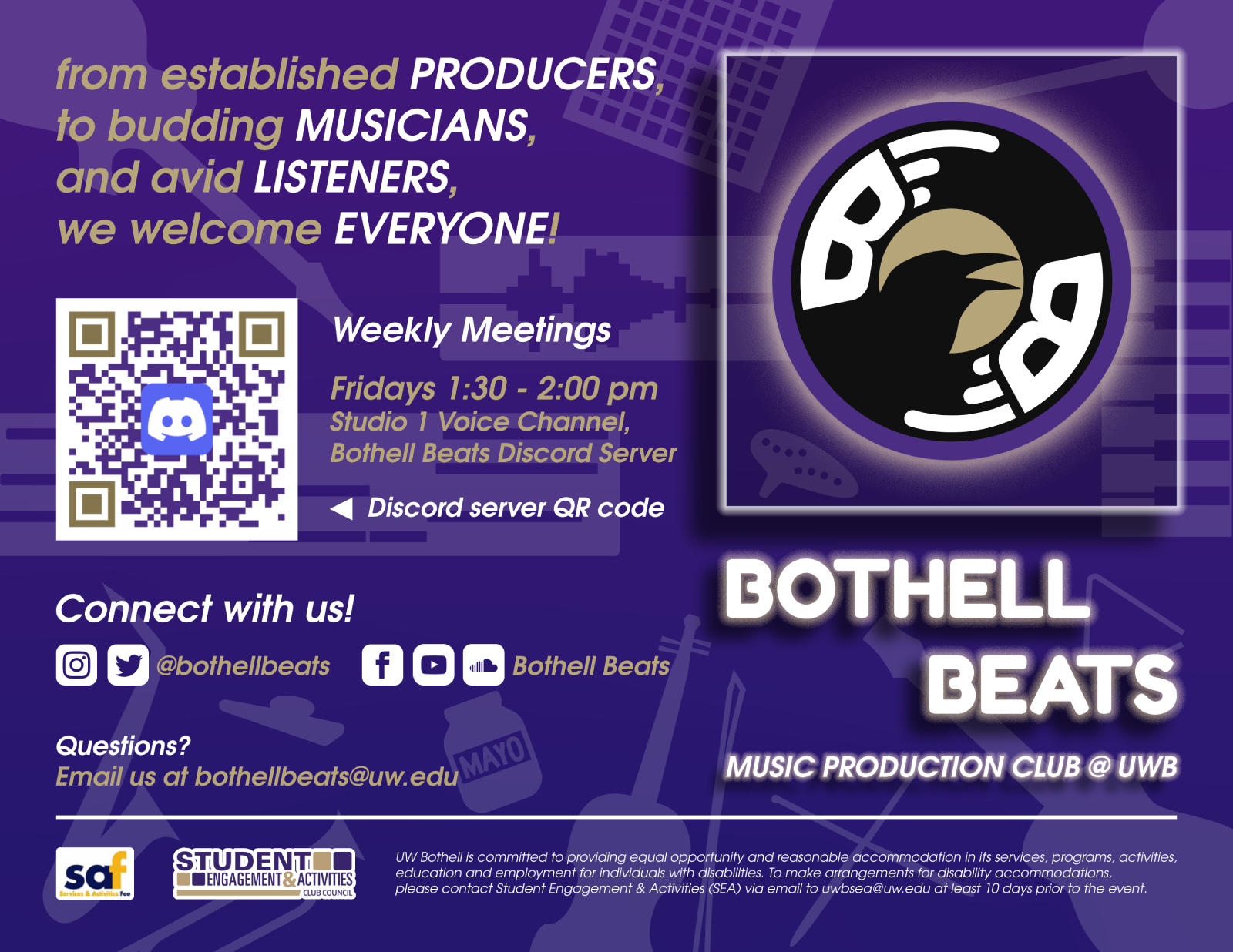
Here are the final (currently used) versions of all the graphic designs I've made for, with, and of the club so far!
// club logo

// event banner (36" x 24")
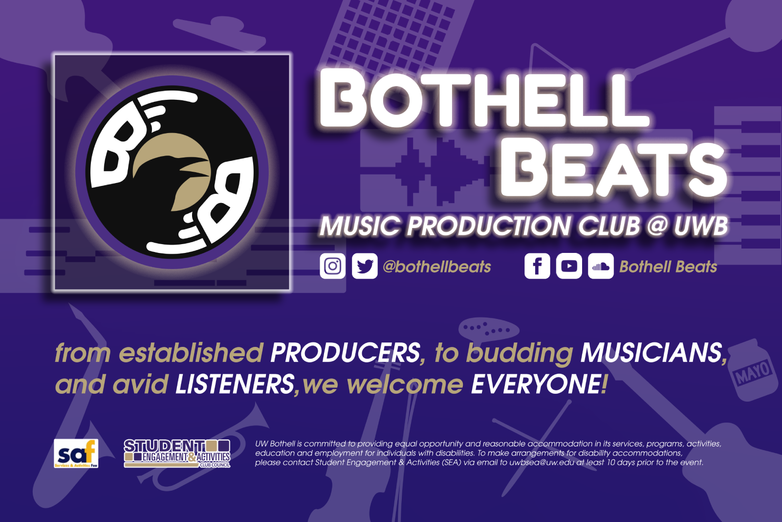
// club flyer (quarter US letter)
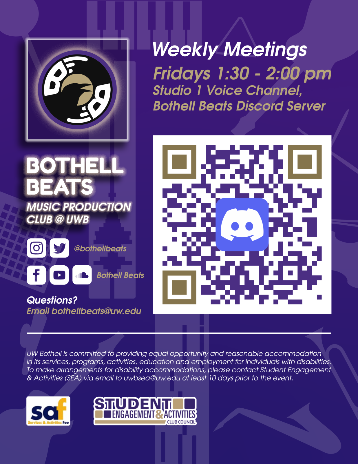
// tabletop info (US letter)
The Reflection
What I Learned
This is my very first experience in an official graphic designer position for a real organization. Working in collaboration with other people in designing is something I found to genuinely enjoy.
My Next Steps
I would love to use more proper tools and methods to draw vectors accurately without having to do too many shape tricks like what I was doing for this one.
It's been a demanding but colorful journey to be an official graphic designer. I've managed to keep up with all the club's demands and have been able to manage projects satisfactorily. What the club needs now are social media graphics to further display what a awesome club it is, with such awesome members.