- ▢
- –
- ✕
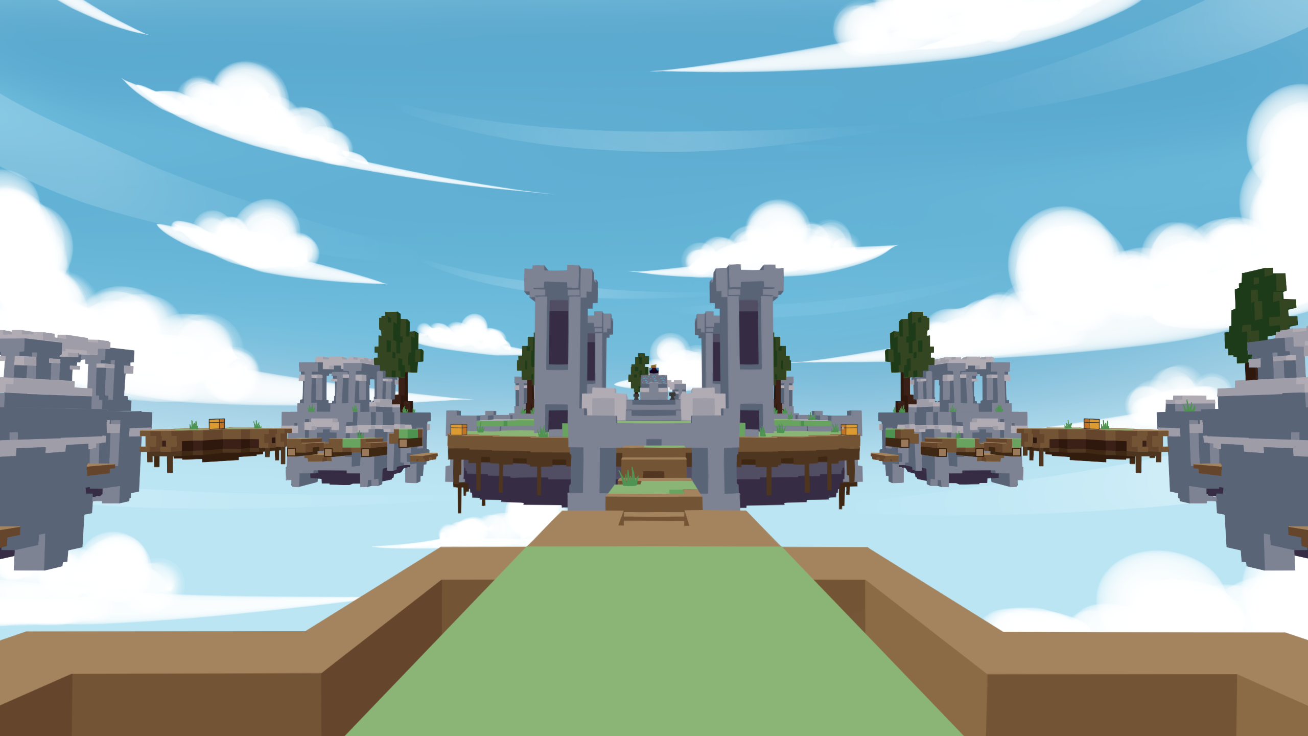
About
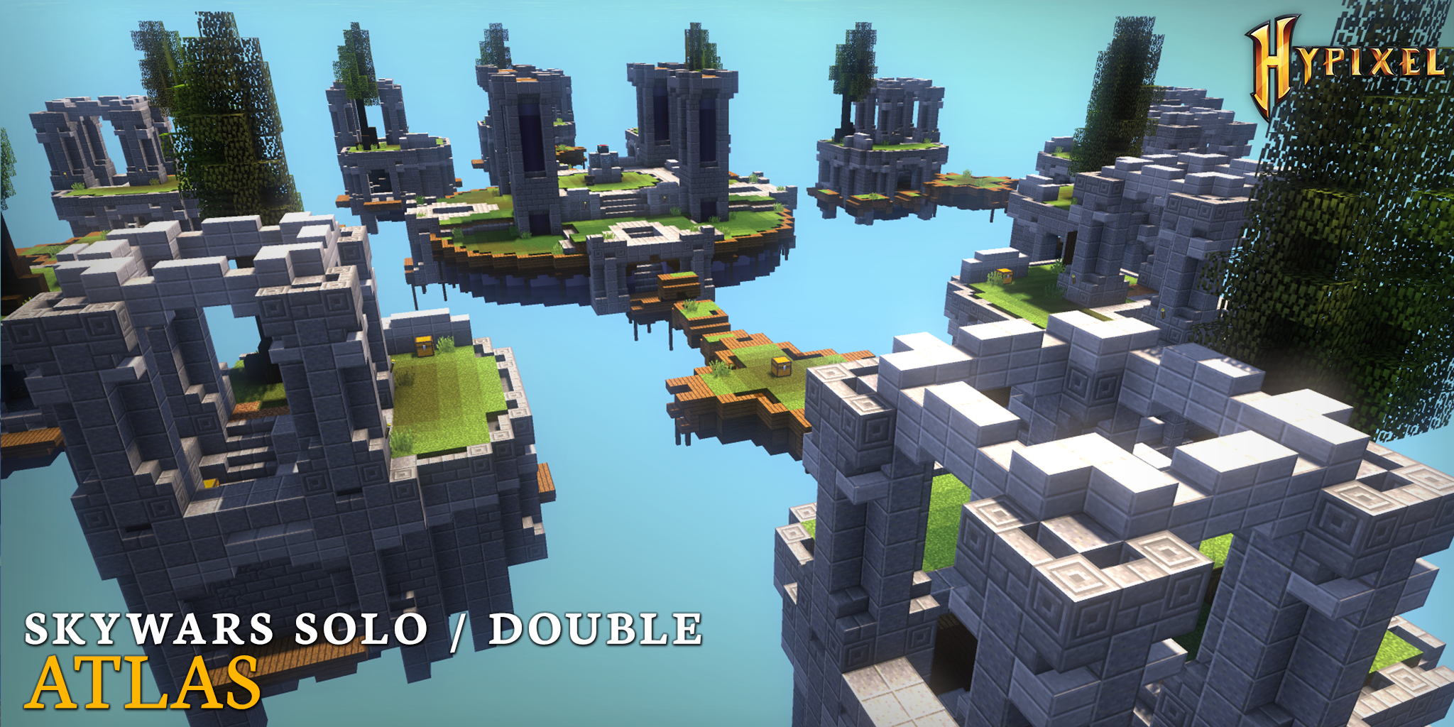
Although Minecraft itself is a game, a lot of people including myself also see it as a meta-game, using it as a tool/platform to create their own games within the game, usually organized in public servers. You have adapted real world games like paintball, hide and seek, and parkour, made some games possible or easier using Minecraft as the virtual platform like Murder Mystery or Turf Wars, and crafted entirely new games in the game like BedWars, Bridges, and especially SkyWars, the game in Minecraft that this art is about. Many of the games have different maps for the matches to happen in, and this one called Atlas is one of SkyWars' many maps.
In Skywars, players battle against each other on floating islands to try to be the last player remaining. You can eliminate other players by bringing down their health points to zero, or by hitting them off the islands to fall into the void under.
// Atlas, one of the maps for SkyWars
// gameplay screenshot (RKY, 2021)
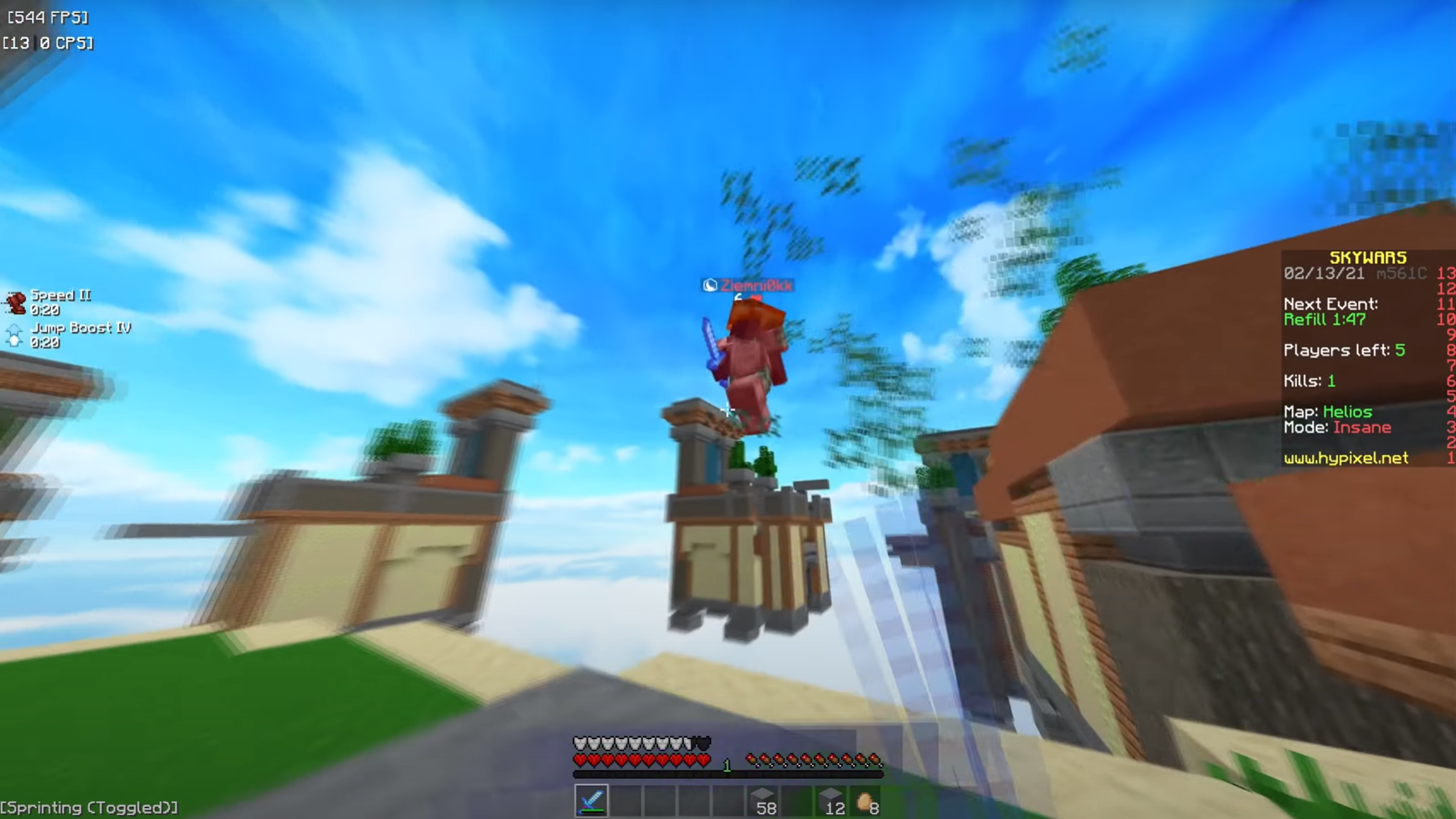
As mentioned, this was made for the starting YouTube channel of a friend, who didn't end up using it anyways, and who afterwards entirely stepped back from the aspiration of doing YouTube. But that doesn't change how I value this piece in any way; it remains to be a personal achievemnt that I am proud of. It's quite a different style than what I'm used to, and we'll see why once we get to seeing how I made it.
The Process
The First Approach
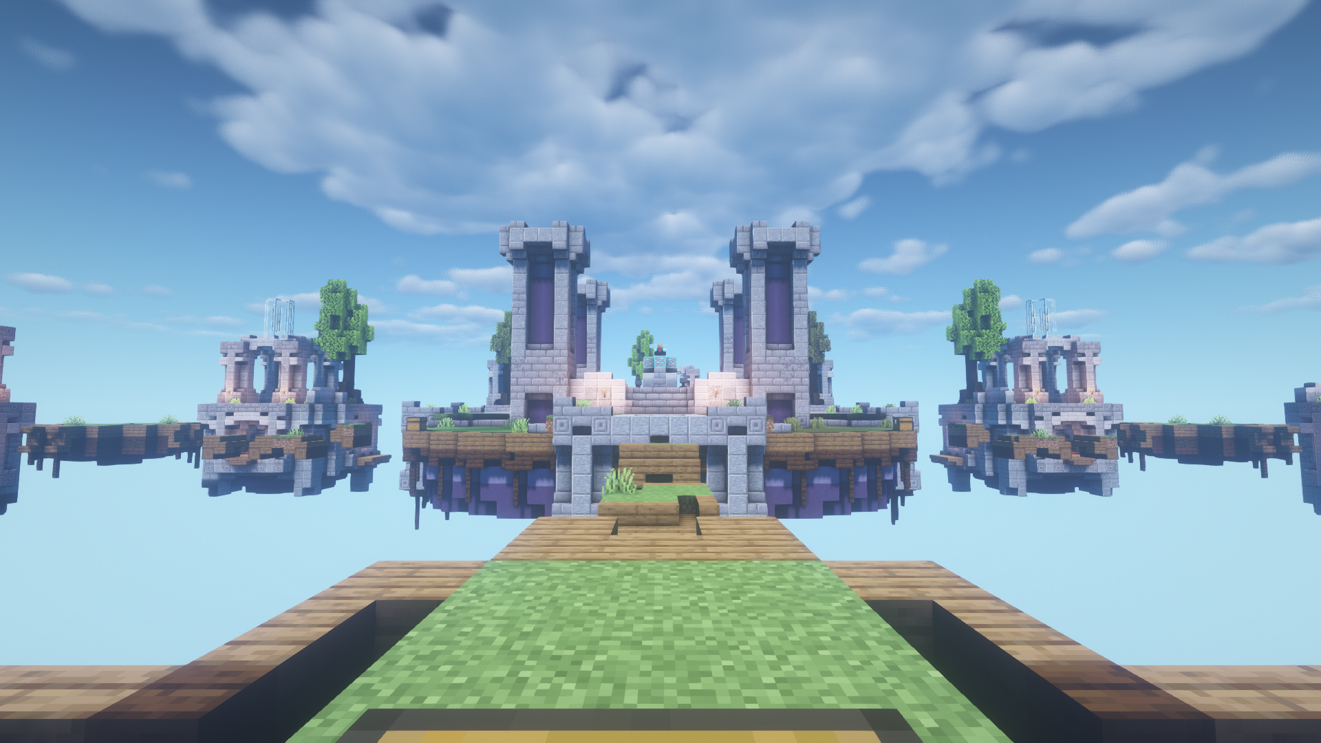
Since I saw this as a major enough project, I thought Paint Tool SAI would be the most fitting tool for this job. I had the initial idea in my head to just trace the outlines of a screenshot from actually standing in the map in-game, but I didn't think of how my method of doing it will affect how it looks in the end. So what I did first was I downloaded a copy of the world to allow myself to fly around in it in creative mode. I took a screenshot to trace once I found the vantage point I was looking for.
// screenshot
// tracing important lines
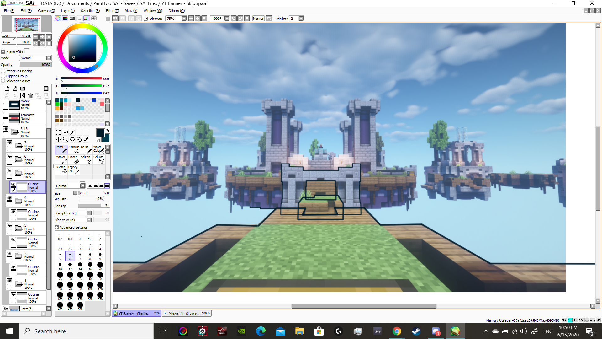
Soon enough, I started to see the the shape of the map in the lines.
// zooming in to trace the more intricate outlines
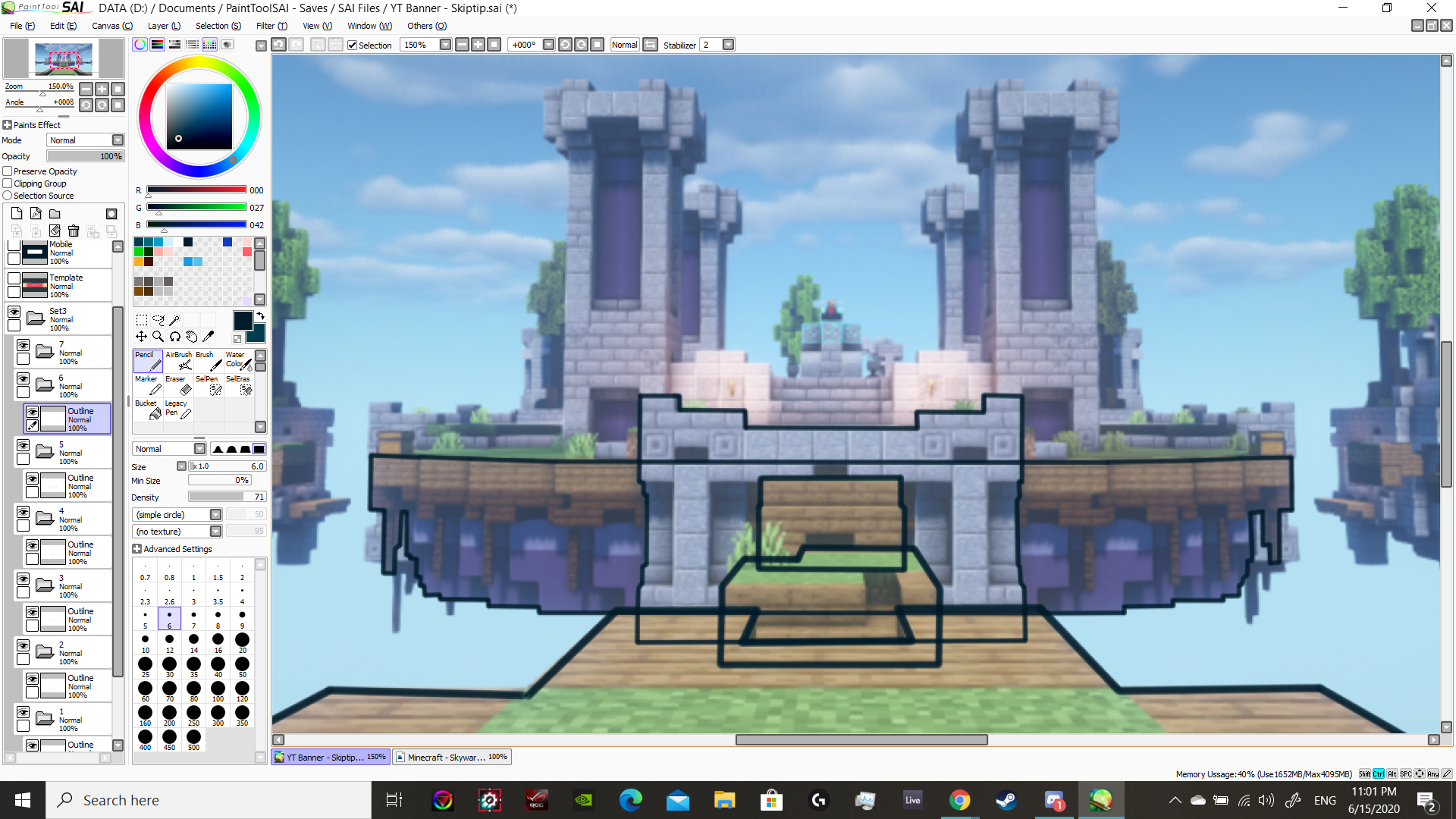
// lines into shapes
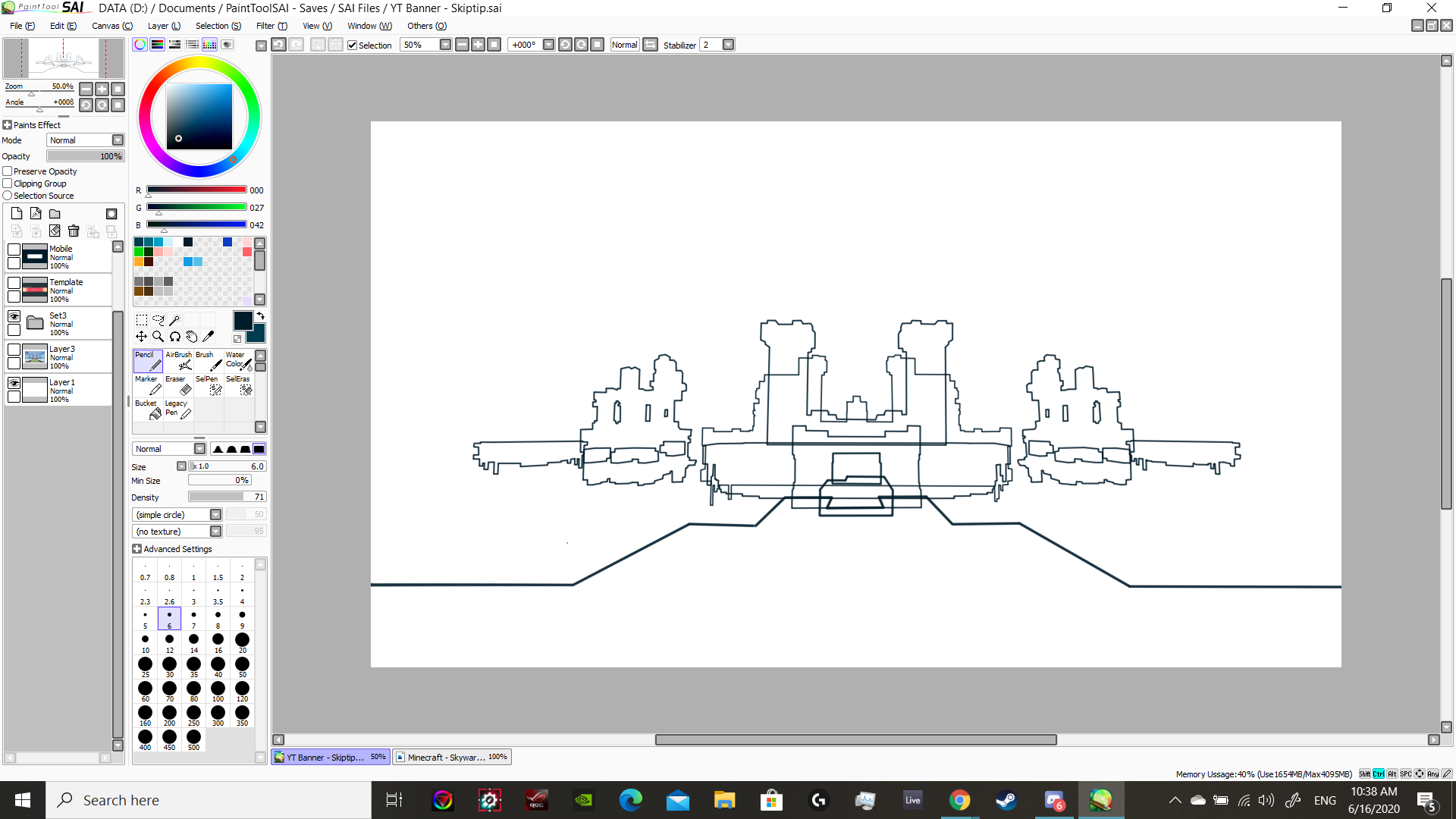
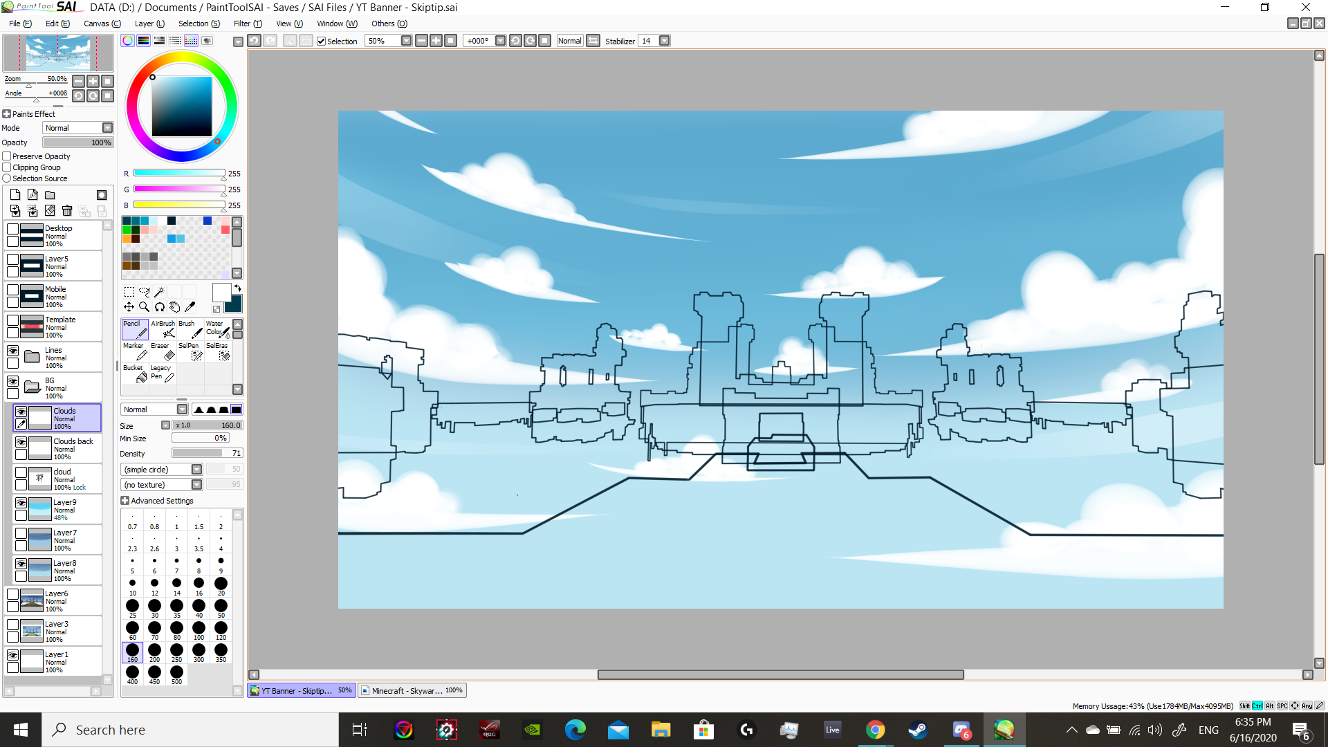
Once I finished tracing all the important lines, I thought the sky should have a dome effect that I suppose makes the scene look more grand, especially from that point of view. It is for a YouTube banner anyways.
// dome sky
Now it's time for the actual blocks of the map. This is where I first and finally realized that the hard work I put into drawing all those lines didn't align with the picture I had in my mind. I was going for a simplistic, modern, cartoony look, but I couldn't get it to work with these lines; inherently they give off an architect's art style. I knew then that I had to throw the lines away. A more long term mistake I had made is my decision to go with Paint Tool SAI. A lot of the artists with art styles that inspire me use it, and my research always led me to decide on Paint Tool SAI, but as good as it is for what people use it for, it's very inversatile and bare-bones. I learned that it's not the tool for me to use with this cartoon style I was going for because it doesn't have any polygon building tools. It's really just a brush, it doesn't even have a virtual ruler to keep lines straight. I had no other tool at the time, though, so Paint Tool SAI is what I have to work with. I completely scratched the lines and tried doing something different, which worked wonders. By now I should clear up what I've been meaning by "cartoony style." It's basically just lineless art, along with restricting to three colors for shading — the color as itself, the color in a shadow, and the color under direct light; I think it simplifies the overall appearance without sacrificing a third dimension for he shapes.
// achieving true linelessness
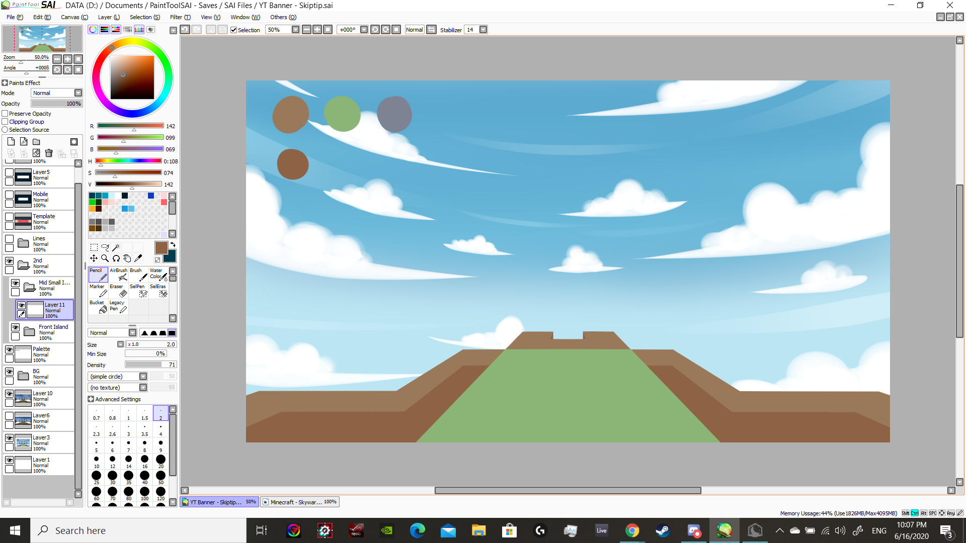
Seeing that this is a great method, I expanded out to other parts of the map without hesitation.
// the center island
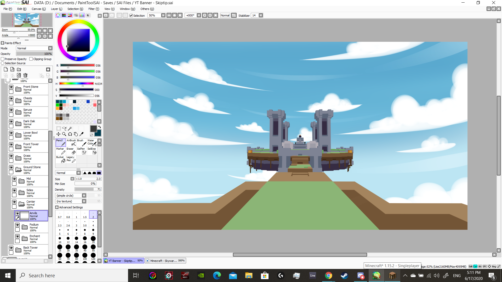
// outer islands
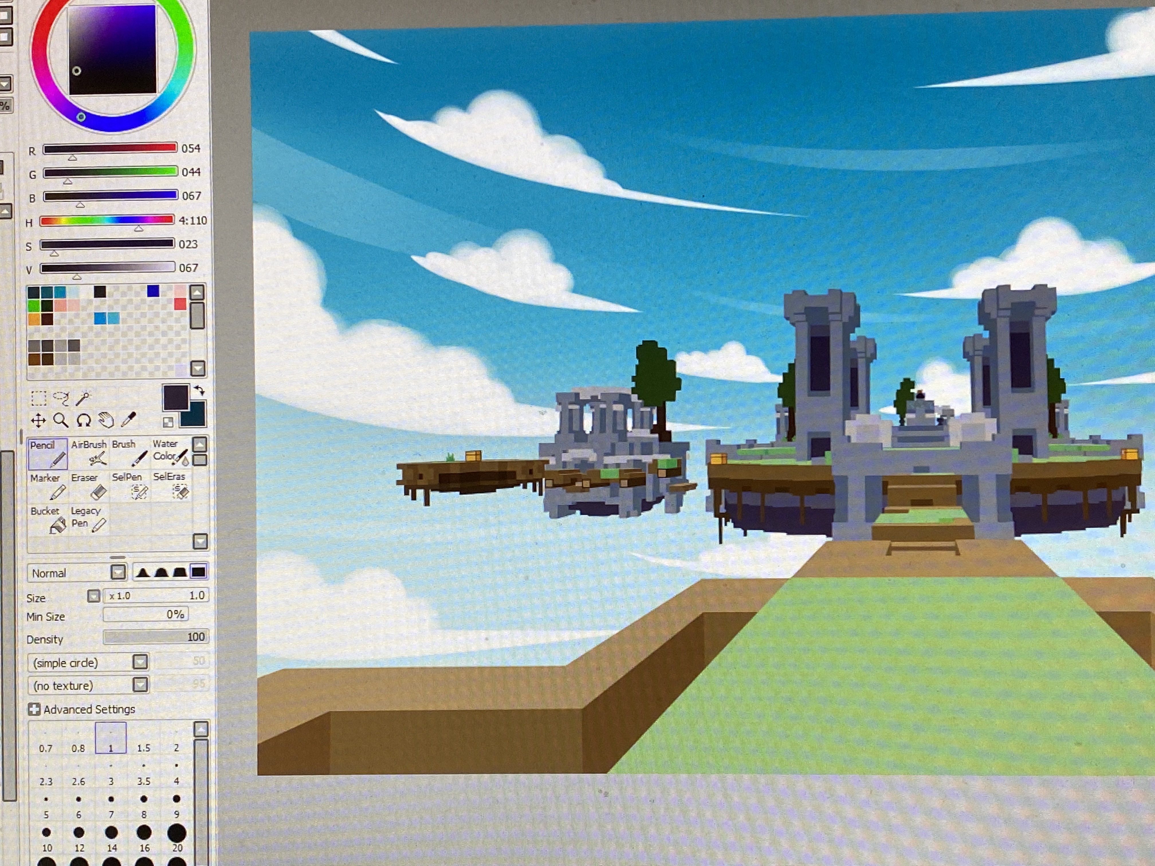
My general formula for this method is to have just one color for each shape that I will make, and from there it's all about arranging them in layers so that they cover each other in the right areas, forming more complex 3D shapes.
// the front-facing sides of all the stone blocks in the screenshot
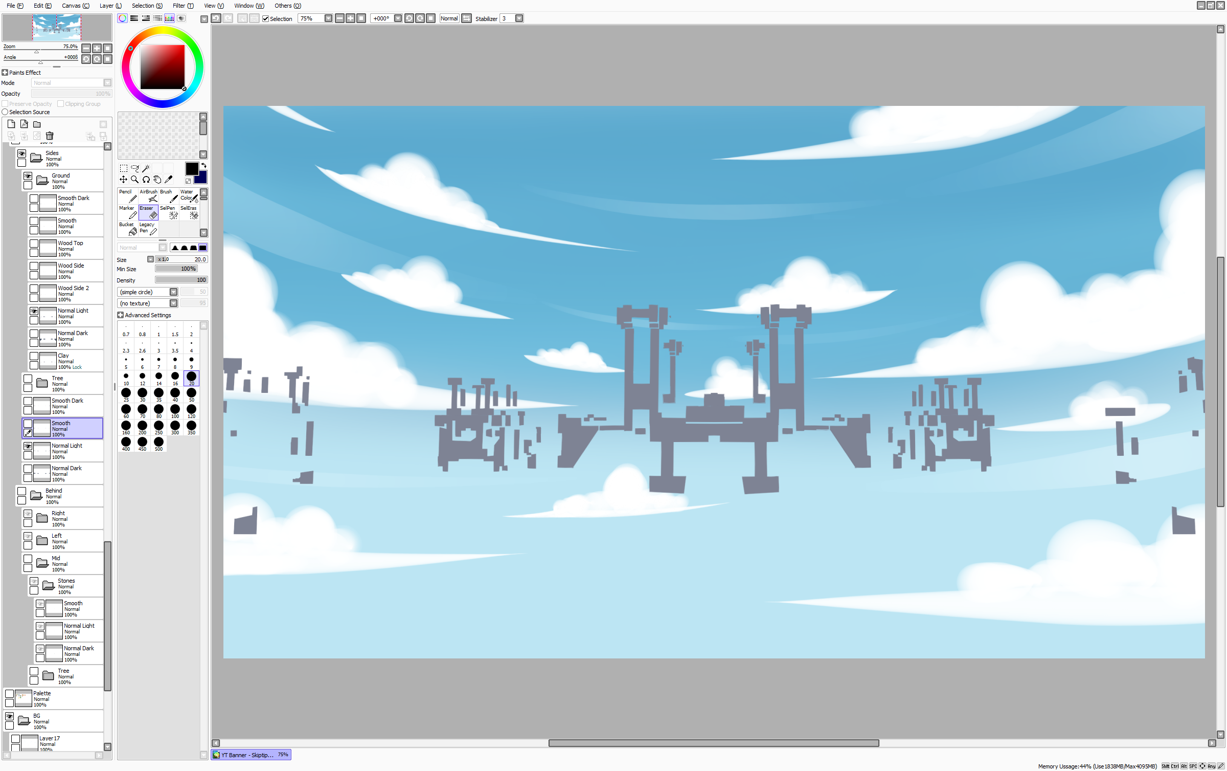
// compare that to the full picture below

This method also made me end up producing so many different pieces just so they stack on top of each other properly that I had to create "objects" comprised of the layers themselves; and they go down so many levels, I had objects of objects of objects of objects.

It took a long while, especially because I was figuring out as I go; again, I've never used this method of layering solid color shapes before, almost like making paper cut art. But it worked really well, and the whole sky and islands were now done. Because this is no longer intended to be a YouTube banner, this is what I usually show to people now. But back when I was making this, this friend, username Skiptip, was asking for more.
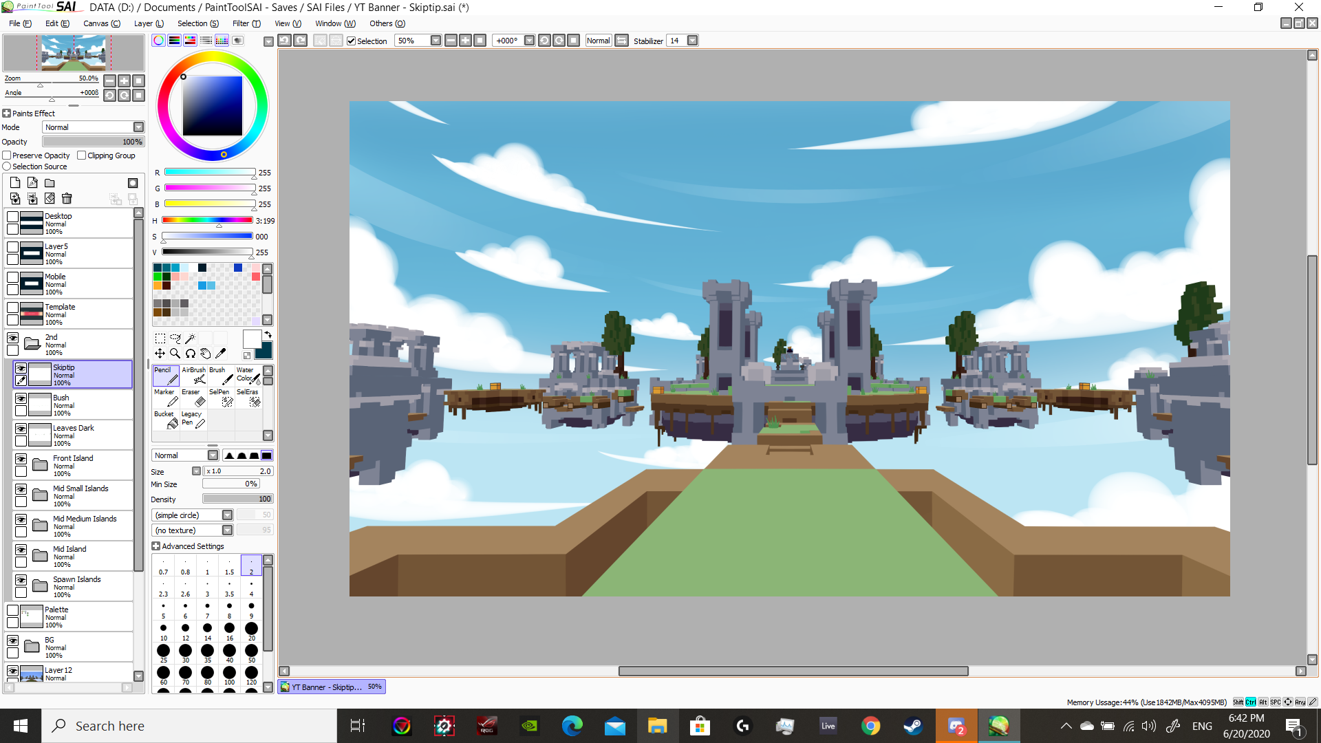
This is where he jumps in with regular inputs to direct me as I go, because I'm no longer following lines here; the world is done, and I'm now following directions.
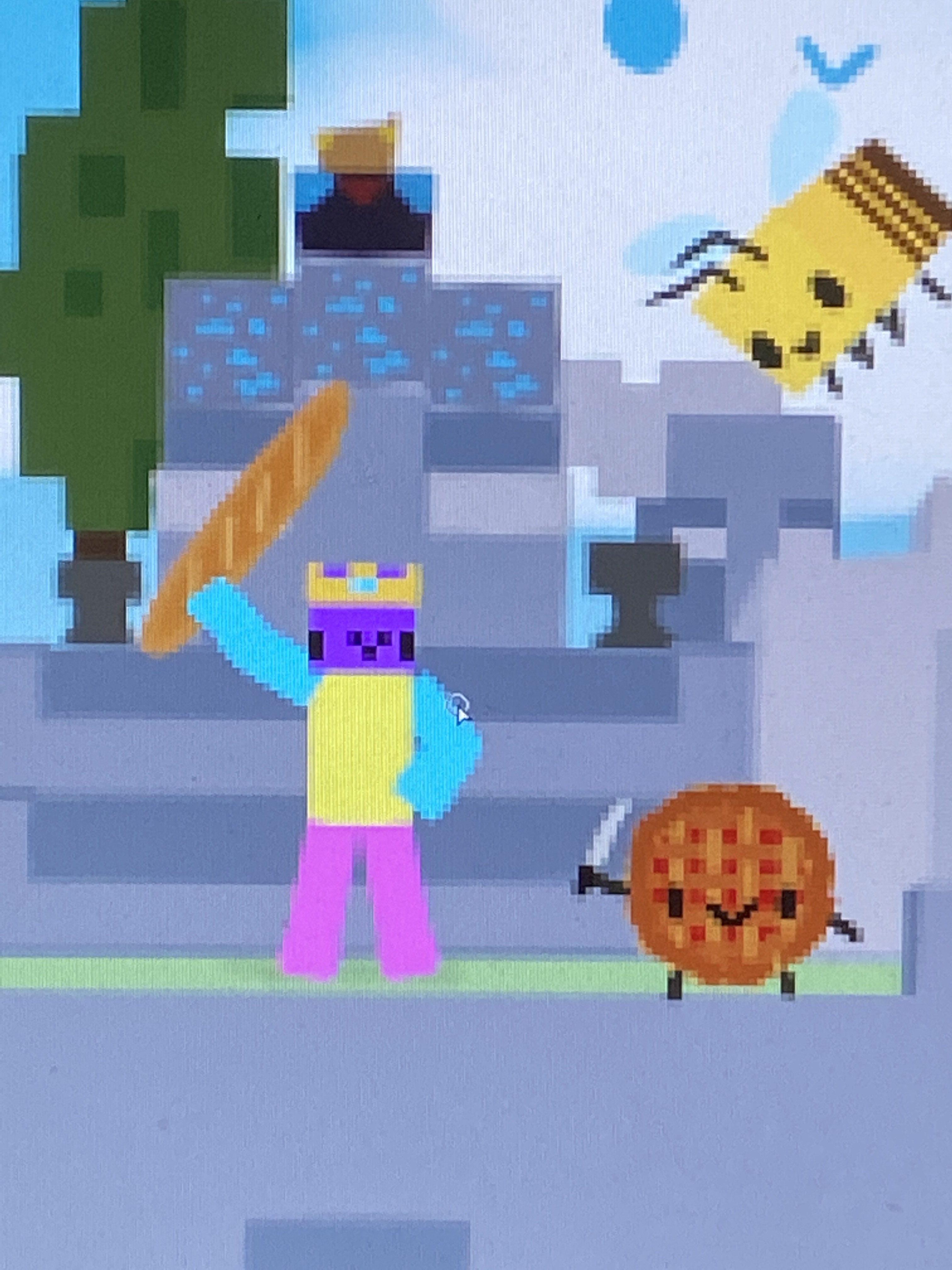
The first thing he wants is his Minecraft character standing in a victory pose on the big center island.
// can you spot him? I made sure he's to scale with the blocks, about two blocks tall.

// I gave him an enchanted diamond sword too (netherite wasn't released yet at the time)
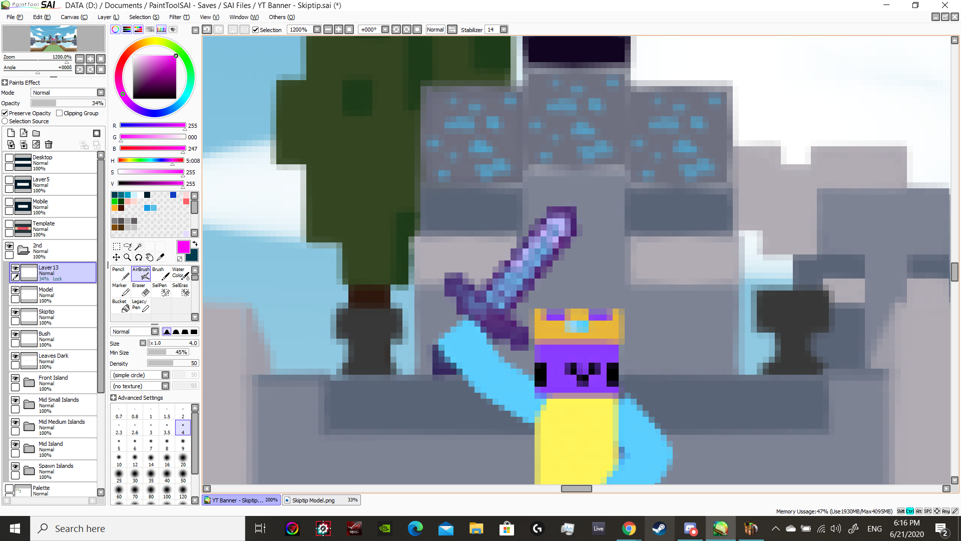
It only gets more and more cursed from this point; I'll just list them out below.
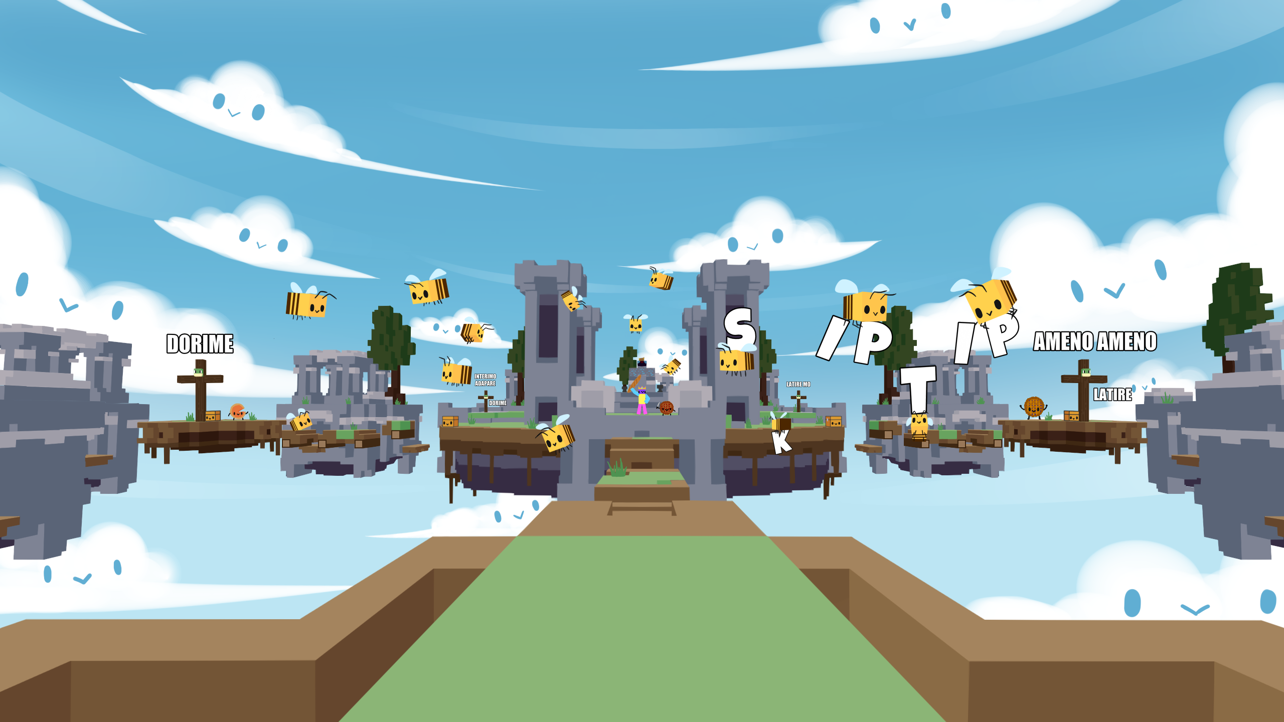
// Skiptip wanted bees around the scene
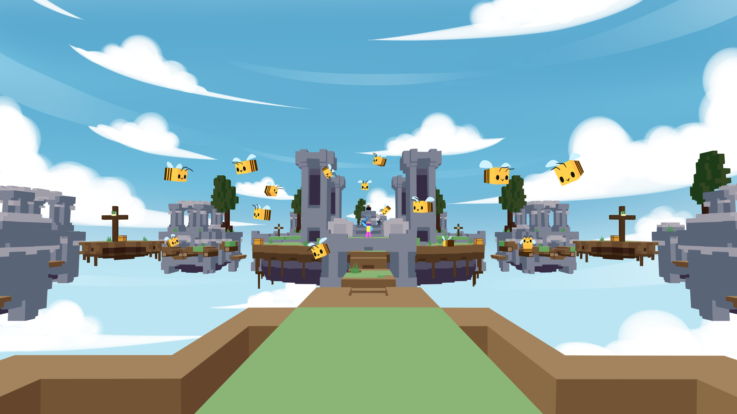
// he wanted faces on everything, frogs on crosses, and the lyrics to the iconic ominous pseudo-latin song Ameno.

Trying to match his energy, I added pies with faces in several places- because, you know, I am the PieSamurai after all
// raspberry pie
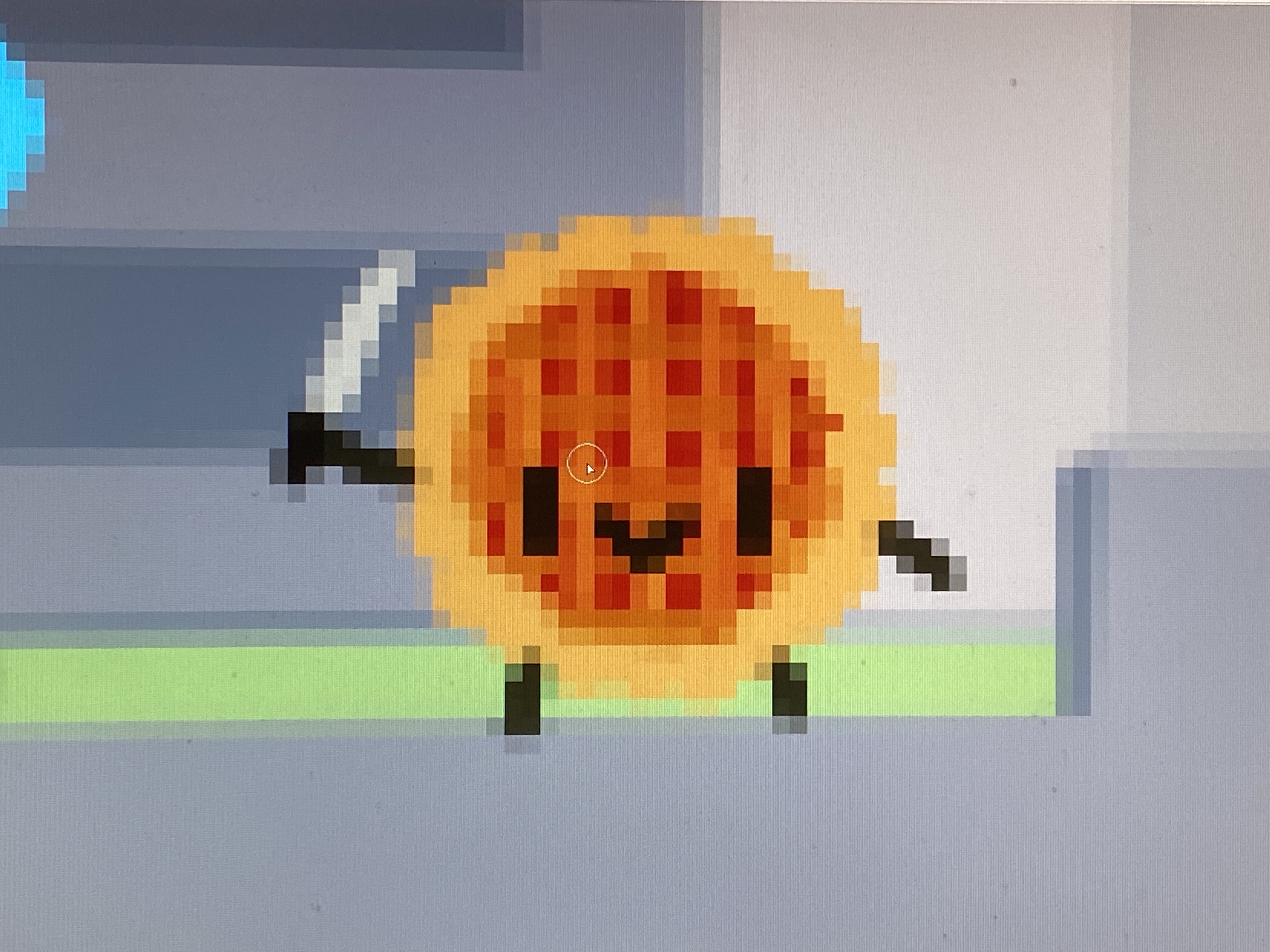
// blueberry pie
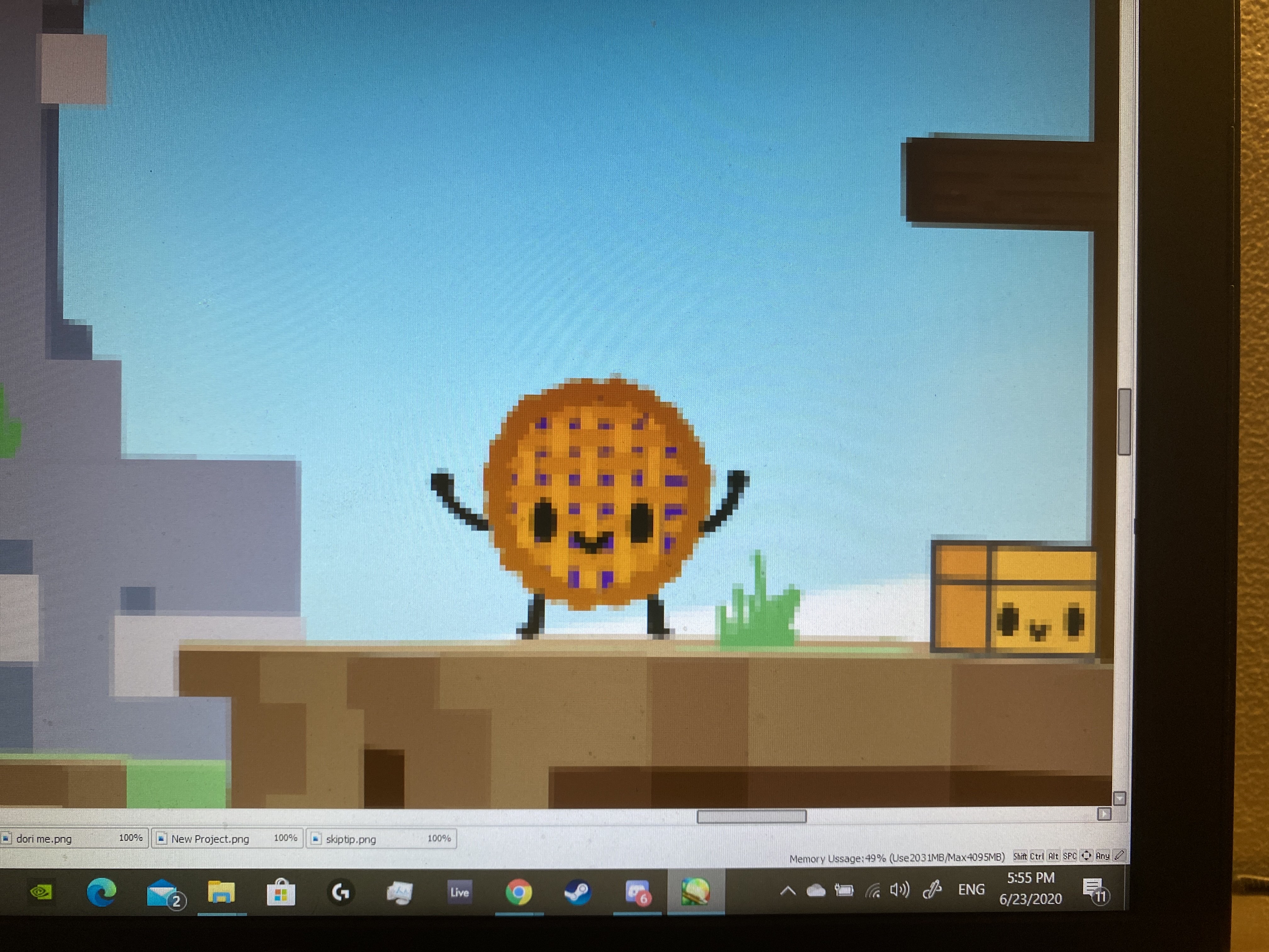
// pumpkin pie
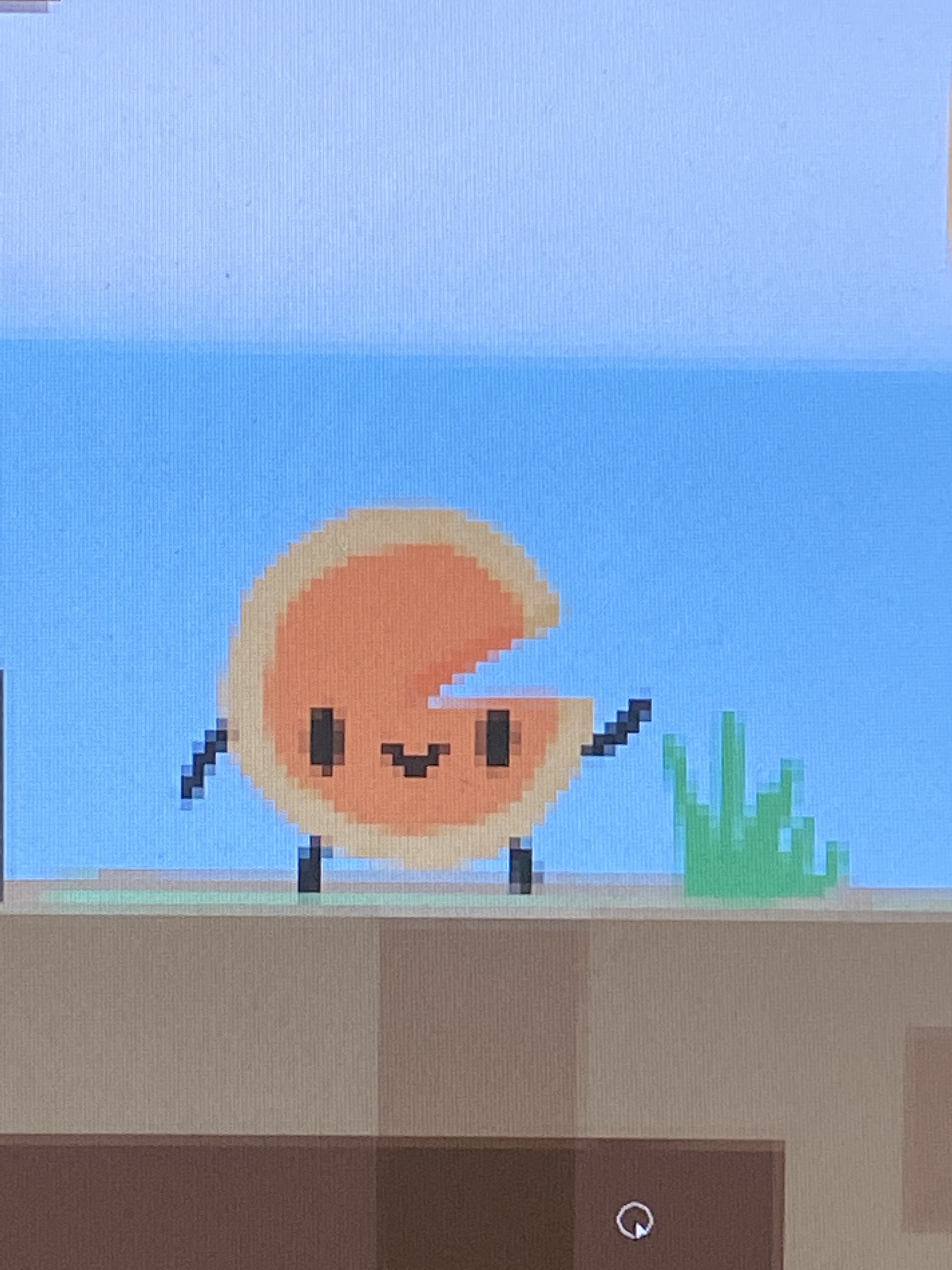
// ...then he tells me he wants to hold a baguette instead
The End Result
Sorry if I ruined it; this might have appeared less impressive knowing this was traced, but I can't lie about it. It still turned out really neat!
// landscape only

// with Skiptip's requests
The Reflection
What I Learned
The first thing I learned is that drawing according to someone else's wants is extremely exhausting. It makes me repeatedly question if I should open commissions — I still haven't yet. BUT, more importantly it has given me a wonderful opportunity to demonstrate that I can adapt my work and how I do my work with minimal issues. The second thing I learned is a new interesting way of drawing, a tedious one nonetheless; it goes back to my habit of going overboard to achieve something with the tools I have.
My Next Steps
This project had produced a style that I really find pleasing. Lineless art is indeed beautiful and has its own atmosphere, but I'd want to find a less tedious and tiring way of producing it.