
By Alaina Sloo, MLIS Day
"Can you help me? I'm looking for a copy of Moby Dick."
"Certainly, sir. Do you know what color it is?"
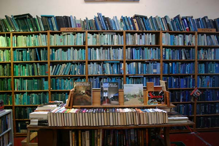
On November 10, 2004, artist Chris Cobb turned the Adobe Bookshop of San Francisco into an experiment in art and book classification when he rearranged the used bookstore's estimated 20,000 books according to the color spectrum.
The installation, called "There Is Nothing Wrong In This Whole Wide World," was supposed to last ten days, but it stayed in place for more than two months thanks to the warm reception it received. Cobb, in a recent National Public Radio interview (November 22, 2004), explained what made him do it:
"I try to take something very ordinary and change its system a little bit to reveal something that you would never see otherwise."
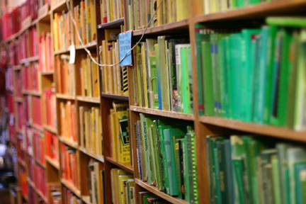
The effect was striking, especially to an American audience* (see photos): the wall of peaceful blues and greens, the way the sunlight made the shelves of red books glow with, as Cobb described it, "unearthly light."
The most common reaction, was "Oh, I love it," said Sri Ananda, who manages the bookstore. People "liked the feeling of the store." Postings in a blog called Superhero Journal reflect the range of comments that Ananda heard in the store. Some people raved about how beautiful it was to experience a room full of books this way. Some talked about the pleasure of serendipity or the beauty of different "worlds of knowledge meeting" in unexpected ways. Several posters in the blog noted that sorting the books by color made sense to them, in the same way that organizing the clothing in their closets by color does. Other comments were tinged with anxiety: "This is beautiful and really neat, but how on earth does anybody find anything?!"
Mostly they didn't. If customers asked for help with finding a book in the rainbow room, said Anada, the staff had to ask, "Do you know the color?" Some people did know the color. And somehow people did find things. More than once, Ananda overheard a customer saying, "Oh wow, I've been looking for this." One of the nice aspects of American bookstores is how they are designed for readers to browse; the new arrangement shifted behavior even further along the search vs. browse continuum. No longer able to make a bee-line for their favorite topics, Ananda said, browsing was their only option and customers saw books they would never have seen otherwise. As Cobb described it on NPR, the color arrangement also made the process of looking for used books more fun. But not for everyone: Ananda still chuckles when he tells the story of one customer who came in and "almost had a nervous breakdown."
Which colors were most popular? According to Ananda, the blues (which comprised the biggest section) and the browns saw the most customer activity. The whites felt uninviting and almost inert in contrast with the warm color energy of the rest of the store. But it was the red books that Ananda says were least attractive to customers. Why should red, the color of red roses and cherry lollipops, be so unappealing? Did the red, red wall seem too aggressive compared to the comfortable blues and greens? Or are red books generally less interesting than yellow ones? Ananda noted that many red books in their collection were bibles, dictionaries, and reference books.
Several of the people who posted to the Superhero Journal said they were inspired by the exhibit to organize things in their own life by color: books, videos, CDs. They weren't the only ones: I missed the exhibit, so I decided to try it at home.
Let me confess right now that I did it, but I couldn't go all the way. It nearly broke my heart, but I broke up the language books. I broke up the gardening books. Goodbye art book ghetto (maybe now we'd actually look at the art books once in a while). But when I tried to break up the mysteries, I just couldn't do it. Old paperback mysteries have singularly unmemorable spines: I'd never find Rex Stout at bedtime if I had to do it by color. And the field guides: would we ever find those if they were scattered? I decided to keep them out of this.
As Chris Cobb also discovered, organizing books by color turns out to be about as free from schematic conflict as the Dewey Decimal System. Is that faded spine color blue or is it green? Some colors just don't fit neatly into a linear spectrum. Where exactly do you put hot pink and brown? And how utterly maddening to discover that each volume of the Dictionary of American Regional English has a slightly different jacket color.
I learned several interesting things from this experiment. Yes, the books look pretty, but over time they began to look too orderly, as though the clamoring of all those thoughts had been stuffed into uniforms and conscripted. Organized by subject, the books don't feel so constrained to me. Sure, the book about ravens can't cross-fertilize with the Dutch dictionaries, but how often do they really need to? As it turns out, I create my own cross-fertilizations - the ones that are of the most interest to me and will probably bear the most fruit over time - in the idiosyncratic way I categorize my own books. Isn't this the direction that classification should be going if we really want cross-disciplinary sparks to fly?
Perhaps the most startling result of this experiment for me was the effect the context of color had on how I value the individual works in my collection. Before the color regime, I would have looked at the History of the Toaster on a miscellaneous non-fiction shelf with affection, even if I hadn't cracked its spine in 5 years. Now I found myself saying, "Too many books for the blue shelf: which blue books are expendable?" and tossing the unfavored into a box without a backward glance.
After the novelty wore off at the Adobe Bookshop, the shop's regular customers wanted the old bookshop back. They wanted to be able to find things. They were tired of serendipity. And I as soon as I finish my last paper this month, I'll be putting my own books back in their old order as fast as I can shelve them. But I have to admit, it was lovely for a little while.
* A wall full of color-coded books would be more familiar to Europeans, who are used to shelves of books arranged by publisher in Tascher green and Gaillimard white.